Internship • Summer 2022
As a UX Design Intern on the Android Color Team at Google, I was tasked with completely redesigning an Monet Studio, an internal tool focused on allowing designers to understand, experience, and utilize dynamic color as a part of the Material You system.
Web Design • User Experience • Interaction Design • Design System
BACKGROUND
The Android Color Team at Google is responsible for working on the dynamic color system associated with Android / Pixel devices. In the past year or so, Android released Material You, a groundbreaking feature on Android devices where colors are extracted from the user's wallpaper and used to formulate different custom color schemes for the user interface. My team plays a critical role in the development of this feature and the internal tool I redesigned is essential in crafting these color mappings.
Unfortunately because the tool I redesigned was internal and protected via an NDA, I cannot show most of my work. What I've included below is the process behind my work as well as the impact of my work.
Role
UX Designer Intern
Methods
Semi-structured Interviews
Wireframing
Prototyping
Tools
Figma
Hosts
Matt Adams
Ashley Park
Team
Android Color
INTERNSHIP FLOW
This was the overall flow of my internship. My primary project involved multiple stages of research and design that bleeded into each other as well as contributing to a design sprint for the next Android and an overarching Android UX summit. In addition, towards the end of my internship, I hosted a design jam for Android designers across international timezones to facilitate color pairing exploration (more below on this). At the end of my internship, I presented my entire redesign and process to designers, engineers, and product managers all across Android.

MONET STUDIO

Used internally on my team and adjacent design teams, Monet Studio was initially built to help designers experiment with color — from extracting colors from wallpapers to testing contrast ratios to generating palettes and recipes and so much more. While Monet's functionality was extensive, with over 30 color tools, it's design had outgrown its interface. Each tool was built ad hoc, meaning that little to no time was given to its own UX, now creating a huge learning curve for designers wanting to use any tool in Monet. Monet had become so intimidating and overwhelming to designers that its tools were sitting idle, despite their extensive value and power.
This was where I came in. My mission was to completely reimagine Monet Studio. To create a design tool that designers could actually use.
USER RESEARCH

INSIGHTS
Personas
One of the primary insights from my interviews was that there were many personas associated with Monet. I noticed that while designers on Color specifically needed some of the advanced controls available in Monet, many of the designers on Android outside of color just needed the ability to quickly export a wallpaper.

The Exporter
Likely a designer outside of Android Color, this user doesn’t want to get lost in the weeds – they want an easy way to experience dynamic color and generate assets without feeling overwhelmed by a ton of options or controls.
The Chef
Likely a designer within Android Color, the Chef uses Monet to convert hex to HCT, to cook up color recipes, check contrast ratios, and extract wallpapers. They value Monet’s finer controls but would appreciate a more streamlined and focused interface.


The Theorist
This user likely wants to explore Monet’s visualizations of the HCT color space, understand the difference between Material and Android Tokens, or play with specific tools focused on gradients, complementary colors and so much more.
New Architecture
Monet fundamentally lacked in information hierarchy with so many tools congesting its navigation, but no clear weight or priority associated with each. My user interviews allowed me to understand how users interact with each tool and which users value which tools. I have an animation here that represents how I understood the significance of each tool prior to my interviews and then my natural understanding of them afterwards.

Color Inspiration
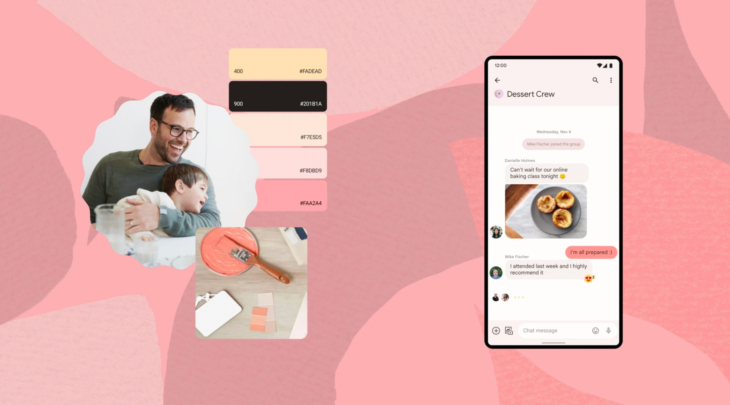
A primary finding from my user research was that there was a desire for color inspiration to be a part of Monet. While Monet currently allows its users to explore Android's color space and experiment with different colors through different experimental tools, there is no resource currently dedicated to finding the colors to be inspired by in the first place. I hosted a design jam during my internship to explore this desire of color inspiration, inviting Android Visual and Motion designers internationally to collaborate on coming up with fun color combinations and interesting names for them, as shown below.

This led me to realize that my redesign needed to address this need and include a shared gallery where users could upload wallpapers, experience dynamic color, and share it with one another.
REDESIGN
As I transitioned into the design stage, I consolidate my thoughts and findings into active design directions and decisions. Now that I had settled on a new information architecture, breaking Monet into multiple connected platforms, each oriented to a different personas needs, it was time to start developing a design system and iterating on the design of each platform. I needed each platform to suit each users needs, but also create cohesion, flexibility, and scalability.

I spent nearly a month and half going through iteration after iteration before finally reaching an MVP that was partially implemented in time for my presentation. In my final week at Google I presented to designers, engineers, and product managers across Android, all of whom highly regarded the work I was able to accomplish in 12 weeks. Unfortunately given that my work was focused on an internal tool that has not yet become public, I am limited in what I can show of my designs. Below I have style spread of some of the components I designed that were critical to the overall designs I crafted.

REFLECTION
Google was always a pipe dream for me. Having used their ecosystem ever since I was able to log onto the internet, my understanding of what good UX and UI is, was largely shaped by Google and its groundbreaking visionaries of designers.
When I met Matt and got assigned this project, it was the culmination of all that I had worked for. I had been given complete creative control and independence in revamping an existing internal tool. It was a large and significant project with the potential to impact designers across Android. I went through a long process of research and iterative design with numerous critiques to get to a final product that not only I was proud of, but that was highly regarded by the designers that had inspired me from the very beginning.
I've been asked the same question by a lot of interviewers — "What is your favorite part of UX Design? Why do you do it?" — and I've always given the same answer. UX Design is about translating thoughts, feelings, experiences into an interaction. It's turning something abstract into something concrete. It's problem solving. I love the idea of being able to have an impact on a user by making their experiences and interactions seamless. With this project, I was really able to tap into this. I was given the opportunity to interview designers, capture their pain points, their needs, their aspirations, and translate it into a visual experience. To make their lives easier.