Bouncr
Bouncr
IDEATION + DISCOVERY
IDEATION + DISCOVERY
IDEATION + DISCOVERY
For college students especially, hosting an event can be tumultuous and unpredictable in terms of making sure only those specifically invited are let in. Events can get out of control and are difficult to manage when more people show up than anticipated, which is especially concerning in the aftermath of the pandemic. The person responsible for making sure only those invited can enter the event often doesn’t know everyone invited personally and likely feels awkward turning people away.
For college students especially, hosting an event can be tumultuous and unpredictable in terms of making sure only those specifically invited are let in. Events can get out of control and are difficult to manage when more people show up than anticipated, which is especially concerning in the aftermath of the pandemic. The person responsible for making sure only those invited can enter the event often doesn’t know everyone invited personally and likely feels awkward turning people away.
For college students especially, hosting an event can be tumultuous and unpredictable in terms of making sure only those specifically invited are let in. Events can get out of control and are difficult to manage when more people show up than anticipated, which is especially concerning in the aftermath of the pandemic. The person responsible for making sure only those invited can enter the event often doesn’t know everyone invited personally and likely feels awkward turning people away.
We surveyed CMU students on their experience with private events only to learn that most guestlists are managed via spreadsheets and invites sent out via groupchats, facebook, or google calendar — all tools that become more and more manual, the more guests you have to manage and also don't have any automation with checking in. From the guest perspective, we also observed a gap. Users often want live information about the capacity of an event or who you know that's checked in at an event that you've been invited to, but no app exists to provide that information for private events.
The Problem
Managing event attendence can be a pain. Especially for busy college students, it can be hard to keep track of all the invitations you sent and check everyone in at the event efficiently.
The Problem
Managing event attendence can be a pain. Especially for busy college students, it can be hard to keep track of all the invitations you sent and check everyone in at the event efficiently.
The Problem
Managing event attendence can be a pain. Especially for busy college students, it can be hard to keep track of all the invitations you sent and check everyone in at the event efficiently.



Our Solution
An app that streamlines the event management process by providing a platform to create events, keep track of invitations, and check-in guests at the door.
Our Solution
An app that streamlines the event management process by providing a platform to create events, keep track of invitations, and check-in guests at the door.
Our Solution
An app that streamlines the event management process by providing a platform to create events, keep track of invitations, and check-in guests at the door.


EARLY DESIGNS
EARLY DESIGNS
EARLY DESIGNS
Considering Mental Models
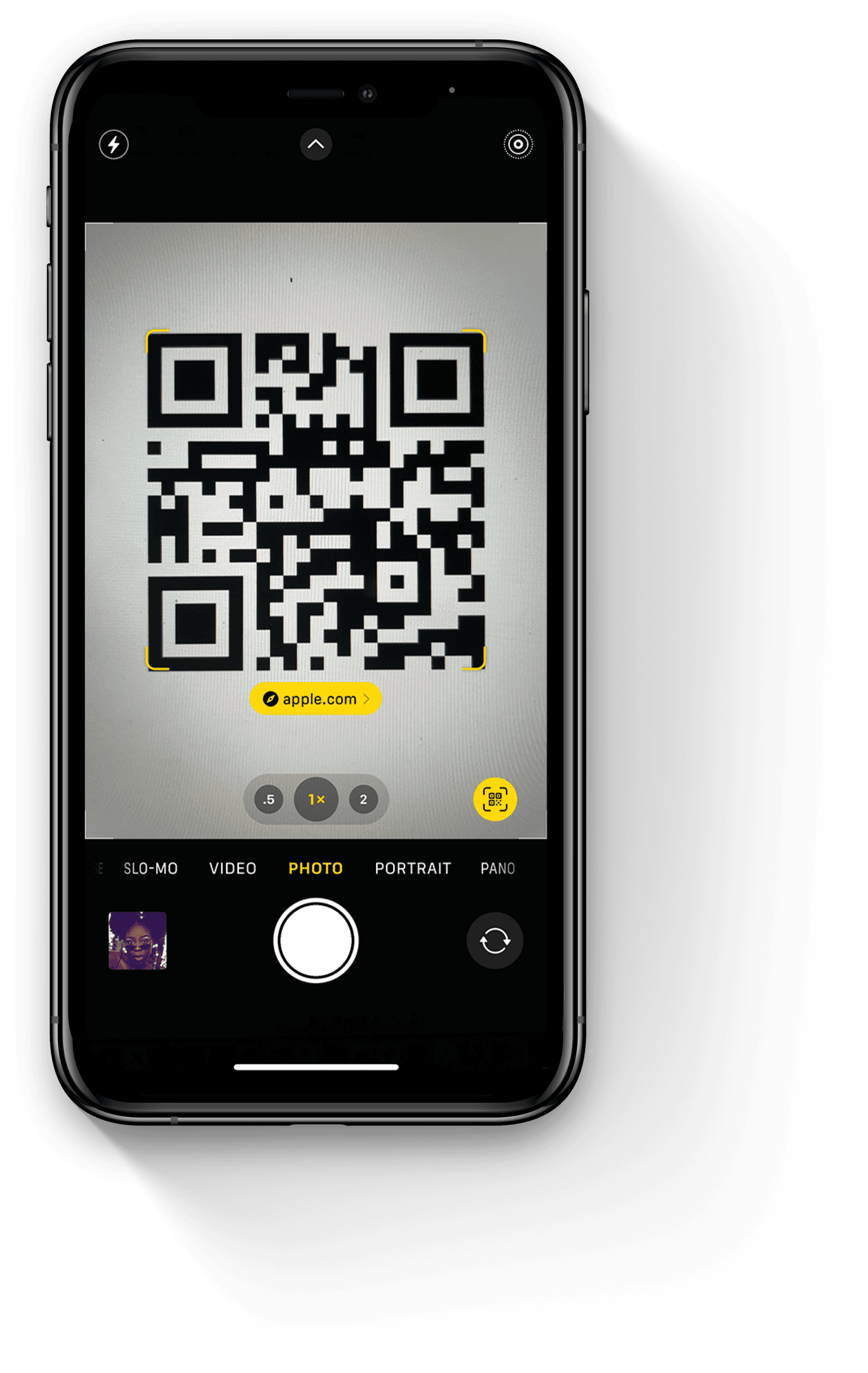
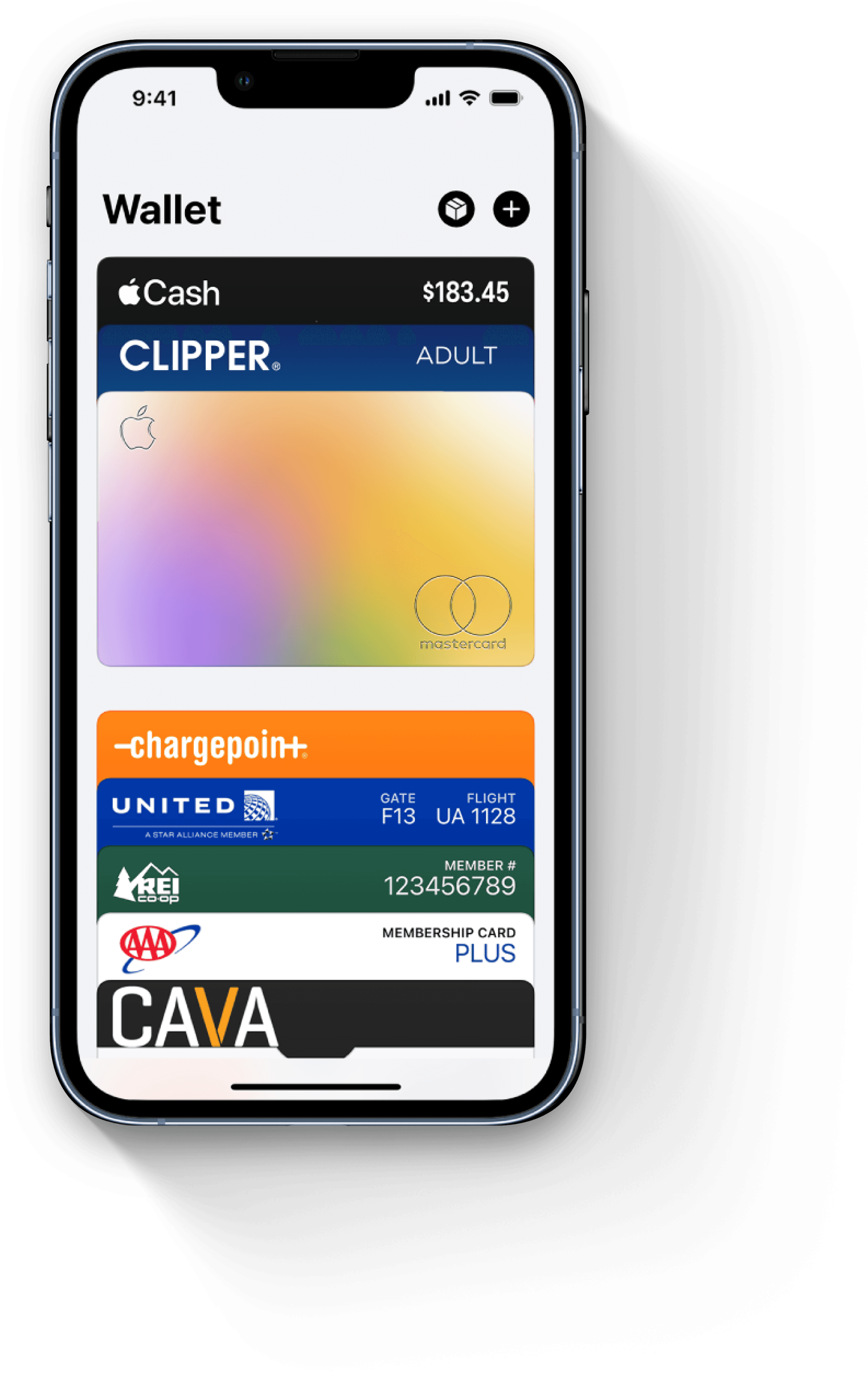
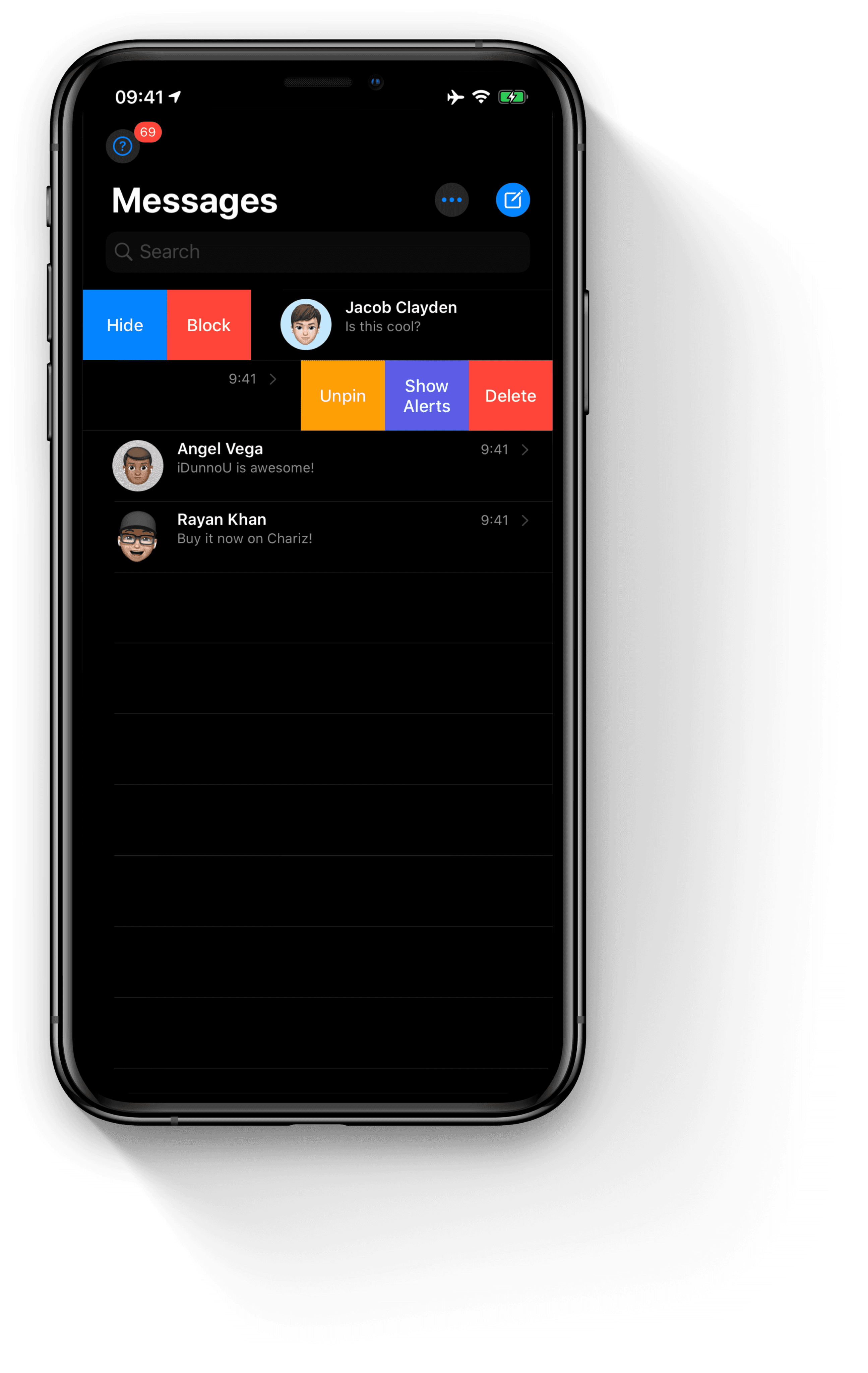
With mobile applications especially, an intuitive user experience often means building off of existing mental models that have become seamless to users. With Bouncr, we wanted to leverage as many interaction models as possible, especially since SwiftUI (the UI kit provided by XCode) had many of the familiar iOS components built in. Three primary models we relied on included the builtin QR code scanning capability of the camera, the stack based interaction on Apple Wallet, and the swipe actions ubiquitious in iOS native applications.






Low Fidelity Wireframes
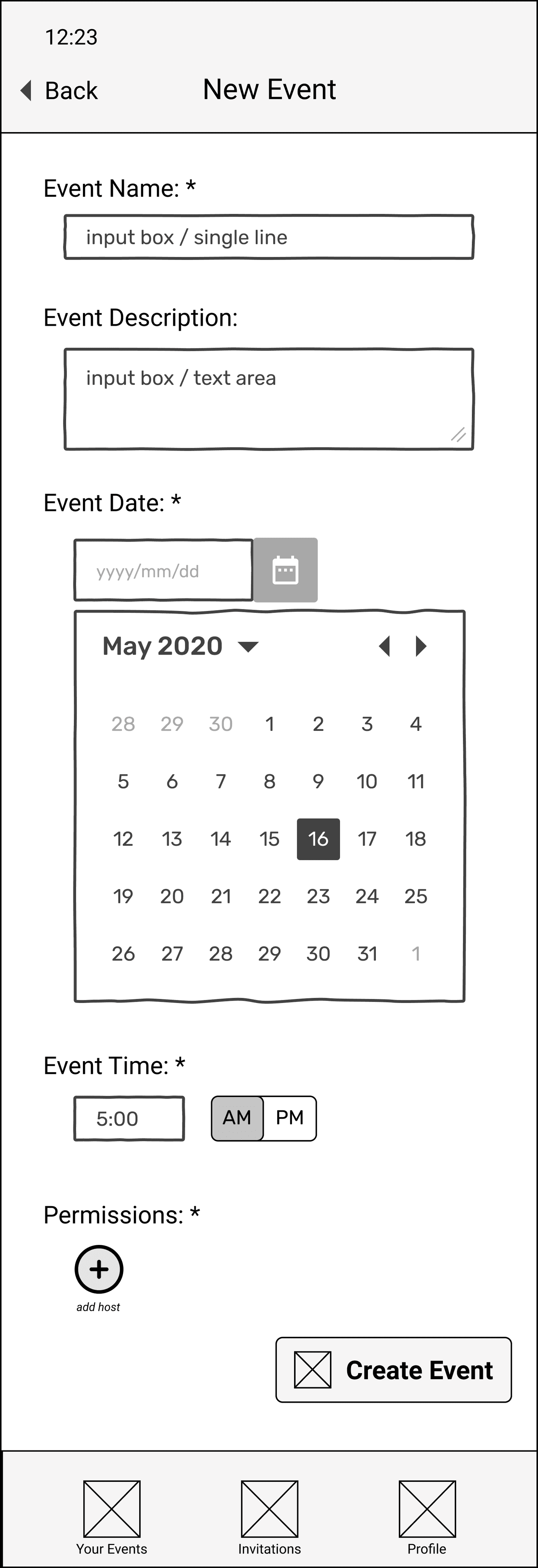
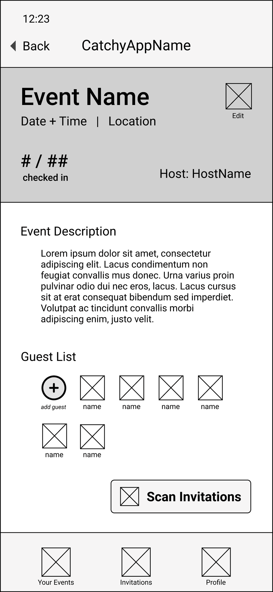
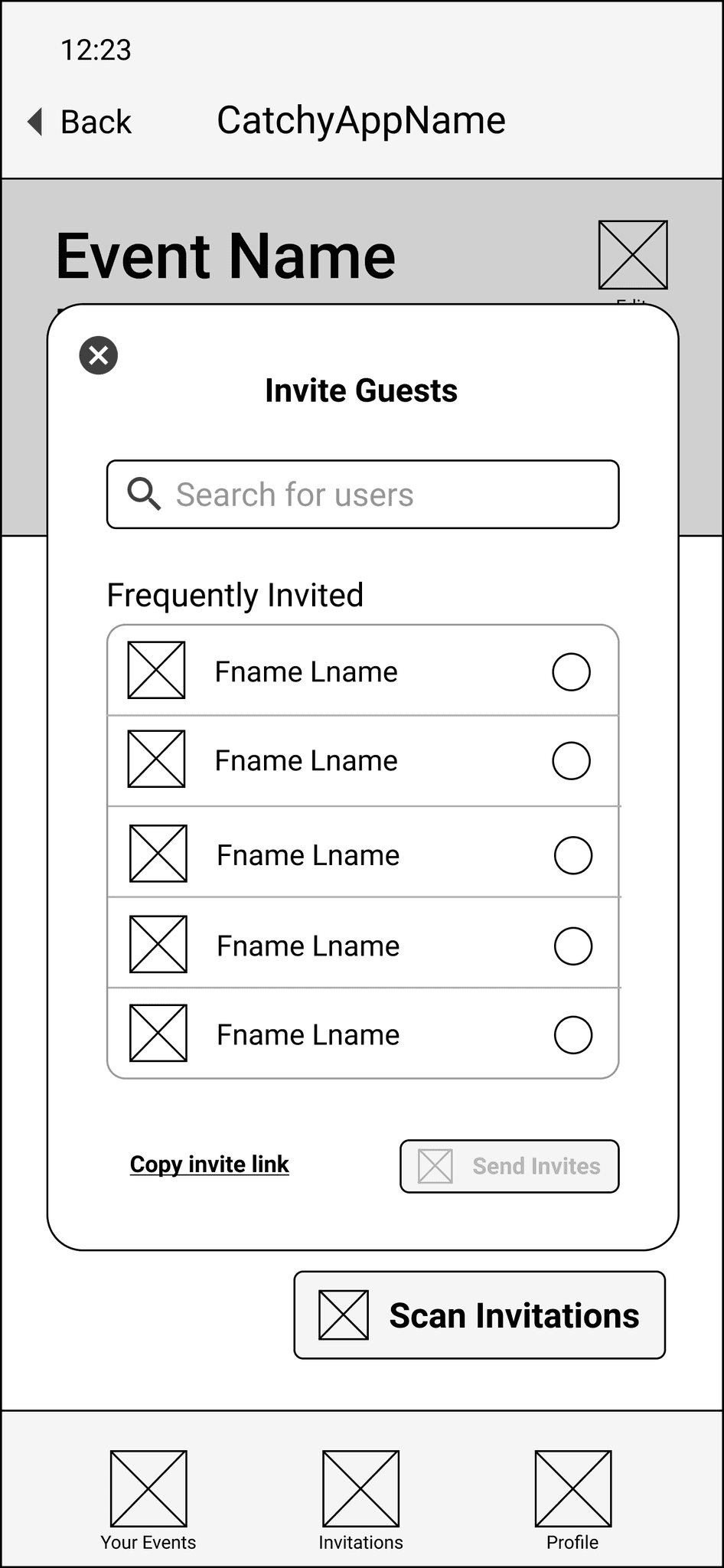
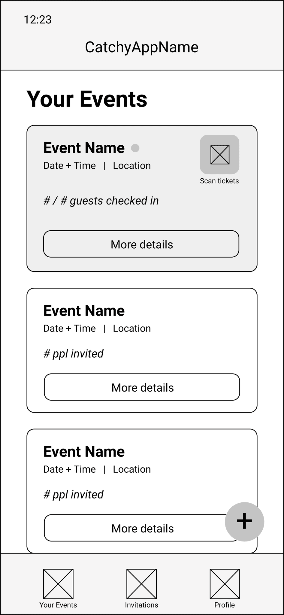
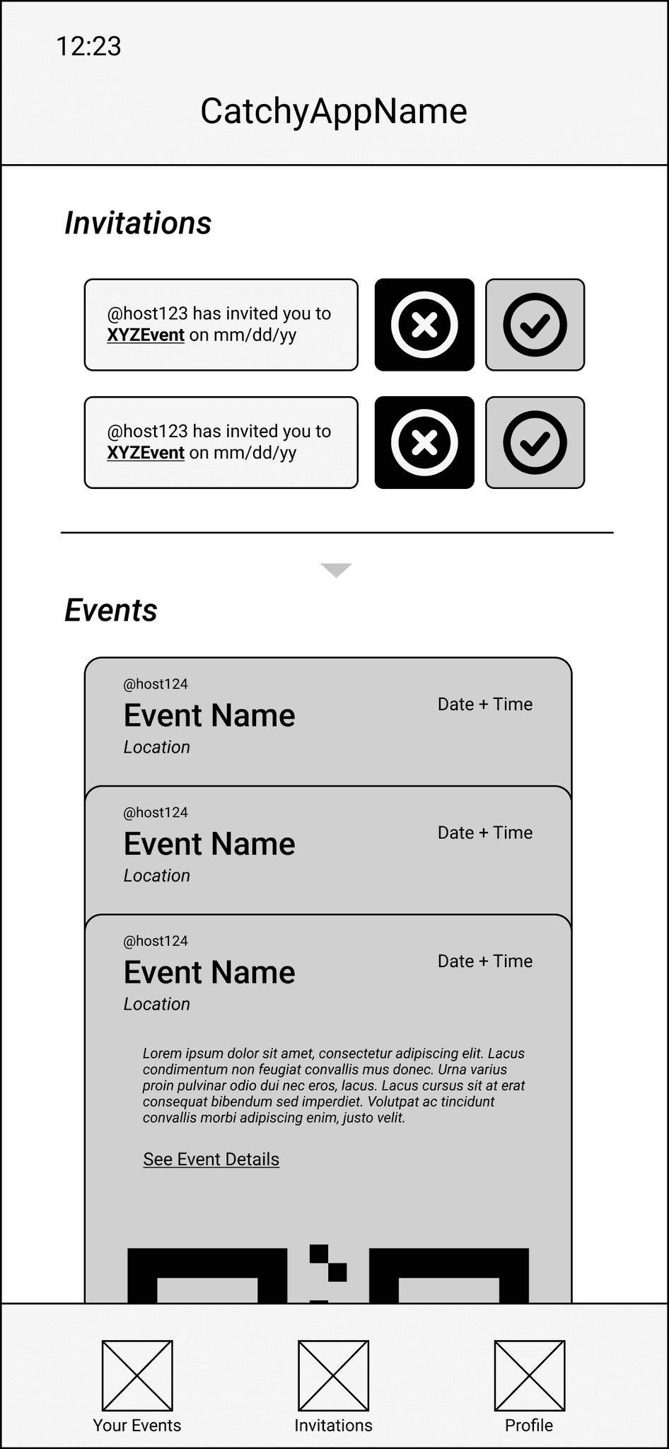
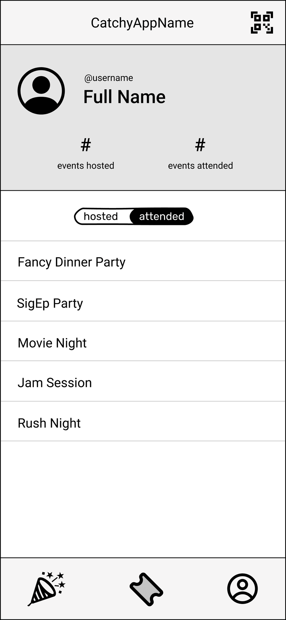
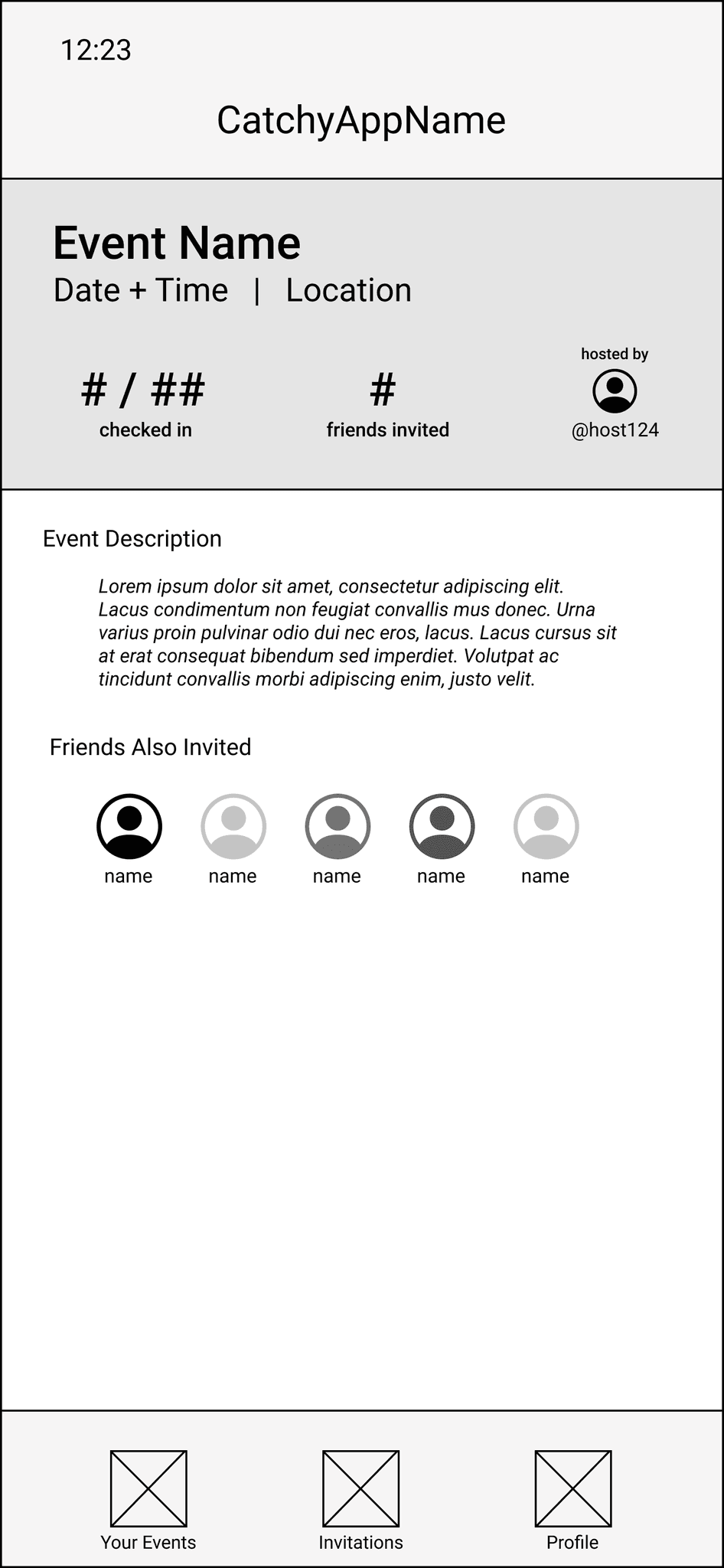
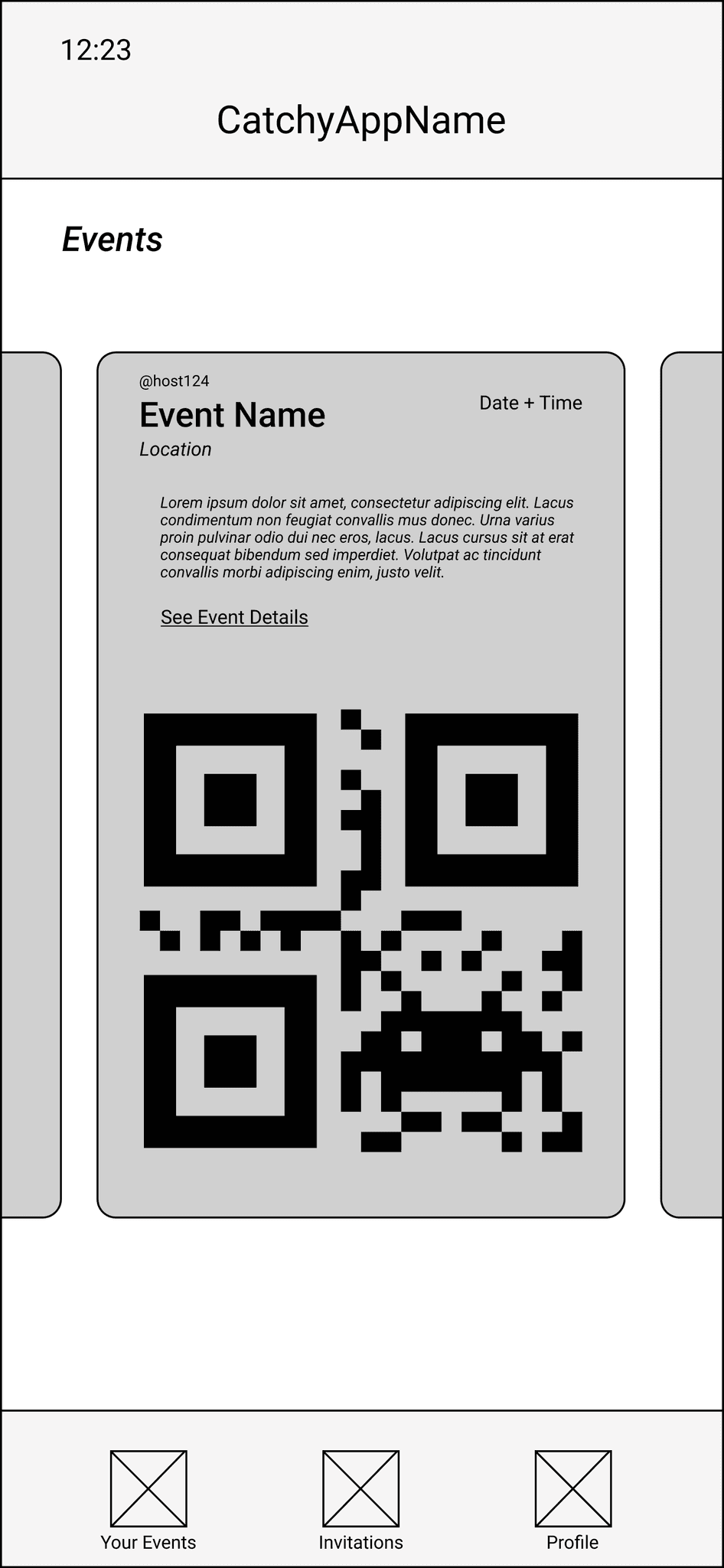
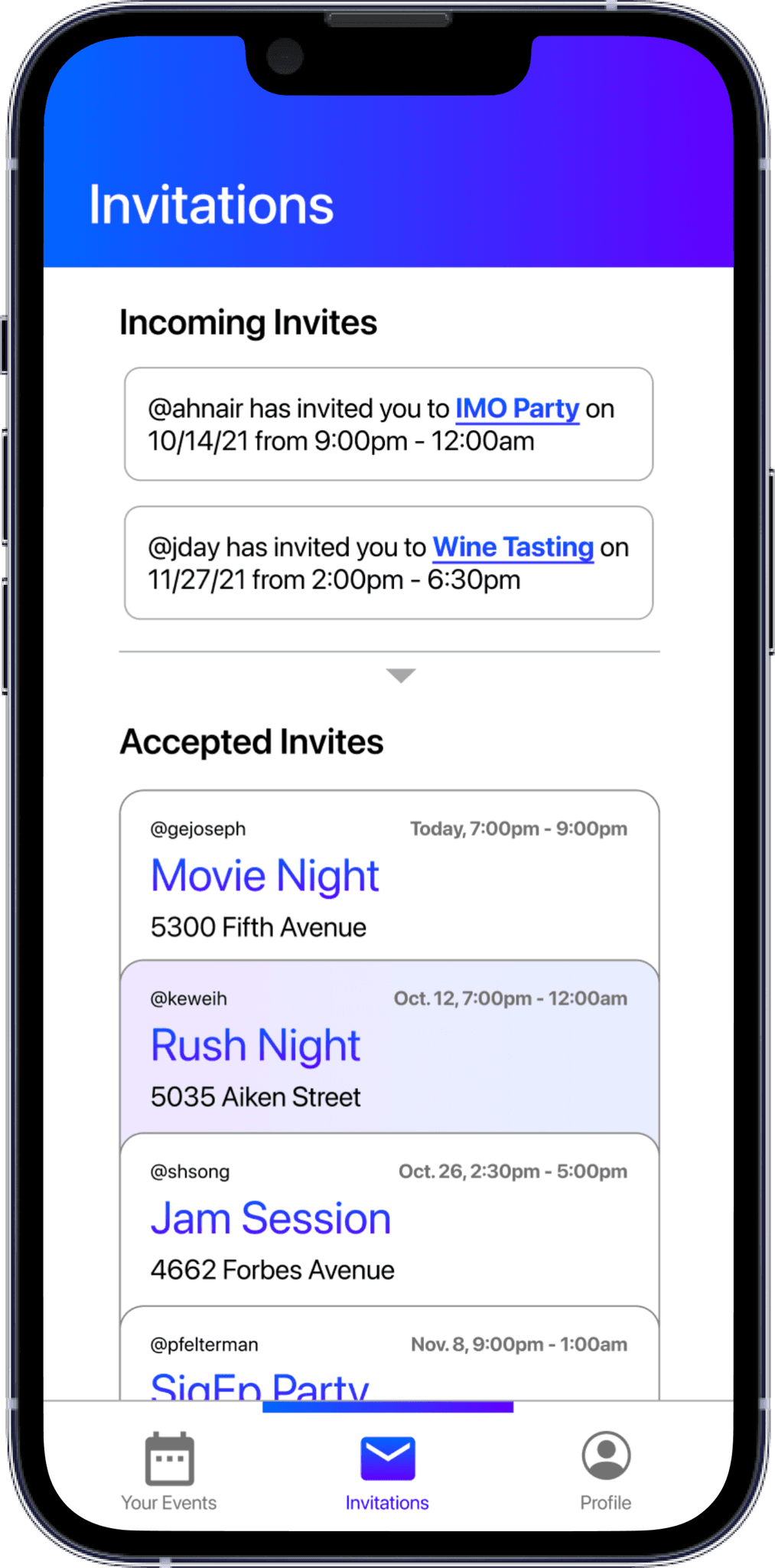
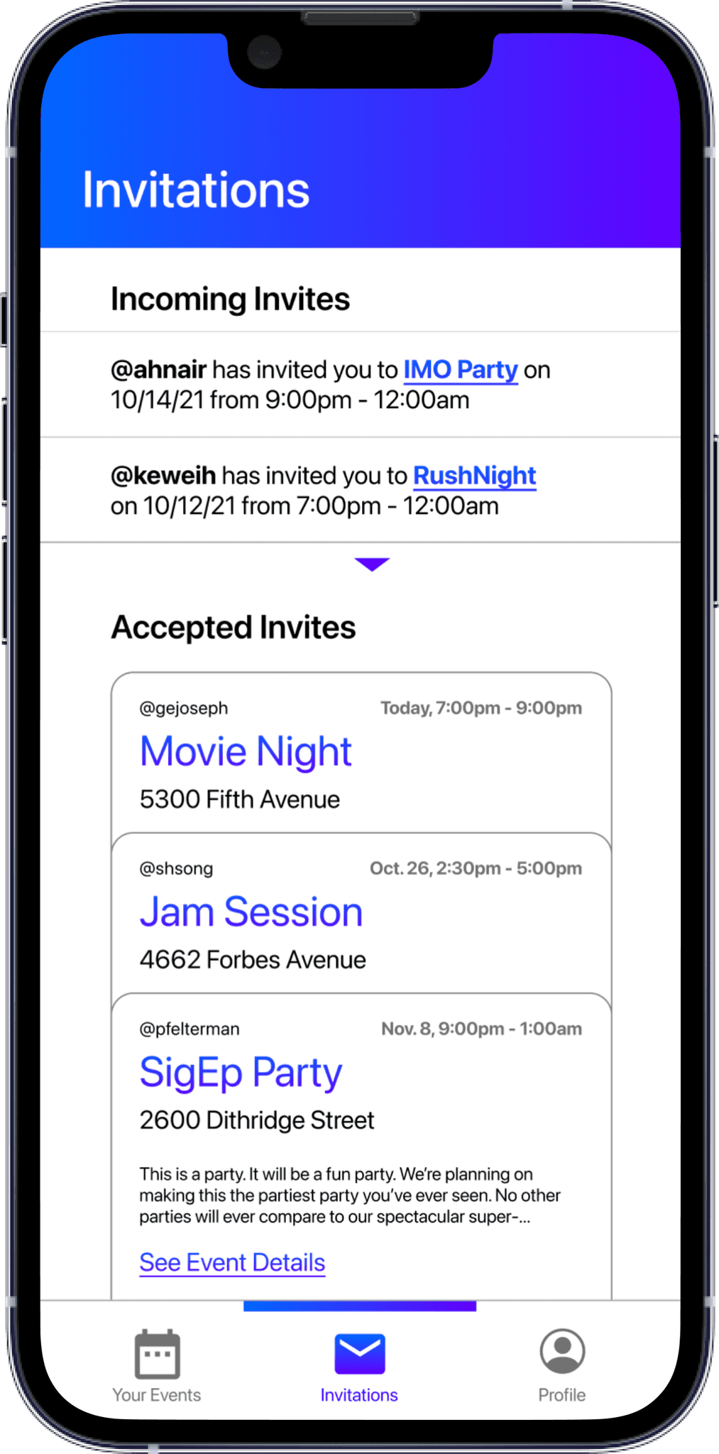
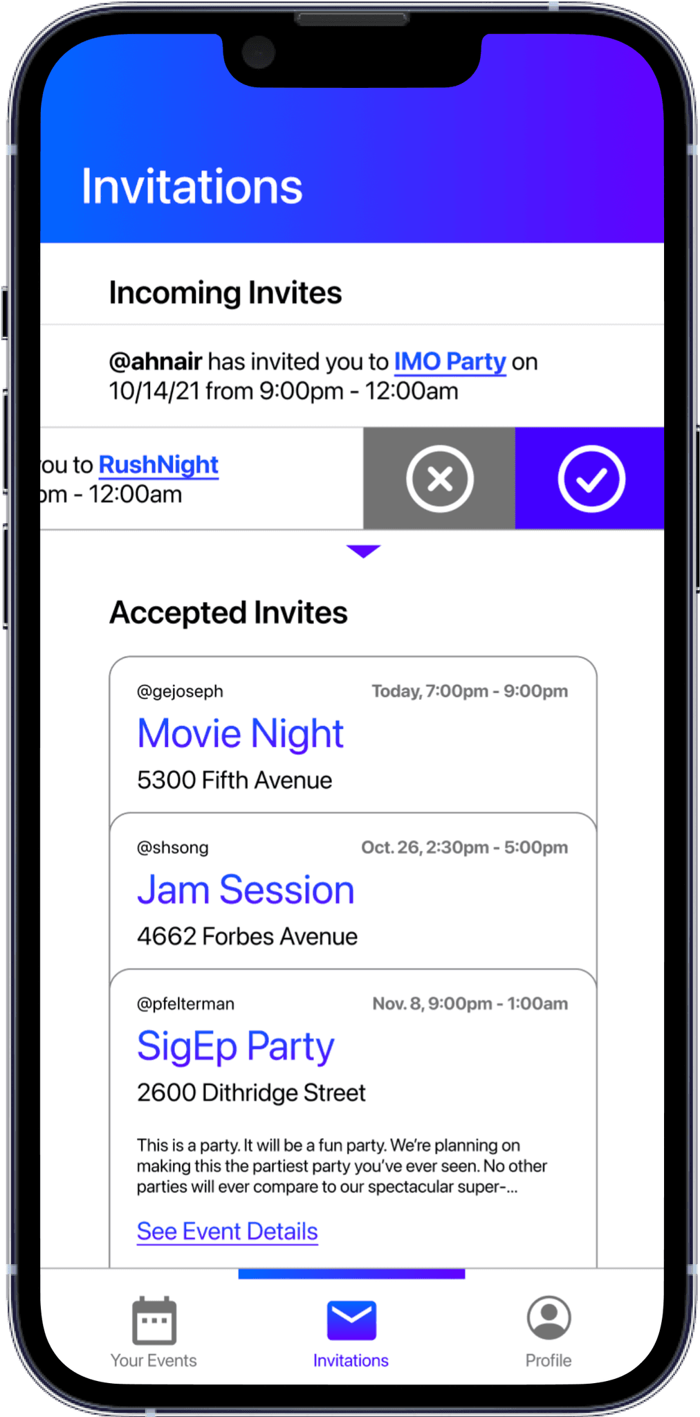
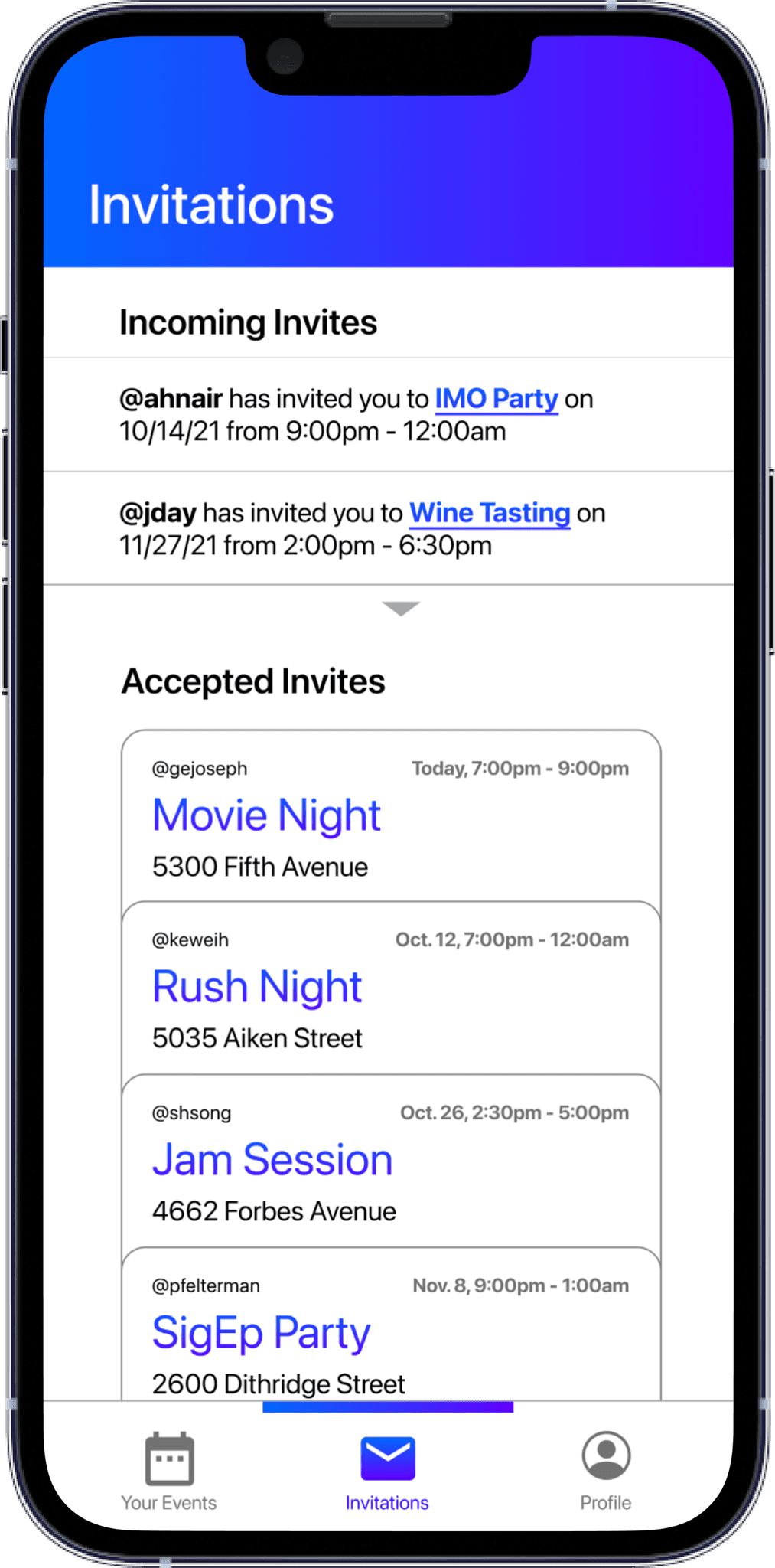
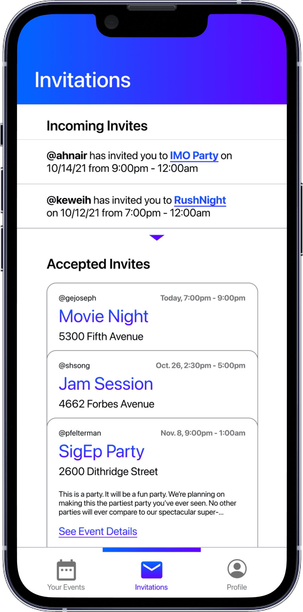
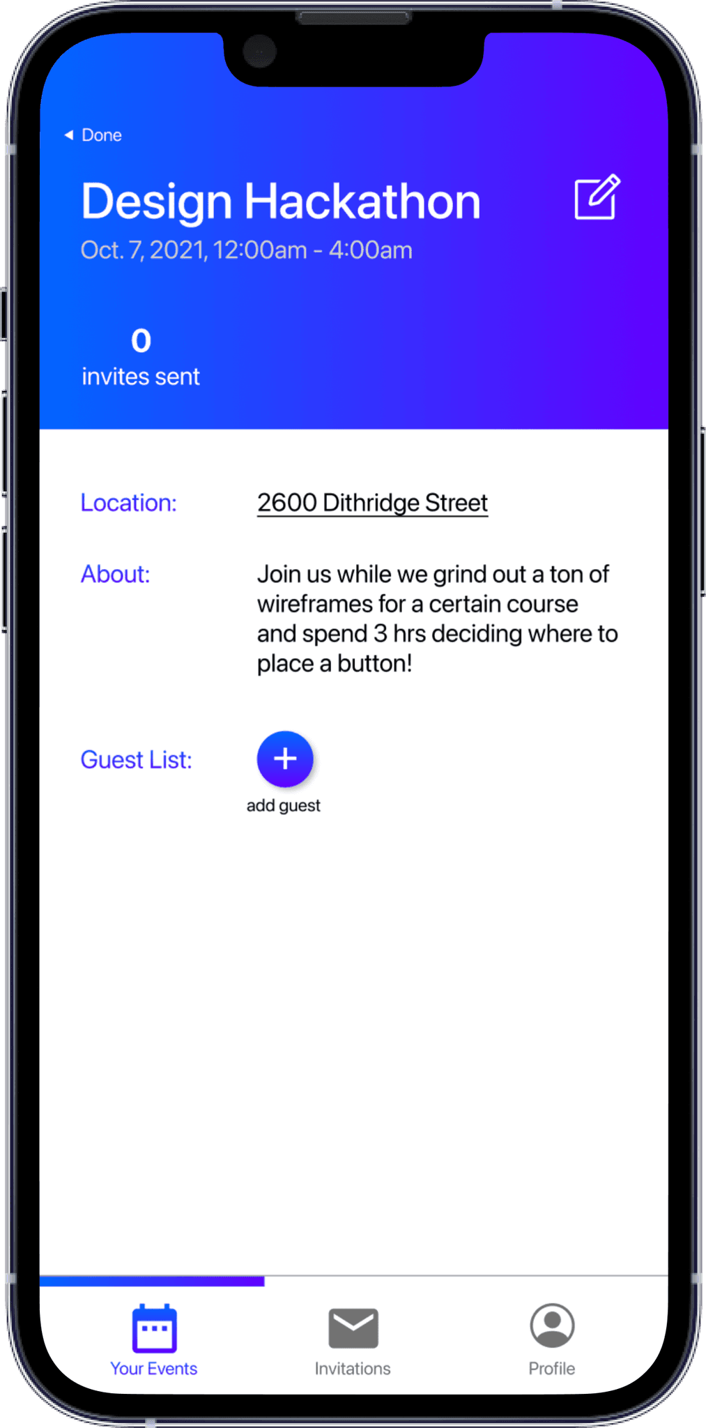
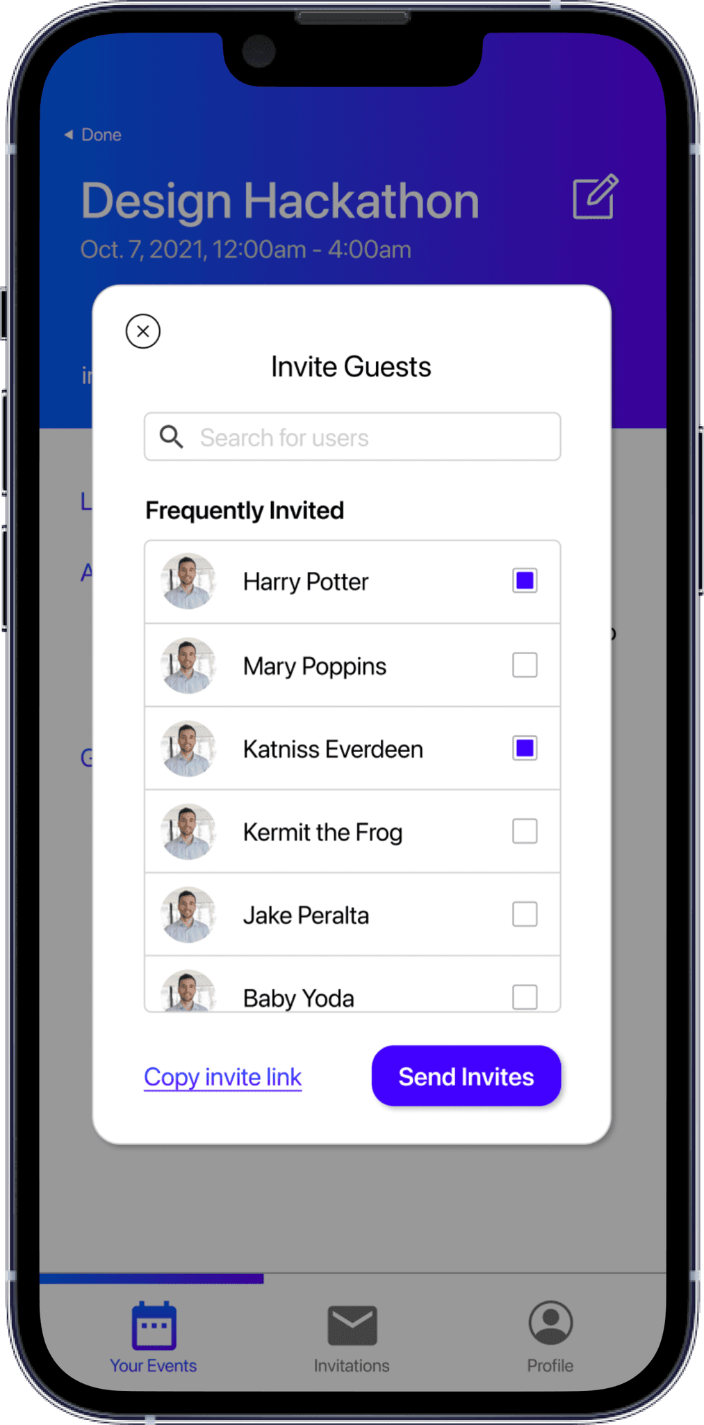
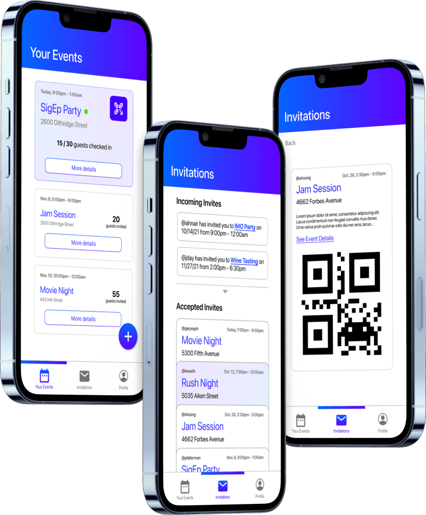
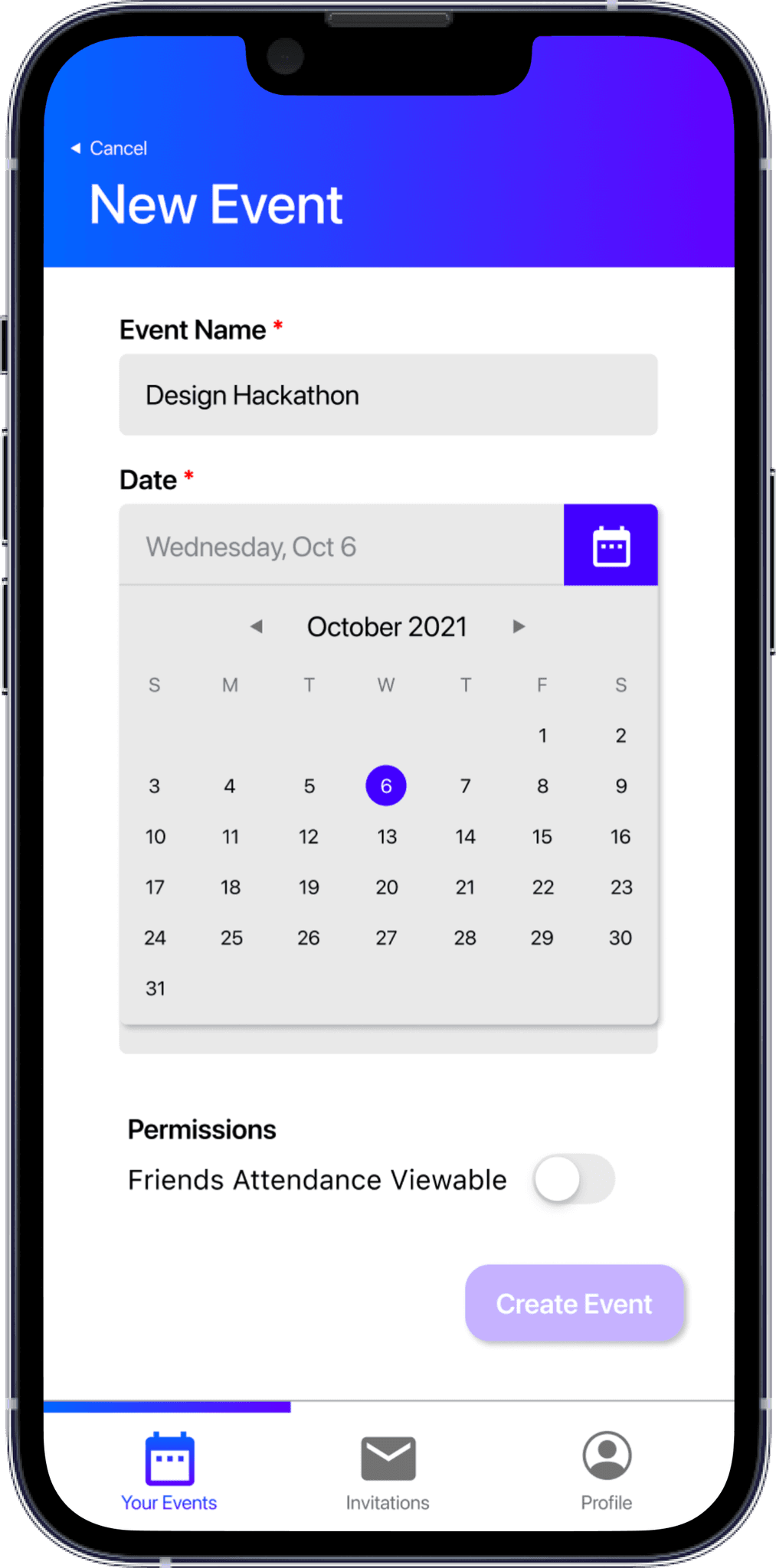
Using the Balsamiq Kit on Figma, we crafted a first set of wireframes focusing on the main flows of our app. We settled on an architecture of three tabs — Events you are Hosting, Events you are Attending, and Profile. We wanted to separate the host-side functionality from the guest-side functionality while still keeping both on the same account in the same app. Below you can see our initial Host wireframes which showcase the flow of viewing all the events you are hosting (now and in the future) and the process of creating an event and adding guests. The Guest wireframes showcase the incoming and accepted invites for a user, with the accepted invites stacked by default and then laid out upon tap for ease of scanning. Each card also has a "See Details" link that takes you to the event details page which contains live statistics.
Host Tabview


Host Tabview


Host Tabview
Guest Tabview + Profile


Guest Tabview + Profile


Guest Tabview + Profile
USER TESTING
USER TESTING
USER TESTING
We conducted several semi-structured interviews to gauge the usability of our designs. Having prototyped the low-fidelity wireframes above, we had each user go through the flow of creating an event and adding guests as well accepting/declining incoming invites and viewing events they are invited to. Below are our primary findings, which directly led to actionable changes in the design.
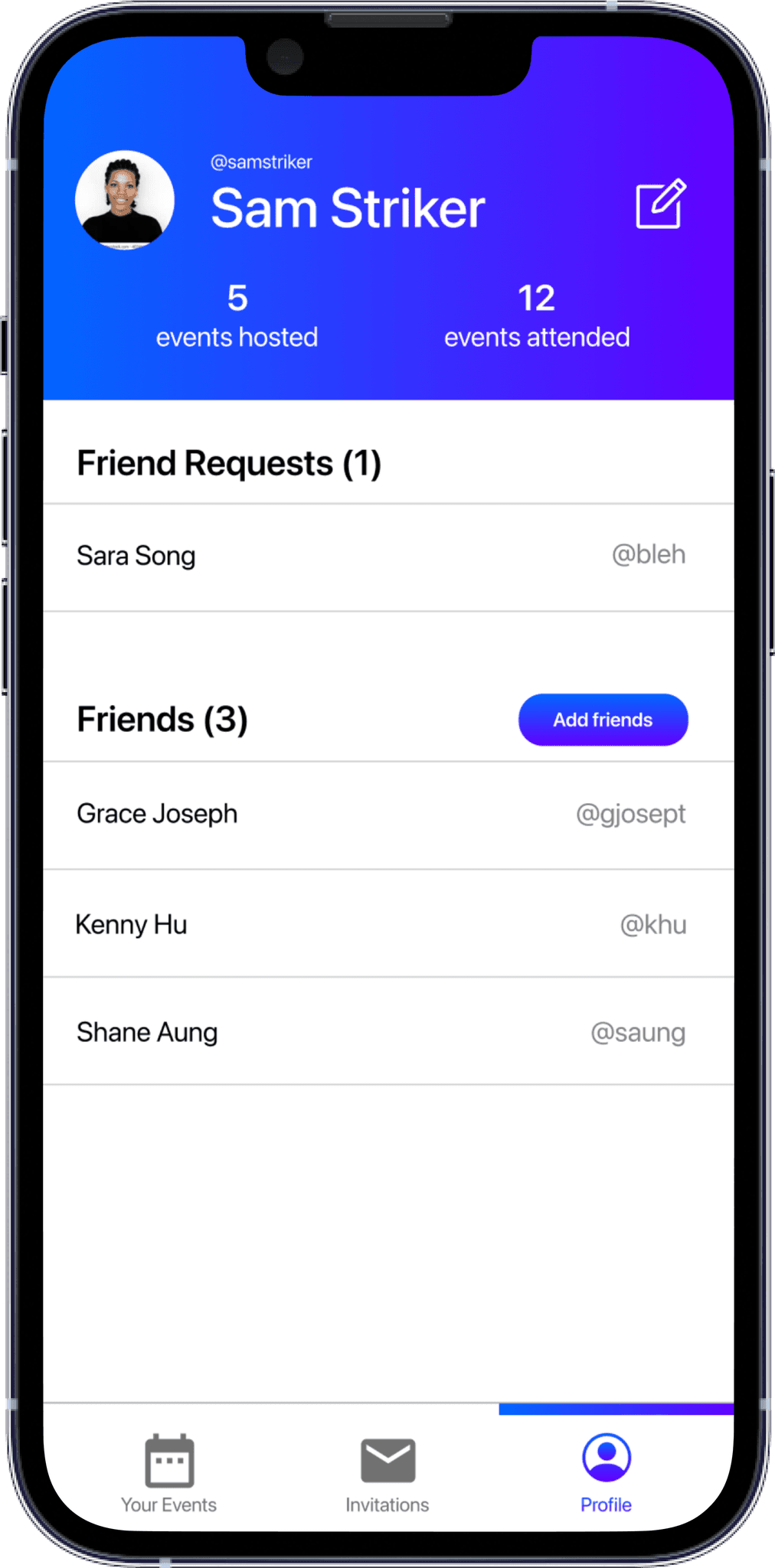
"Wait, where do I find my friends?"
We had forgotten to include a place for users to add friends as well as view friend requests. Users had mentioned that including a history of hosted and attended events seemed redundant and unnecessary, so we opted to use that screen real estate for our oversight.




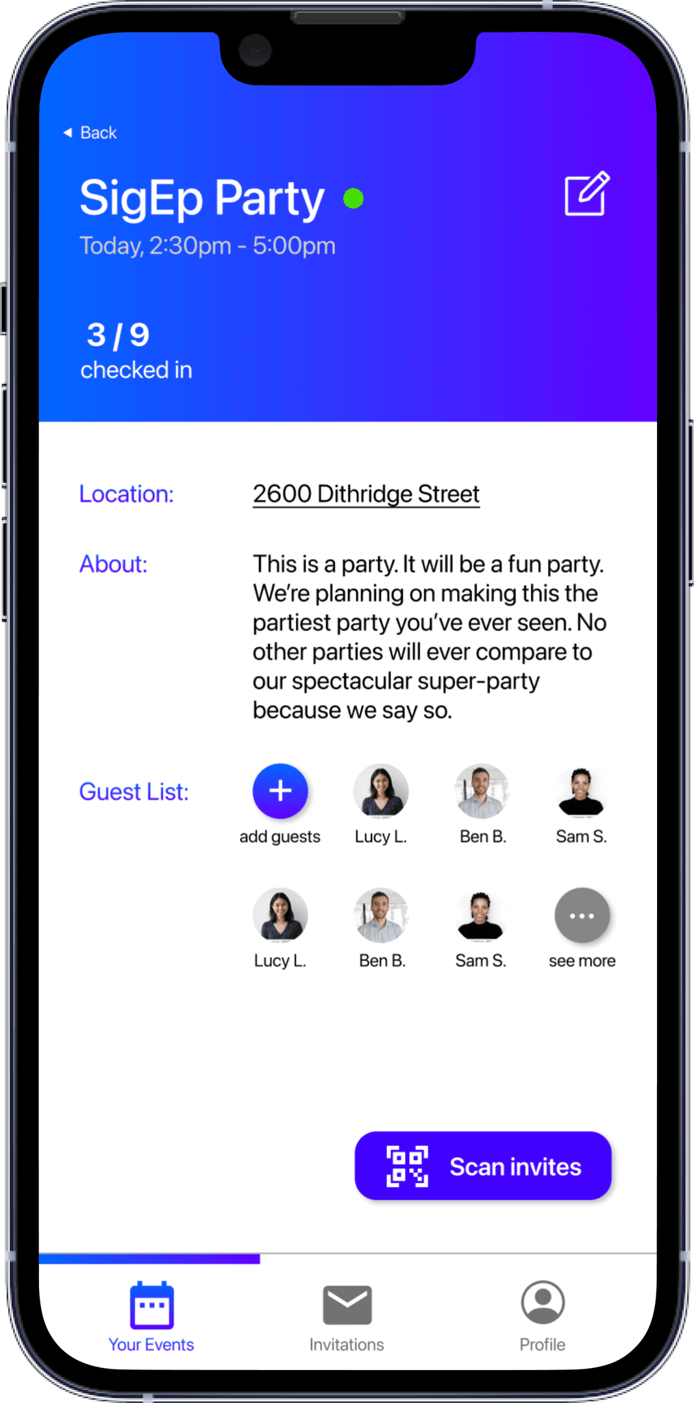
"The guestlist could get long."
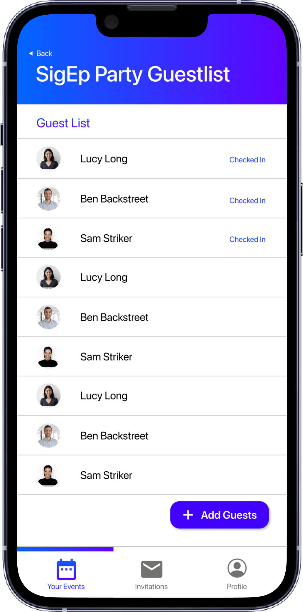
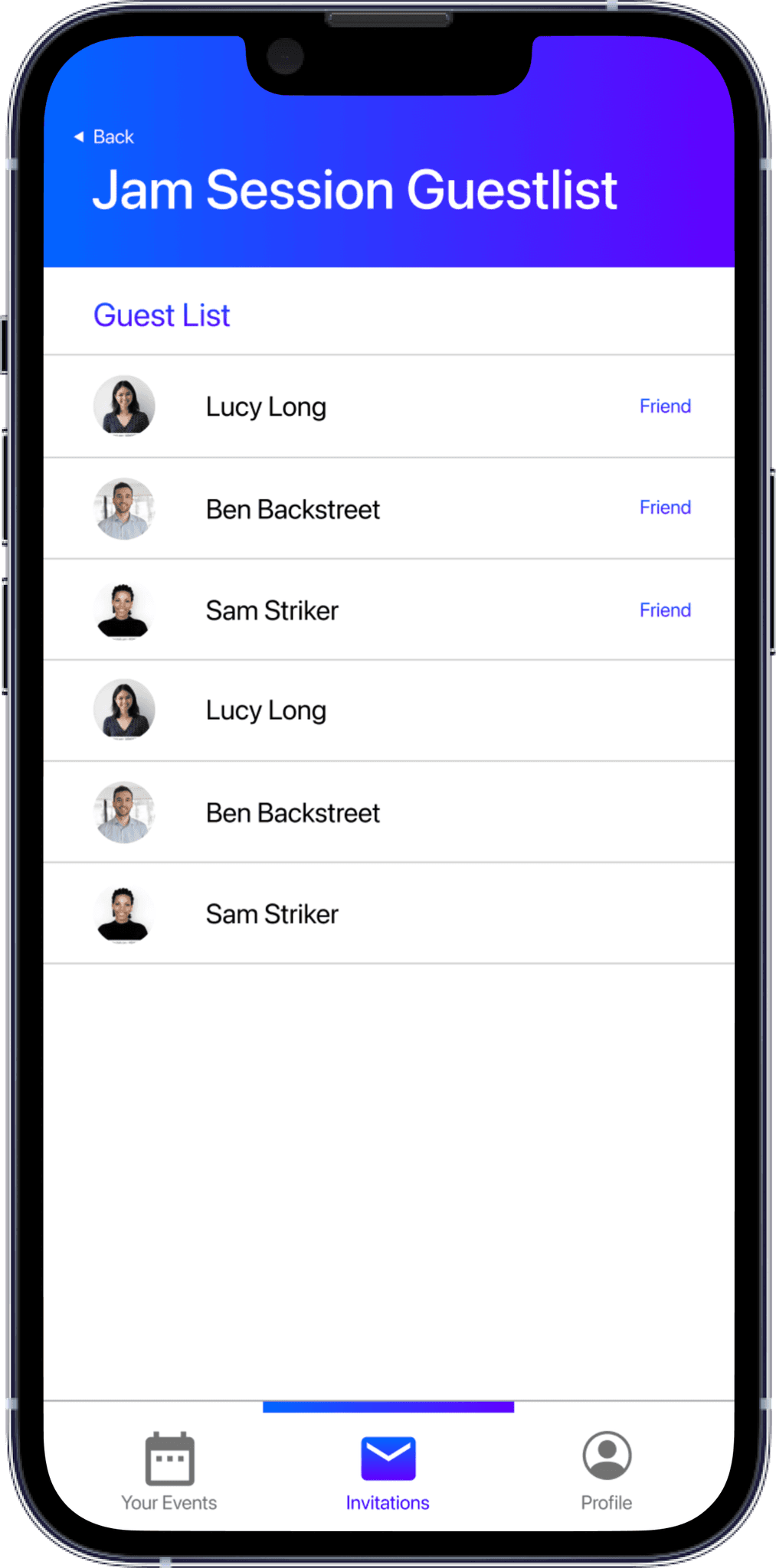
With the design we originally had for the guestlist section on the event details page, we had no plan for overflow. With the updated design, we could include another page dedicated to the guestlist, even showing whether guests have checked in.




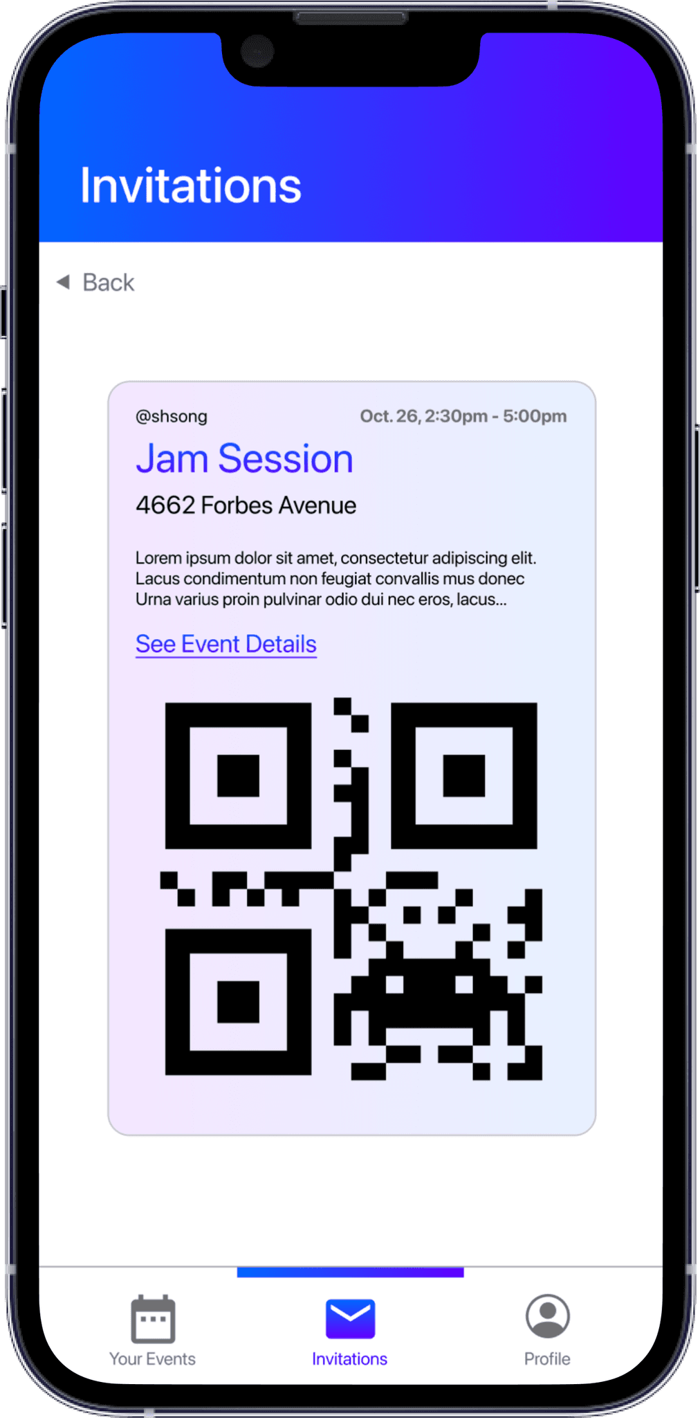
"Oooh, it would be cool to have it change color once you're checked in!"
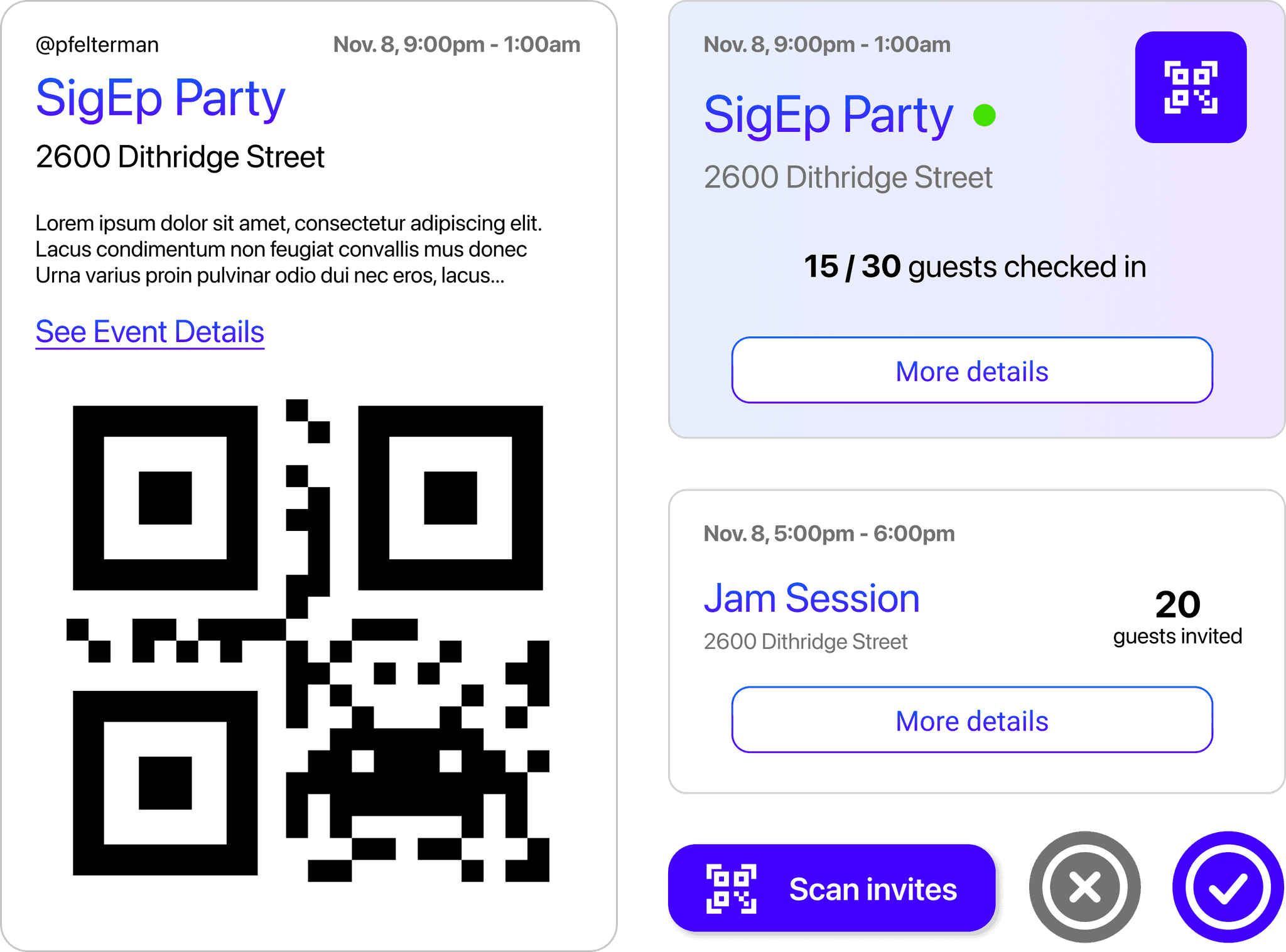
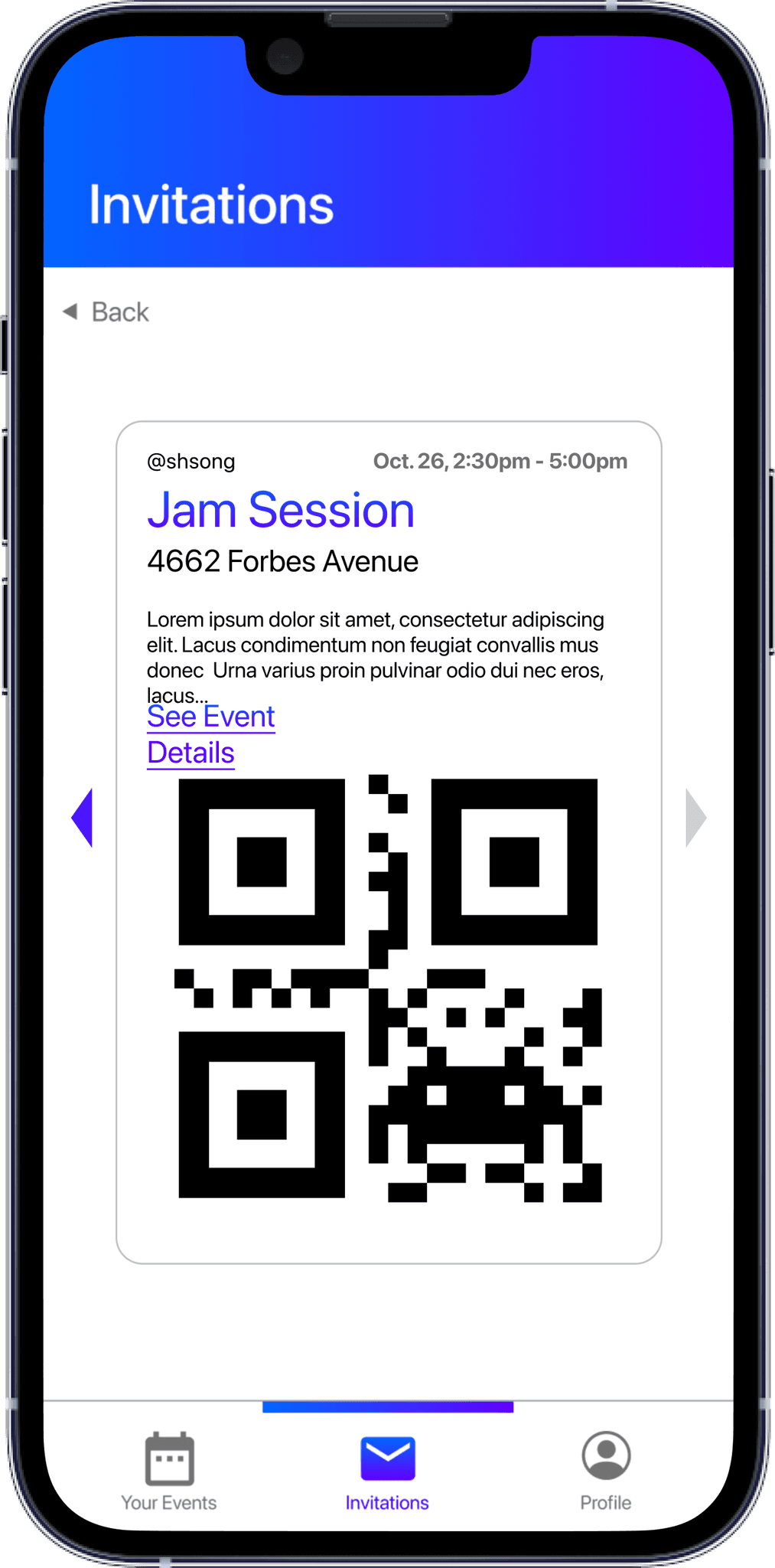
One of our users came up with a great idea of changing the color of the card once its been scanned, providing confirmation to the guest that they've been checked in.




BACKGROUND
BACKGROUND
BACKGROUND
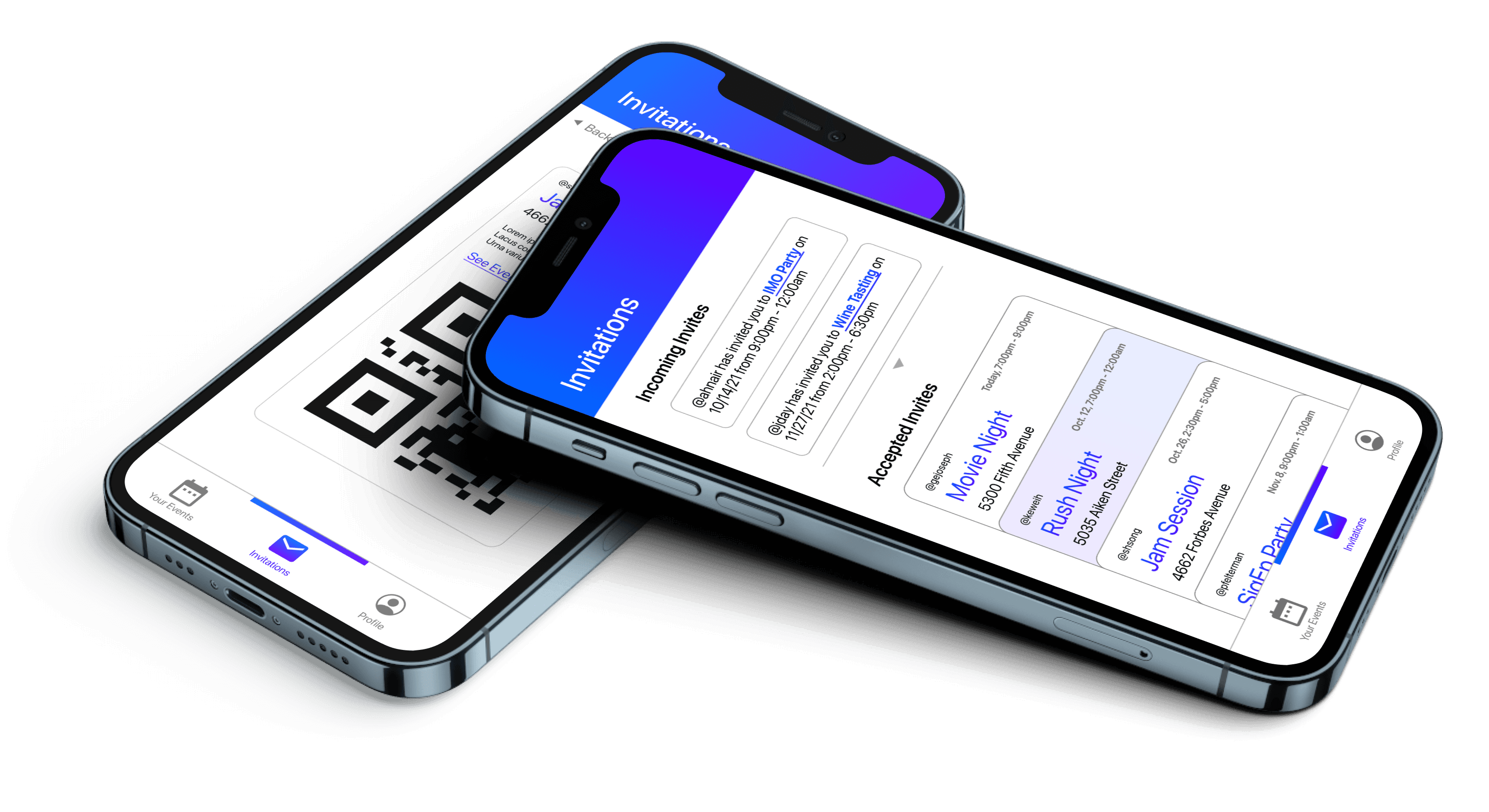
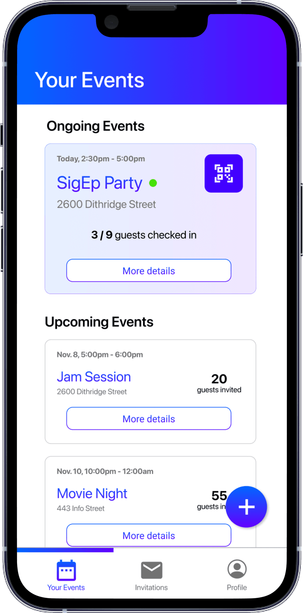
Bouncr is an event access management tool that allows users to either create an event with a specified guest list or easily gain access to events where they are invited. Hosts can generate exclusivity with their events by sending tickets to their guestlist and those guests can easily get into the event by using the QR code that comes with their ticket. As guests arrive, the app provides statistics to guests about how many people are invited, which of their friends have already checked in to the event, and how many people are at the event of those invited.
This iOS app was made over the course of a semester using Xcode and Firebase. Since Fall 2021, we have been rebasing the backend of our app from Firebase to Ruby on Rails in preparation for deployment to the App store.


Roles
UX Designer
Frontend Developer
Collaborators
Sara Song
Kenny Hu
Shane Aung
Methods
Agile
Semi-structured Interviews
Wireframing
Prototyping
Full-Stack Development
Tools
Figma
Xcode + SwiftUI
Github
iMovie
Roles
UX Designer
Frontend Developer
Collaborators
Sara Song
Kenny Hu
Shane Aung
Methods
Agile
Semi-structured Interviews
Wireframing
Prototyping
Full-Stack Development
Tools
Figma
Xcode + SwiftUI
Github
iMovie
Roles
UX Designer
Frontend Developer
Collaborators
Sara Song
Kenny Hu
Shane Aung
Methods
Agile
Semi-structured Interviews
Wireframing
Prototyping
Full-Stack Development
Tools
Figma
Xcode + SwiftUI
Github
iMovie
BACKGROUND
Bouncr is an event access management tool that allows users to either create an event with a specified guest list or easily gain access to events where they are invited. Hosts can generate exclusivity with their events by sending tickets to their guestlist and those guests can easily get into the event by using the QR code that comes with their ticket. As guests arrive, the app provides statistics to guests about how many people are invited, which of their friends have already checked in to the event, and how many people are at the event of those invited.
This iOS app was made over the course of a semester using Xcode and Firebase. Since Fall 2021, we have been rebasing the backend of our app from Firebase to Ruby on Rails in preparation for deployment to the App store.


Roles
UX Designer
Frontend Developer
Methods
Agile
Semi-structured Interviews
Wireframing
Prototyping
Full-Stack Development
Tools
Figma
Xcode + SwiftUI
Github
iMovie
Collaborators
Sara Song
Kenny Hu
Shane Aung
IDEATION + DISCOVERY
For college students especially, hosting an event can be tumultuous and unpredictable in terms of making sure only those specifically invited are let in. Events can get out of control and are difficult to manage when more people show up than anticipated, which is especially concerning in the aftermath of the pandemic. The person responsible for making sure only those invited can enter the event often doesn’t know everyone invited personally and likely feels awkward turning people away.
We surveyed CMU students on their experience with private events only to learn that most guestlists are managed via spreadsheets and invites sent out via groupchats, facebook, or google calendar — all tools that become more and more manual, the more guests you have to manage and also don't have any automation with checking in. From the guest perspective, we also observed a gap. Users often want live information about the capacity of an event or who you know that's checked in at an event that you've been invited to, but no app exists to provide that information for private events.
The Problem
Managing event attendence can be a pain. Especially for busy college students, it can be hard to keep track of all the invitations you sent and check everyone in at the event efficiently.


Our Solution
An app that streamlines the event management process by providing a platform to create events, keep track of invitations, and check-in guests at the door.
EARLY DESIGNS
Considering Mental Models
With mobile applications especially, an intuitive user experience often means building off of existing mental models that have become seamless to users. With Bouncr, we wanted to leverage as many interaction models as possible, especially since SwiftUI (the UI kit provided by XCode) had many of the familiar iOS components built in. Three primary models we relied on included the builtin QR code scanning capability of the camera, the stack based interaction on Apple Wallet, and the swipe actions ubiquitious in iOS native applications.


Low Fidelity Wireframes
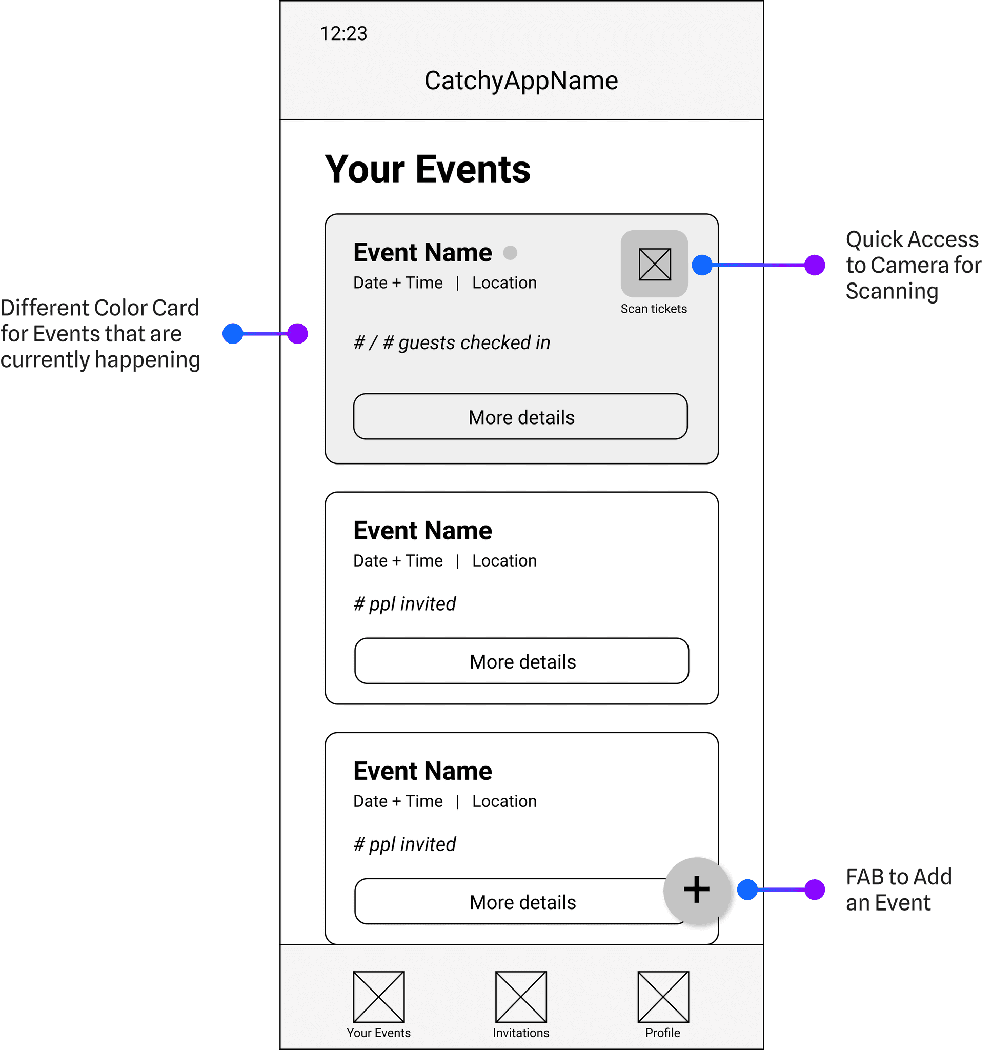
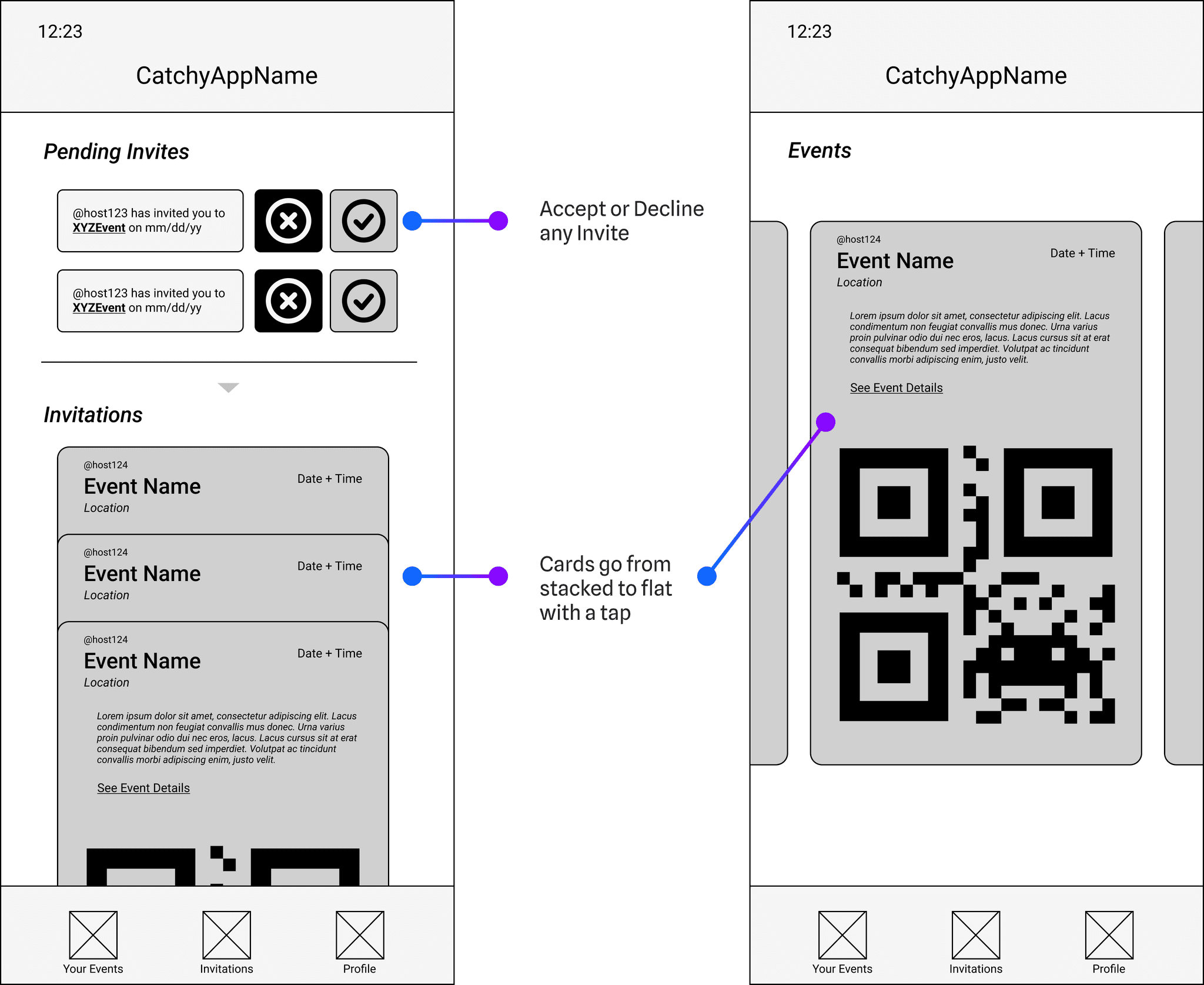
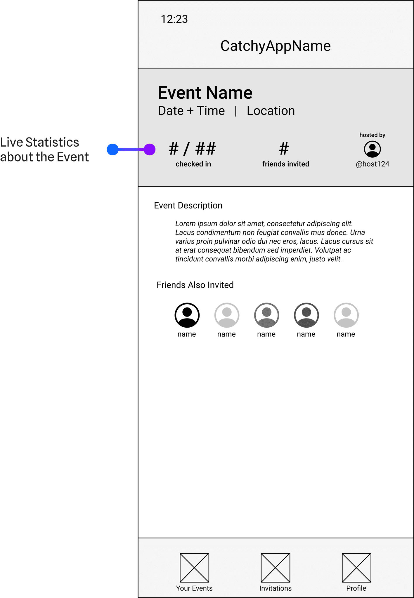
Using the Balsamiq Kit on Figma, we crafted a first set of wireframes focusing on the main flows of our app. We settled on an architecture of three tabs — Events you are Hosting, Events you are Attending, and Profile. We wanted to separate the host-side functionality from the guest-side functionality while still keeping both on the same account in the same app. Below you can see our initial Host wireframes which showcase the flow of viewing all the events you are hosting (now and in the future) and the process of creating an event and adding guests. The Guest wireframes showcase the incoming and accepted invites for a user, with the accepted invites stacked by default and then laid out upon tap for ease of scanning. Each card also has a "See Details" link that takes you to the event details page which contains live statistics.
Host Tabview


Guest Tabview + Profile



USER TESTING
We conducted several semi-structured interviews to gauge the usability of our designs. Having prototyped the low-fidelity wireframes above, we had each user go through the flow of creating an event and adding guests as well accepting/declining incoming invites and viewing events they are invited to. Below are our primary findings, which directly led to actionable changes in the design.
"Wait, where do I find my friends?"
We had forgotten to include a place for users to add friends as well as view friend requests. Users had mentioned that including a history of hosted and attended events seemed redundant and unnecessary, so we opted to use that screen real estate for our oversight.


"The guestlist could get long."
With the design we originally had for the guestlist section on the event details page, we had no plan for overflow. With the updated design, we could include another page dedicated to the guestlist, even showing whether guests have checked in.
"Oooh, it would be cool to have it change color once you're checked in!"
One of our users came up with a great idea of changing the color of the card once its been scanned, providing confirmation to the guest that they've been checked in.


DESIGN SYSTEM
DESIGN SYSTEM
DESIGN SYSTEM
Palette
We wanted to strike a balance between dramatic and professional with our color scheme. We found that splashes of cobalt, indigo, and violet were conducive to the sentiments we wanted to evoke with our interface.
Primary
Secondary
Gradient
Typography
We decided to stick with Apple's default typeface SF Pro Display because it felt clean and professional, balancing out the bright colors and gradients.
SF Pro Display 34
Title
SF Pro Display 28
Heading 1
SF Pro Display 22
Heading 2
SF Pro Display 20
Heading 3
SF Pro Display 16
Body
SF Pro Display 12
Caption
Aesthetic
Wanting to maintain consistency with iOS standards, we kept our design flat with limited dropshadows used for Floating Action Buttons (FAB) and Modals.
Aesthetic
Wanting to maintain consistency with iOS standards, we kept our design flat with limited dropshadows used for Floating Action Buttons (FAB) and Modals.
Aesthetic
Wanting to maintain consistency with iOS standards, we kept our design flat with limited dropshadows used for Floating Action Buttons (FAB) and Modals.


FINAL DESIGNS
FINAL DESIGNS
FINAL DESIGNS
Monitoring your Event as a Host

Monitoring your Event as a Host


Monitoring your Event as a Host


Accepting an Invite to an Event as a Guest
Accepting an Invite to an Event as a Guest


Accepting an Invite to an Event as a Guest


Checking in to an Event as Guest + Viewing the Guestlist
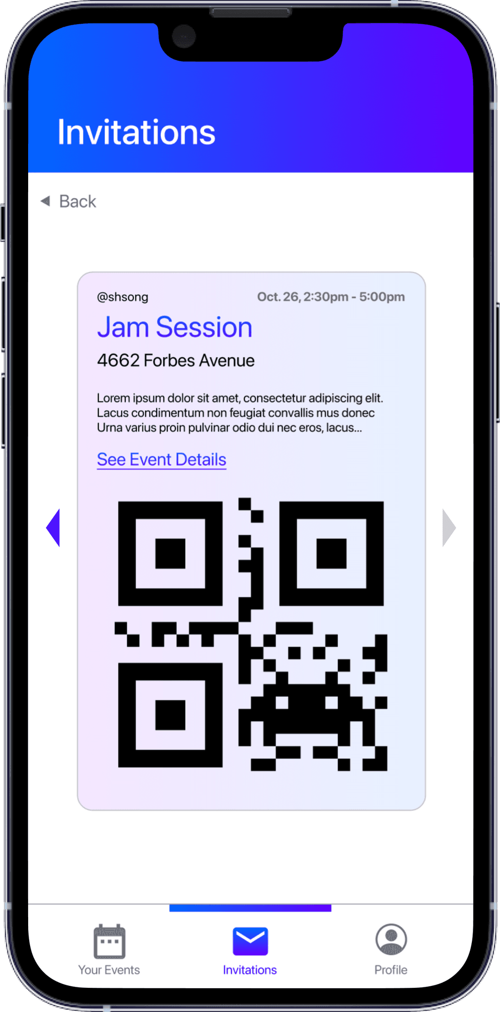
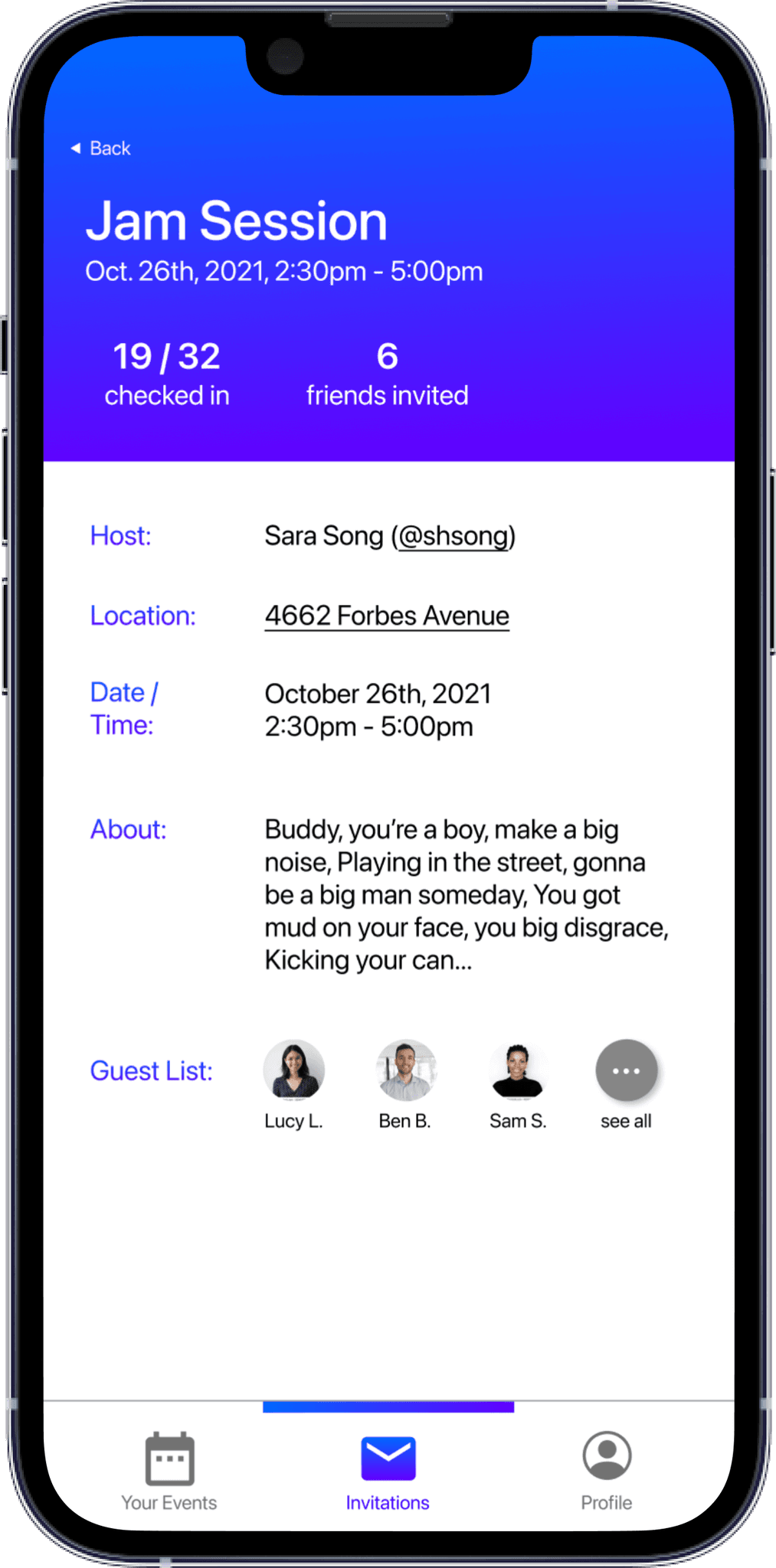
Checking in to an Event as Guest + Viewing the Guestlist


Checking in to an Event as Guest + Viewing the Guestlist


Creating A New Event as a Host + Adding Guests
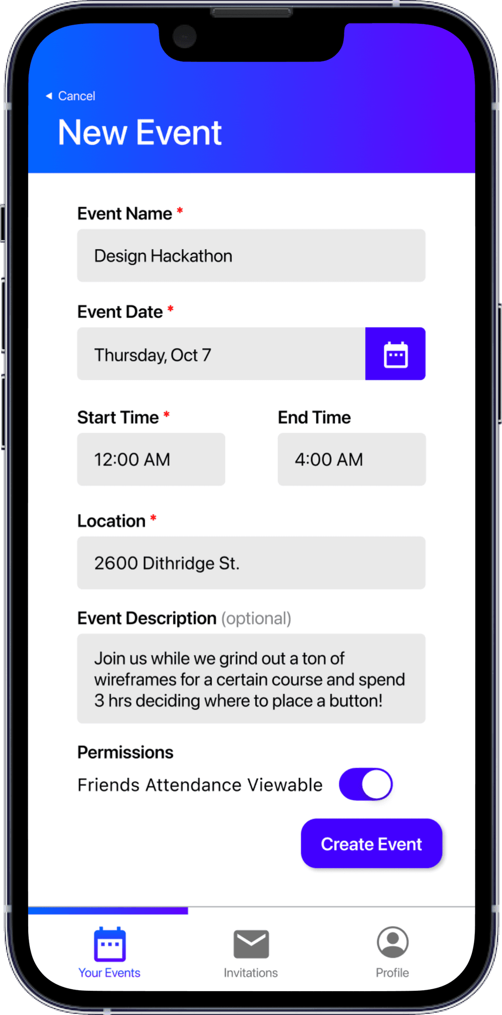
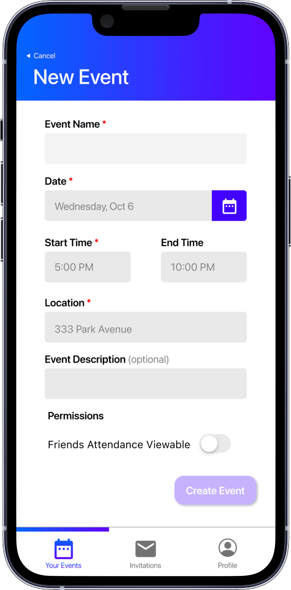
Creating A New Event as a Host + Adding Guests


Creating A New Event as a Host + Adding Guests


High-Fidelity Wireframes
High-Fidelity Wireframes
High-Fidelity Wireframes
Spread

Spread

Spread
FINAL DESIGNS
High-Fidelity Wireframes
Creating A New Event as a Host + Adding Guests




Monitoring your Event as a Host


Accepting an Invite to an Event as a Guest


Checking in to an Event as Guest + Viewing the Guestlist



Spread


DEVELOPMENT + DEPLOYMENT
My role in the development process included implementing all the guest-level functionality, meaning the incoming invites to accept or decline, the invitation cards that transition from stacked to unstacked, as well as the event details page. Additionally, I was responsible for the scanning functionality which involved dynamically generating QR codes for each invitation and ensuring that only hosts can scan each invitation.
After winning the mobile app competition associated with the course and sponsored by Capital One, we have been in the process of refactoring the codebase of our app, switching from a Firebase Realtime Database for our backend to a Rails server. Carnegie Mellon's Interfraternity Council has expressed interest in deploying the app for their private events.
Other Deliverables
For the course, we were also tasked with creating a promo video and poster for the app as well as an 8-10 minute pitch to be given to Capital One Investors on the final day of class.
REFLECTION
This project was one of the most memorable design and development experiences I've ever had. Prior to this app, I had never worked on any application or interface all the way from the ideation stage to the deployment stage — I had always been designer OR developer, never both in one sitting. Bouncr really cemented my ability to think as a developer as I designed, providing me the foresight that made implementation substantially simpler. It might be a hottake, but I think having frontend technical skills really gives you an edge as a designer, letting you think ahead and forcing you to be more practical and minimal in your design thinking. I've seen so many cases where implementation has been an afterthought in the design process, resulting in poor development and forcing designers to scale back after the fact.
That said, while I had developed interfaces before, I had never worked with SwiftUI (Xcode's builtin UI Kit) before. I had poked around in the Figma Community and found this SwiftUI Input Kit File that helped me understand what design patterns components were native to Swift that could be applicable to our design for ease of future implementation. This was critical in creating a design that was actually completely feasible implementation-wise and was a resource I ended up sharing with the rest of the class for their reference.
Looking back as a TA for this course now, Bouncr has had an amazing impact on this course and allowed me to share knowledge not only as a designer by trade, but as a developer by leisure.
Coming Next
Coming Next
Coming Next
Health
Health
Health
Project • Fall 2022
For the course Interaction Design Studio, my team was tasked with designing a responsive website that addresses a pain point in the current healthcare system. After extensive research, we chose to create a design that targets the lack of transparency between service providers and patients in terms of wait time and efficiency.
Responsive Web Design • User Experience • Interaction Design • Watch Interface Design