Project • Fall 2022
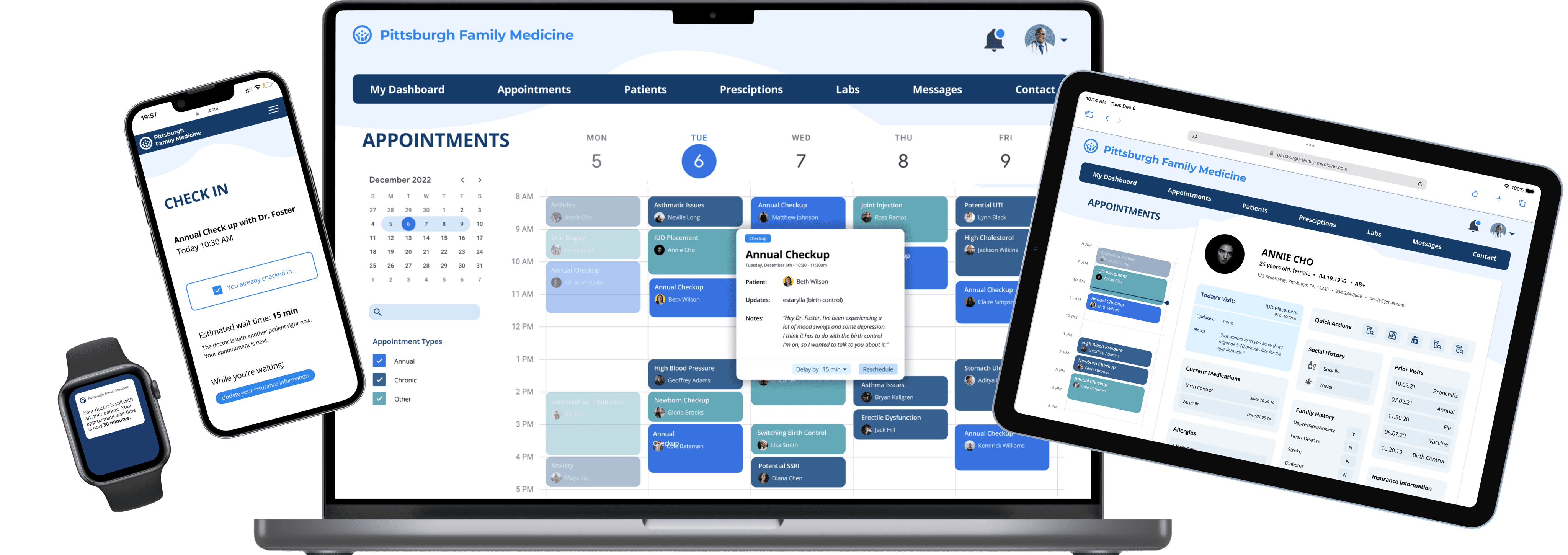
For the course Interaction Design Studio, my team was tasked with designing a responsive website that addresses a pain point in the current healthcare system. After extensive research, we chose to create a design that targets the lack of transparency between service providers and patients in terms of wait time and efficiency.
Responsive Web Design • Interaction Design • Watch Interface Design
BACKGROUND
The increase in the variety of devices used to access websites challenges companies to embrace the users’ ability to determine the device, display and context when interacting with a digital service and consuming content.
Assigned the domain of healthcare, we created a responsive web design for a family medicine practice seeking to make scheduling more efficient for patients, providers, and administrators. Over the course of the project, my team conducted research, modeled users, generated concepts, isolated high-value opportunities, and iteratively designed cross-device interactions.
Role
UX Designer
Project Manager
Methods
Personas
Storyboards
Speed Dating
Wireframing
Prototyping
Tools
Figma
Figjam
Collaborators
Callie Riek
Alexa Wang
Amsala Govindappa
Links
IDEATION + DISCOVERY
Research
The first step in this process was to look into what issues healthcare providers face by conducting both primary and secondary research.
Primary Research
Speaking with healthcare providers, including a medical student and speech language pathologist
Speaking with business owner (admin at a doctor’s office)
Speaking with people who have experience as patients in a doctors office or hospital
Secondary Research
Reading reviews of various doctors offices online
Researching healthcare trends and problems that are already being discussed in the news and industry-specific media
Insights
It became immediately clear to us that healthcare is a complex field with no shortage of problems. It seemed that every piece of research we did unearthed some new issues. However, we did hear a couple repeat issues.
Current interface used in healthcare (usually EPIC or something similar) is confusing, especially when trying to onboard new users. This is especially problematic in teaching hospitals, where new students come in and out.
Doctors need to be efficient with their time
Patients are tired of waiting a long time to see doctors. Appointments are often delayed and they do not know for how long.
When viewing patient information/ writing notes, doctors need to be able to pull up a variety of information such as health history, past notes, and imaging.
Electronic record access requires a lot of training in order to properly use, which is costly for hospitals
Personas
Based on our research we created personas for the customer (patient), service provider (doctor), and business owner (hospital admin). At this stage it became clear that addressing all the needs of these dramatically different stakeholders would be one of the main challenges of this project. Especially in healthcare where information about customers is uniquely private and protected, we knew the types of information displayed to each of these three stakeholders would be entirely different.

Beth Wilson
Beth is a masters student at CMU, who sees her primary care physician annually and makes all her appointments online via her laptop and sometimes her phone. She likes to be able to quickly access her medical information and make any updates as needed. (Full Persona)

Dr. Shawn Foster
Dr. Foster works in a hospital who sees a wide array of patients every day. He uses technology to keep track of patient records, exchange notes with other doctors, and be aware of past or future appointments for each patient. (Full Persona)

Janine Keller
Janine is a hospital administrator who makes sure everything runs smoothly. She plays a major role in the organizational side of healthcare, and doesn’t interact with patients. She also doesn’t regularly access patient records, but oversees the people who do. (Full Persona)
Scenarios
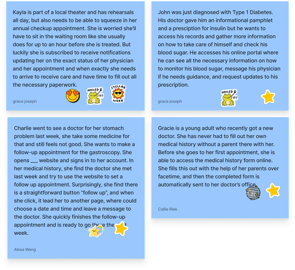
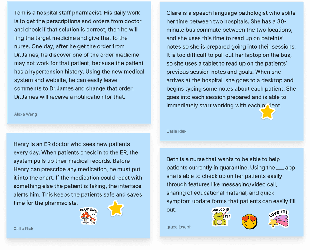
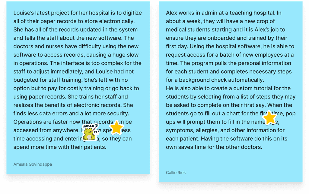
After we understood the user needs and pain points via analyzing the personas, we start to create some scenarios for each of the stakeholders. This is where we began to think of how responsive web could improve the experiences of users in each scenario, and we started to come up with some potential user flows. After we finished, we used cute stickers to vote on what we thought were the most valuable stories. We also considered the universality of service provider scenarios. Since there are multiple roles (doctors, nurses, pathologists, pharmacists), we chose some roles and stories which are more general.
Patients
Service Providers
Administrators
Storyboards
After we selected a few scenarios, we started to draw and design the storyboards. We first divided the scenarios into 4 chunks: “Context”, “Problem”, “Solution” and “Resolution”, and then based on those chunks, we drew images to show the details. We also start to cover some screen sketches in the storyboards. We have two patient storyboards, one doctor storyboard and one service provider storyboard, showing different views of the healthcare industry.
Speed Dating
After developing storyboards, we reached back to several of the people we interviewed to ask them for feedback on each scenario.
For our storyboard showcasing appointment delays (3), interviewees wondered how service providers could communicate to patients how delayed they may be or even quickly reschedule and on the patients side as well, how they may indicate to the service provider if they are running late.
For our storyboard focused on staff tutorials (2), interviewees mentioned that a system like that would need to accommodate many different user types with different permissions and would likely not be able to leverage responsive design as well, since they should be completed on a desktop ideally.
Interviewees generally liked the storyboard showcasing appointment delays (3) and the storyboard showcasing patient communication with service provider via mobile app (1) over the other two storyboards.
EARLY DESIGNS
Device Mapping
Before we started designing for each stakeholder, we needed to know which devices each one would be most likely to use. Ultimately our research led us to understand the following:
Patients
book appointments
make updates to health history
view test results
checkin for appointments
view notifications
view notifications
Service Providers
view schedule
view patient charts
order labs
take notes during exams
view patient charts
order labs
take notes during exams
Administrators
migrate records
view statistical data
Low-Fidelity Wireframes
Now that we had understood which devices each stakeholder were likely to use, we started low-fidelity wireframing. We decided to focus on the mobile device for the patient, the tablet for the service provider, and the desktop for the administrator, designing a web solution that would target many of the pain points we had found in our research.
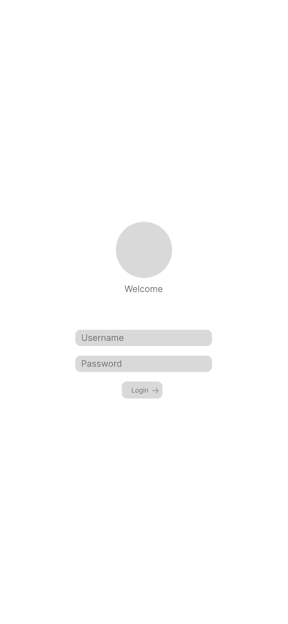
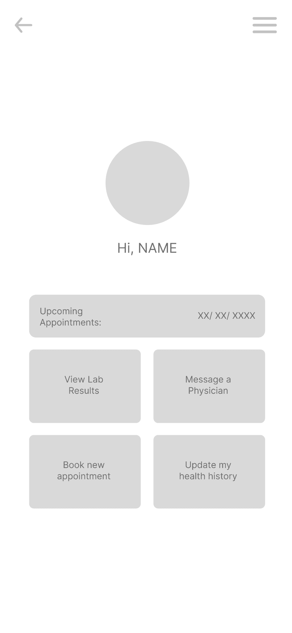
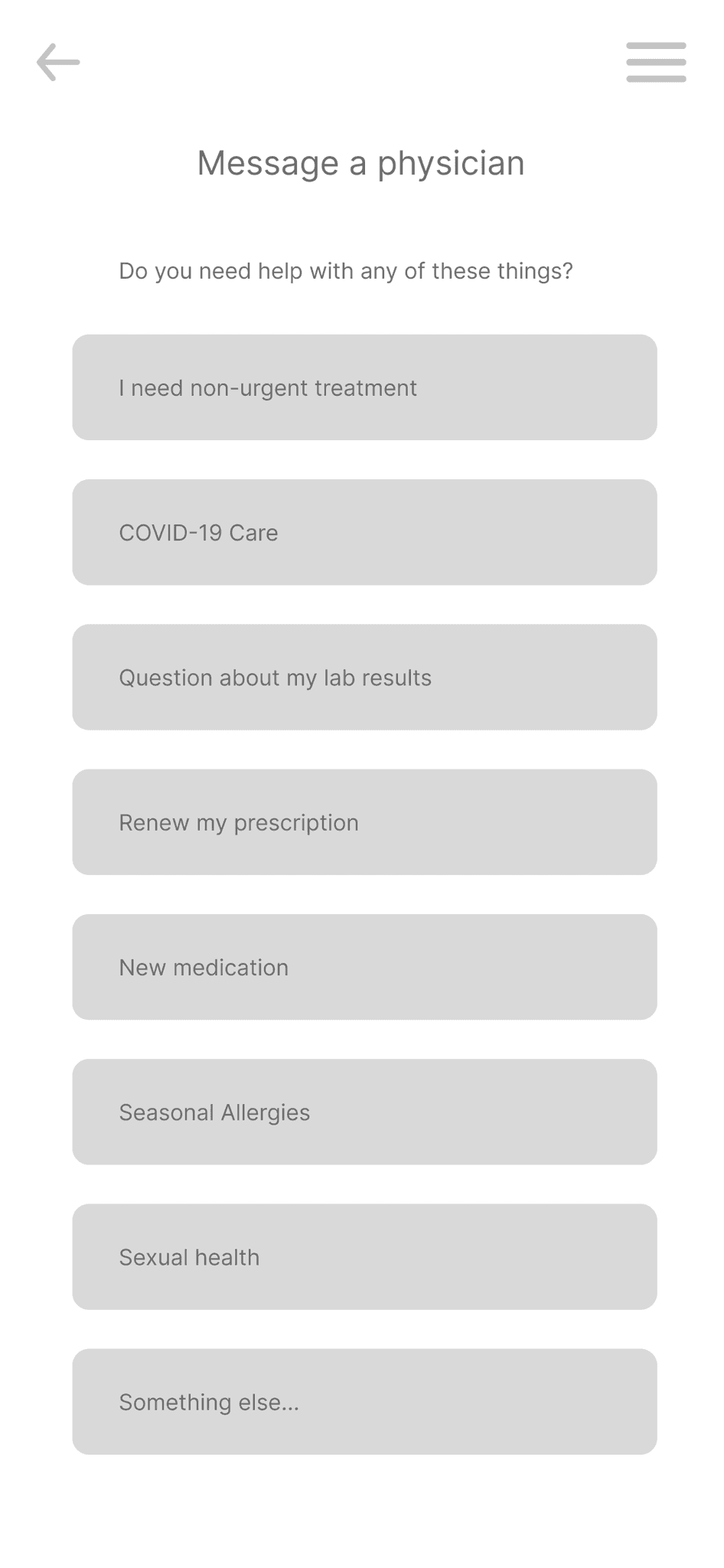
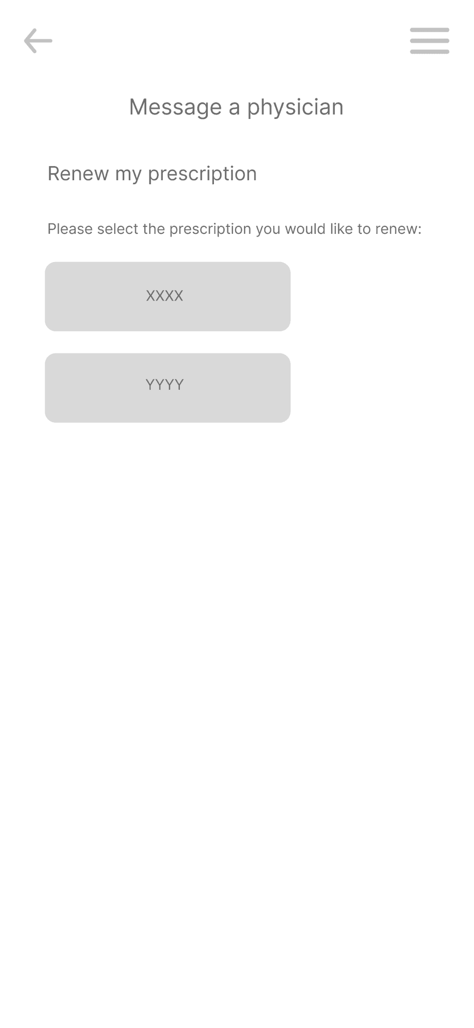
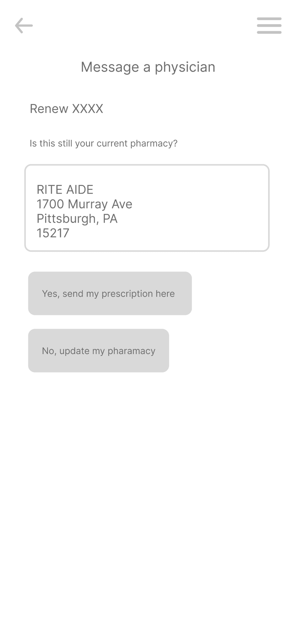
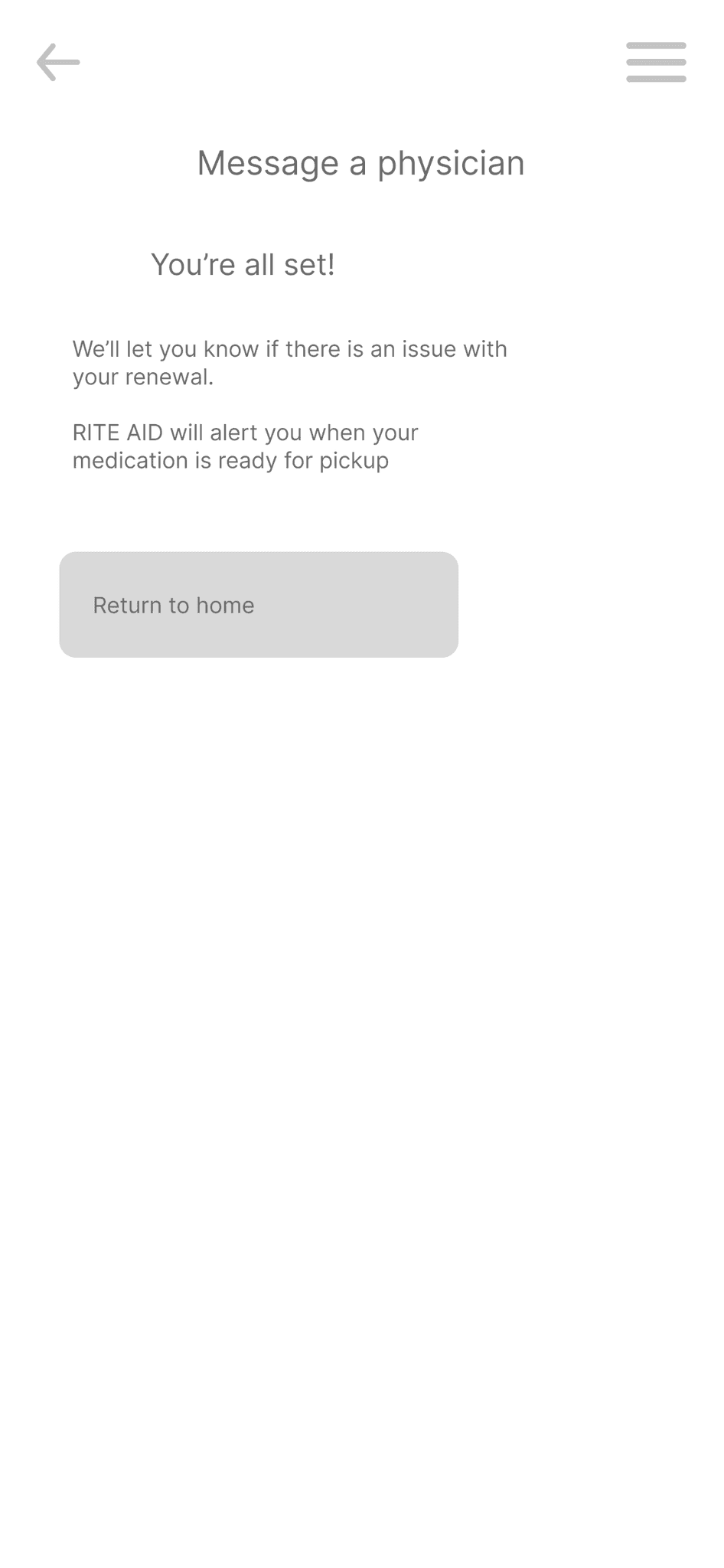
For our first iteration of a patient flow, we decided to focus on making a system that facilitated communication with a physician, as shown with a prescription renewal here.
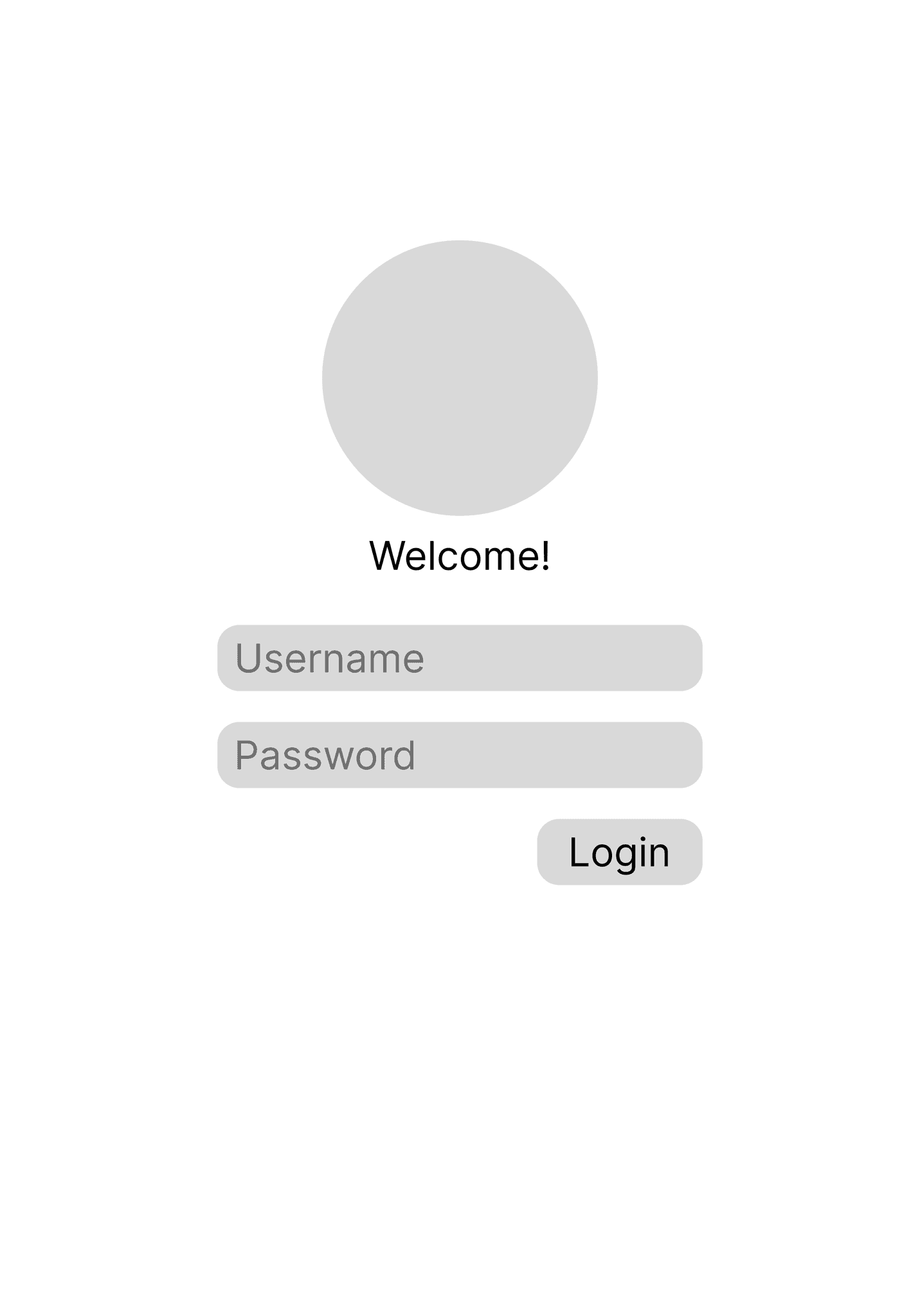
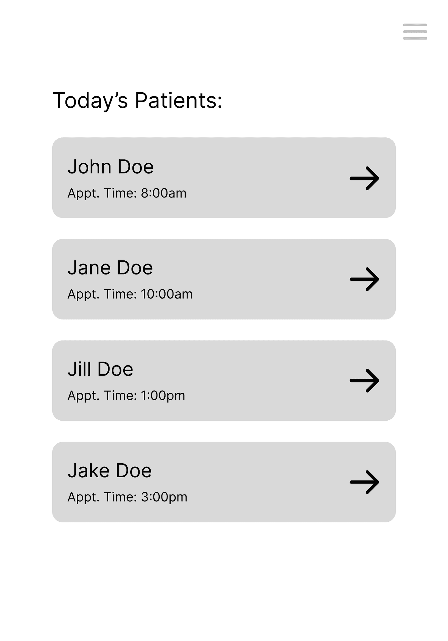
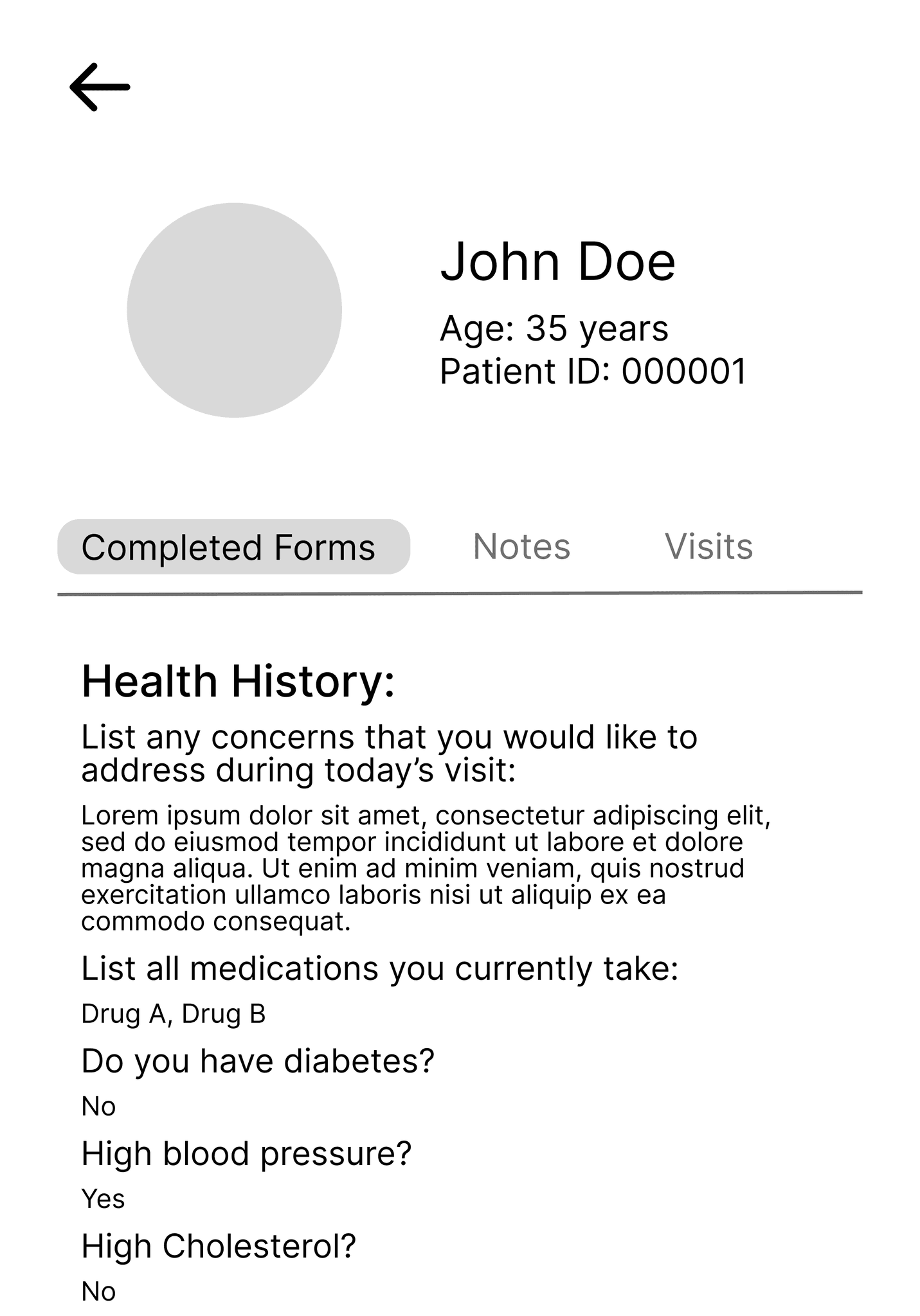
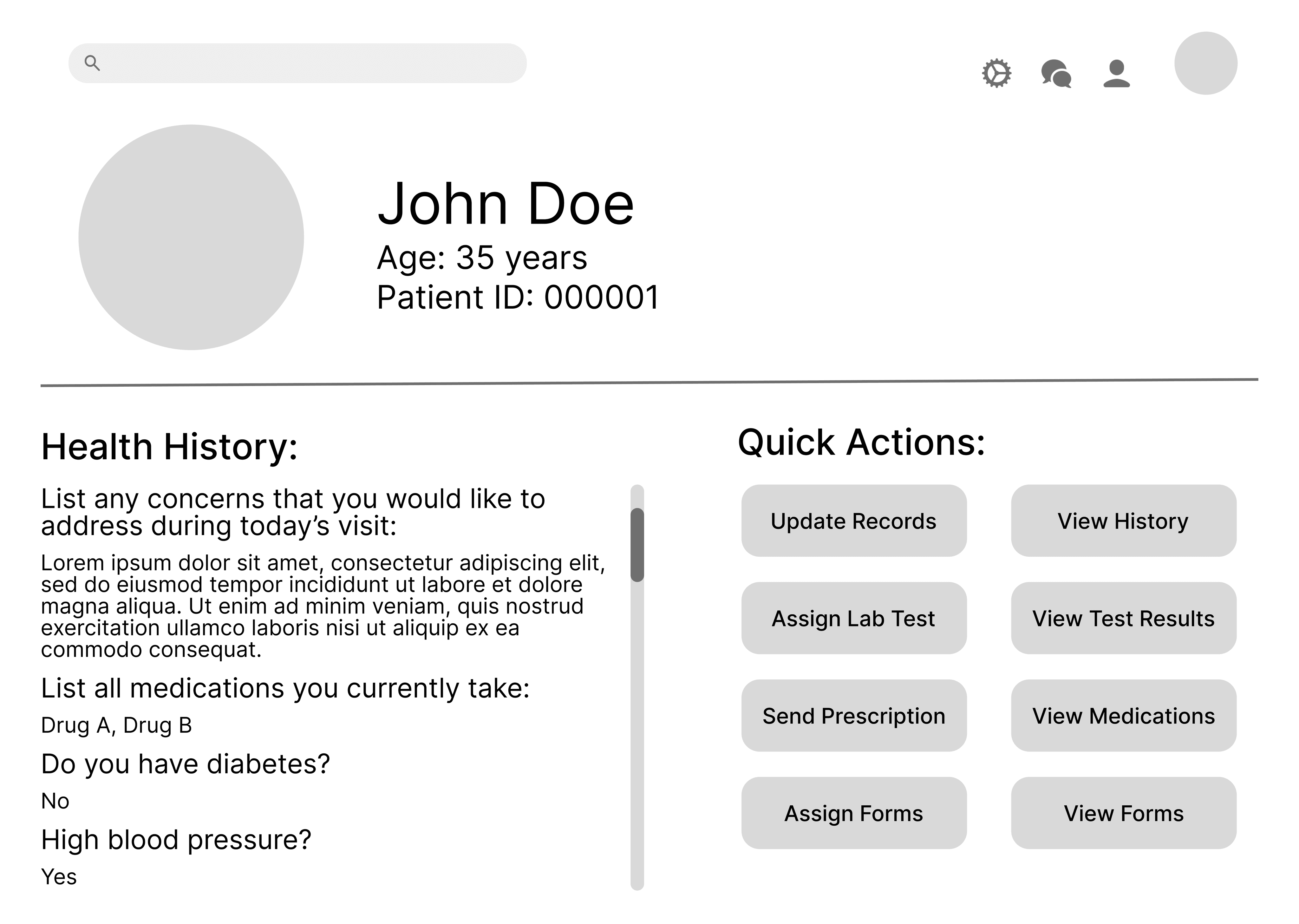
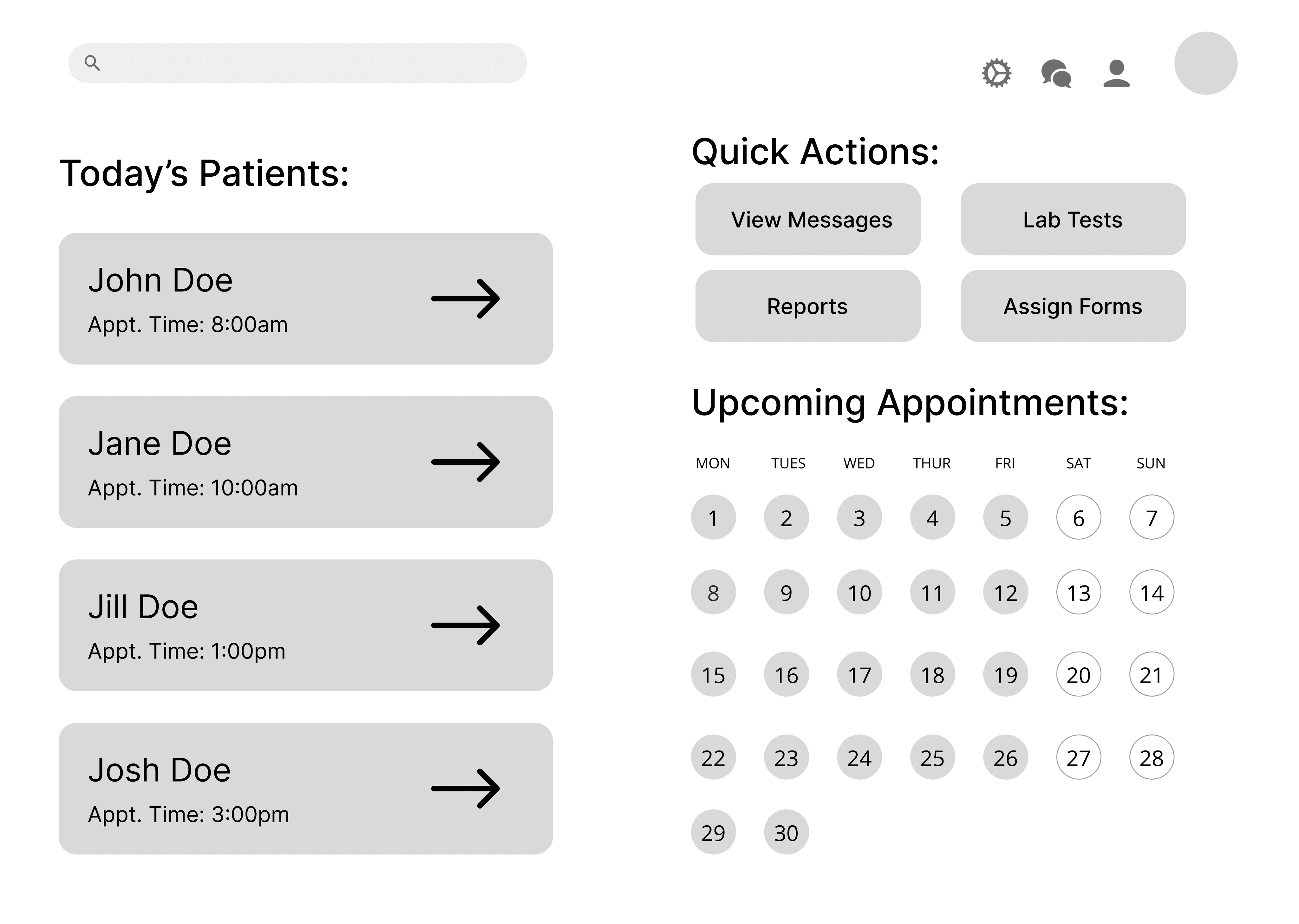
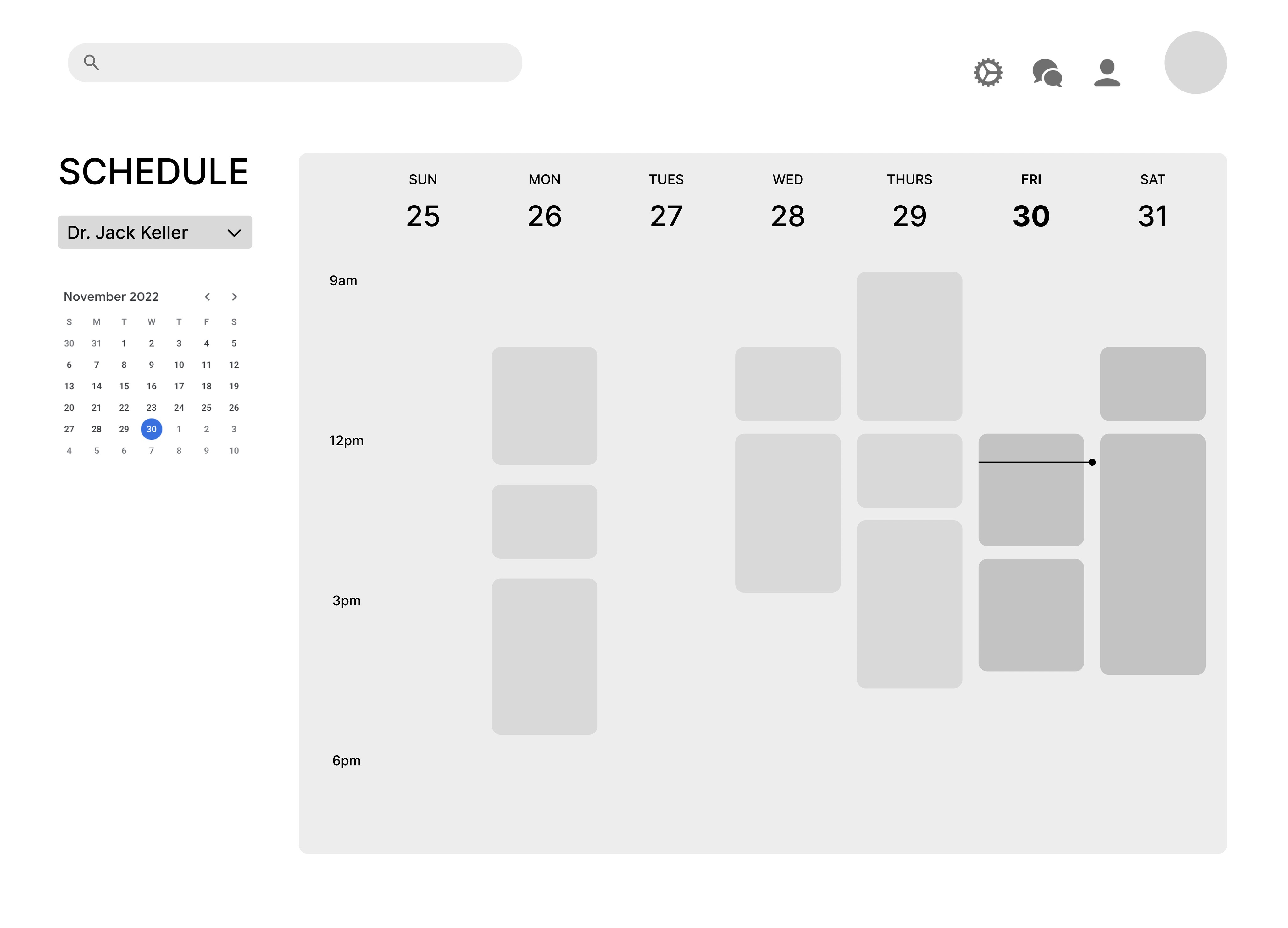
For the service provider flow, we decided to address the need for quick access to patient information for upcoming appointments, as demonstrated here on a tablet.
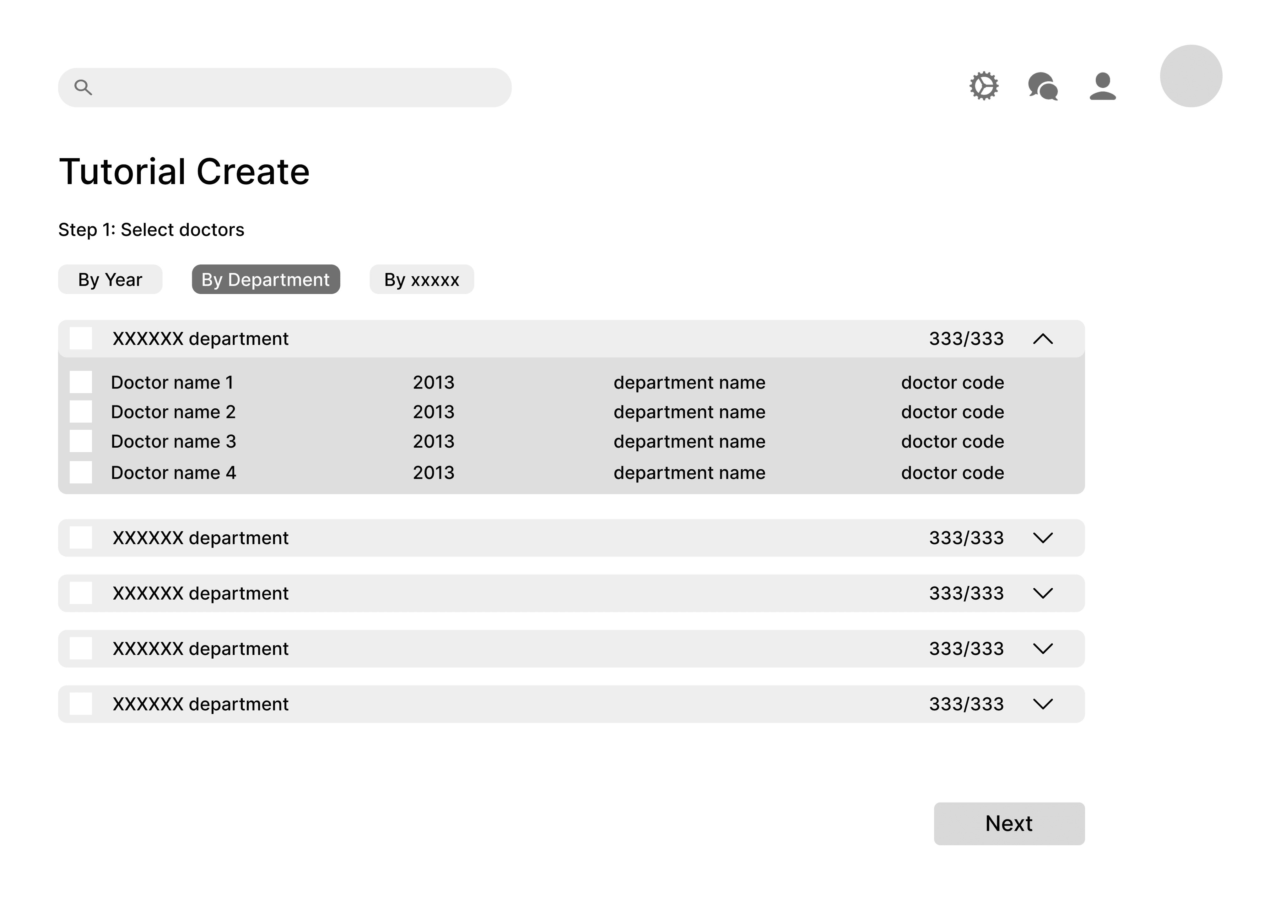
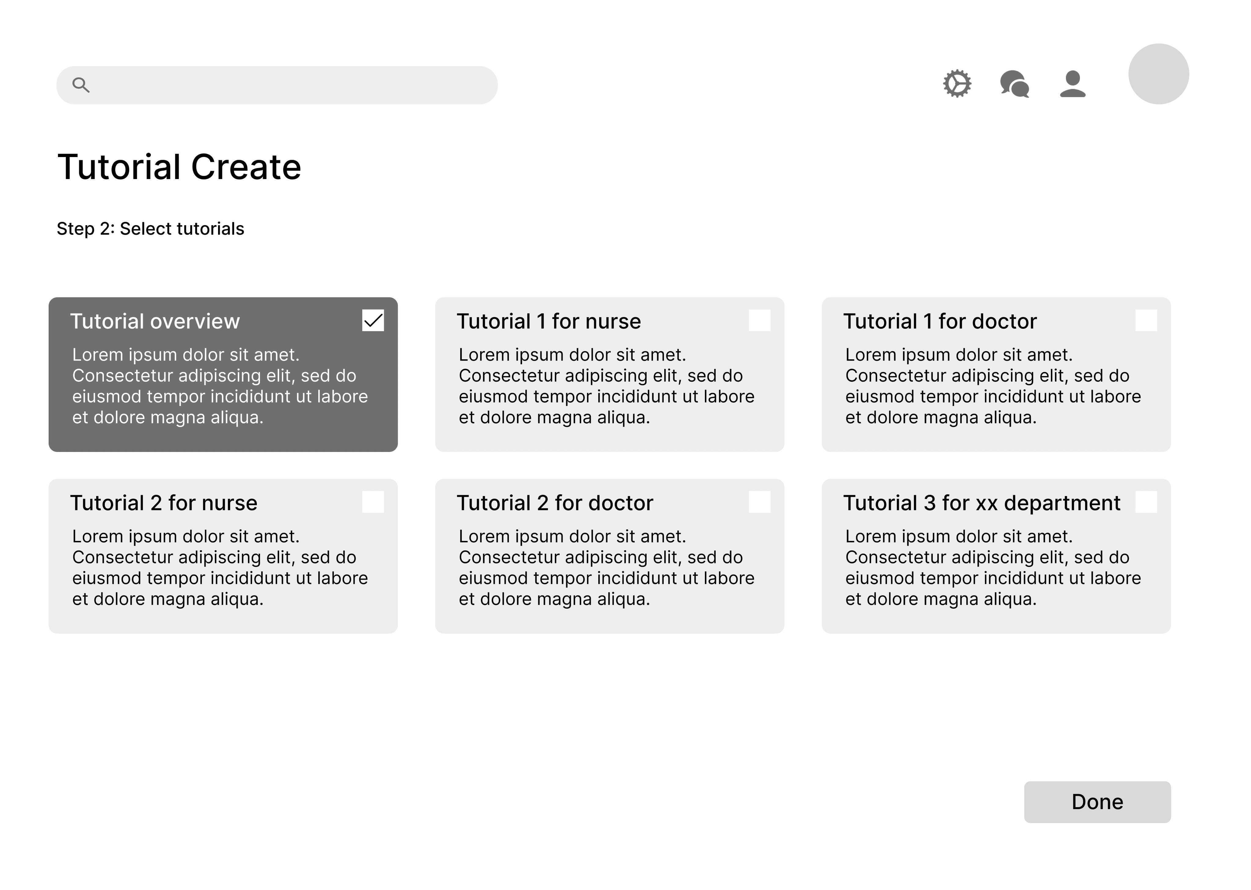
For the administrator flow, we decided to showcase how an admin could easily assign custom tutorials to different staff members for onboarding.
PIVOT
After multiple critiques on our early designs, we realized we were trying to address too many pain points at once. The healthcare is riddled with problems in user experience, but the goal of this project was to hone in on one problem and leverage responsive design to solve it. We came together as a team and went back to the drawing board, settling on a singular problem that pervaded many of our scenarios — the lack of transparency between service providers and patients.
We even wrote a more in-depth scenario focusing on each this issue affected each stakeholder and could be addressed using responsive web design. As we moved forward and started working on our final designs, we each kept looking back at this new, detailed scenario to keep our design focused.
Beth recently started taking birth control and has experienced mood swings and some depression. She wants to make an appointment with her doctor to discuss options and potentially starting an SSRI. She accesses her portal through Pittsburgh Family Medicine to make an appointment with her doctor, Shawn Foster. She updates her medication history to include birth control and includes a note about why she’s making the appointment. Her portal lets her fill out all the necessary paperwork in advance and immediately sends it to her doctor.
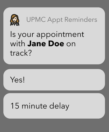
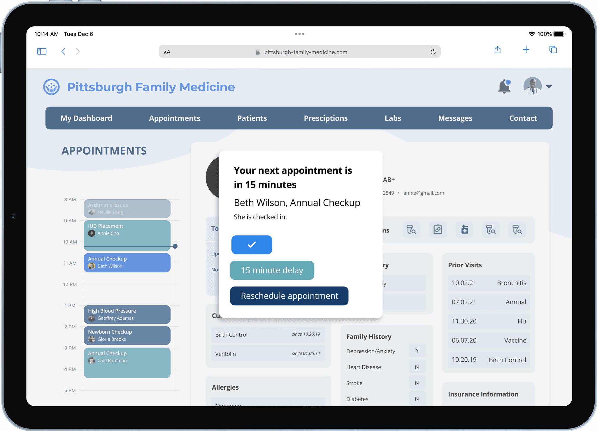
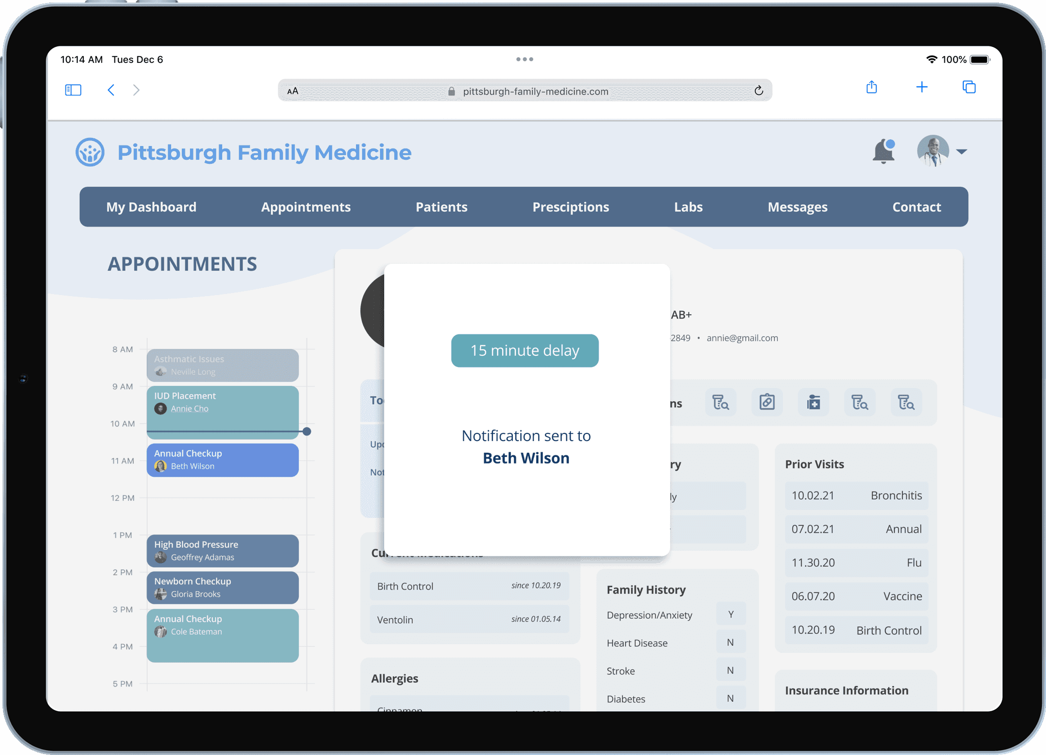
Dr. Foster sees a new appointment with Beth pop up on his calendar. On the morning of the appointment, he sees the digitized paperwork showcasing her update in medications. The patient before Beth on that day is taking longer than scheduled so he notifies via his watch that he needs 15 more minutes. Beth gets a notification of the delay and knows she has more time.
Because all the paperwork has been sent in advance and he’s been able to review it on his tablet, Dr. Foster is all ready for the appointment and has a list of suggestions for medication that specifically works with her lifestyle as well as the recent birth control prescription.
Janine, the admin, is able to track all the data pertaining to delays of appointments and make business decisions accordingly, such as to increase the default appointment duration.
Low-Fidelity Wireframes
Now that we had a clear scenario to design for, we started working on a new set of low-fidelity wireframes, this time exploring multiple devices for each stakeholder.
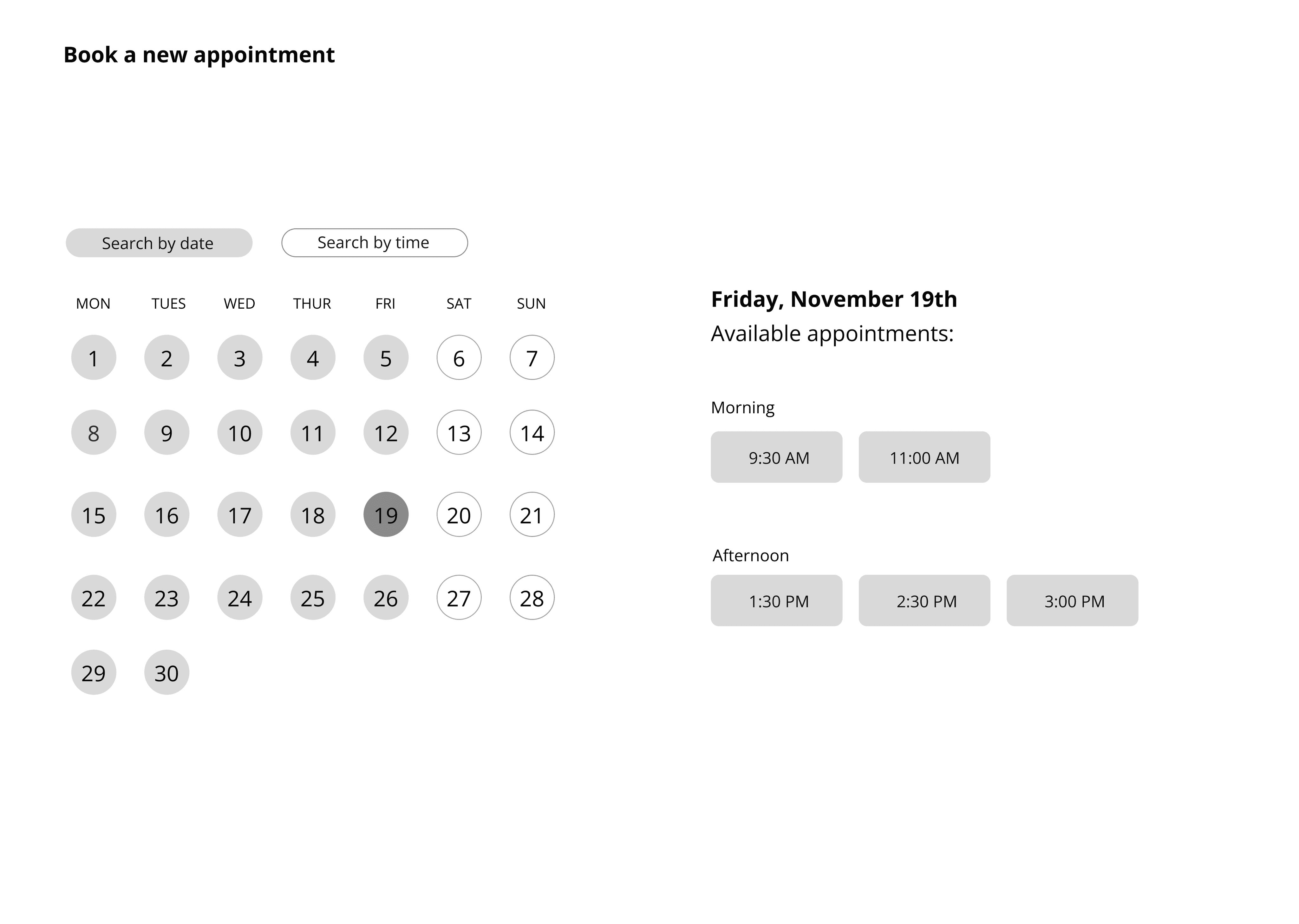
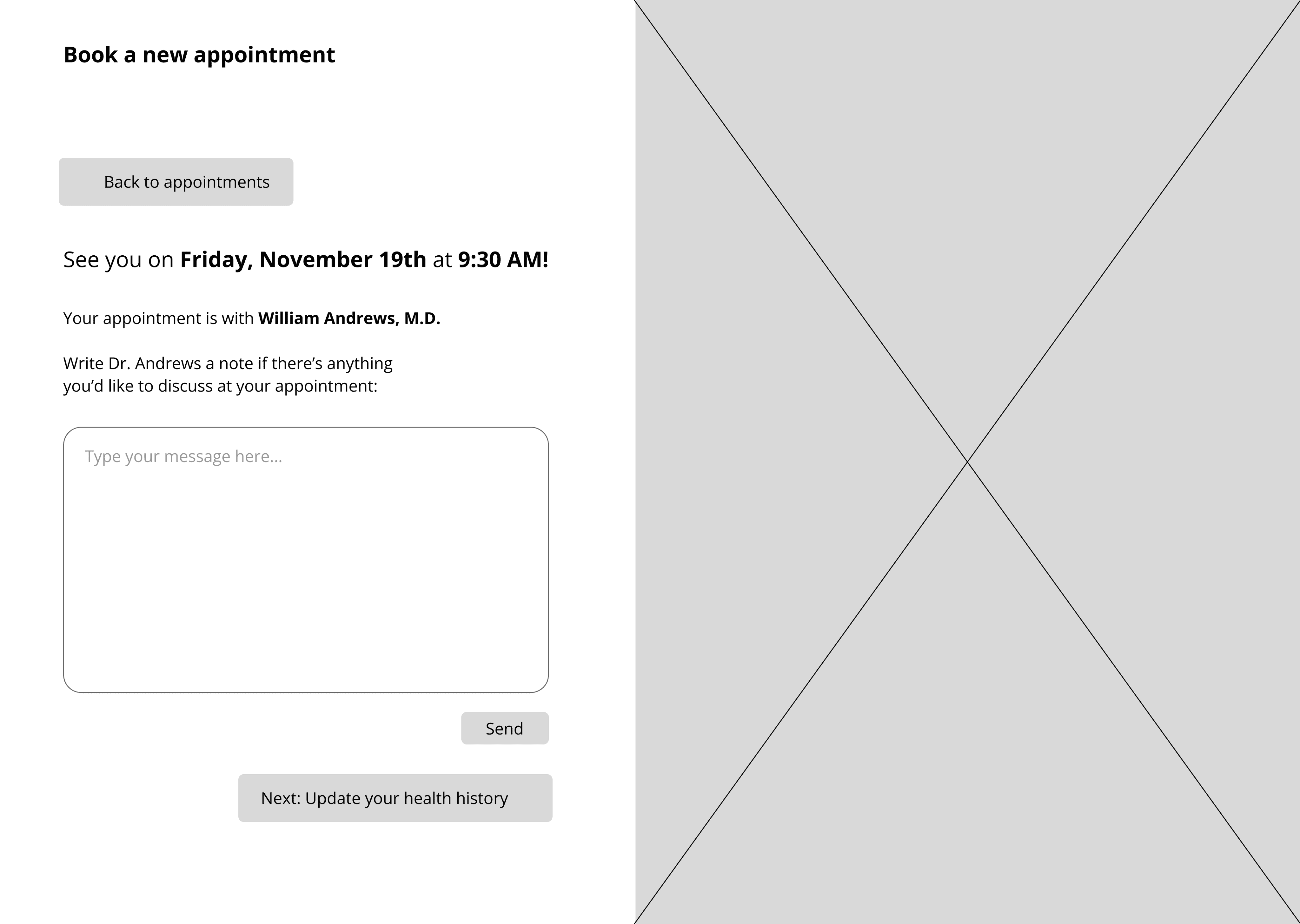
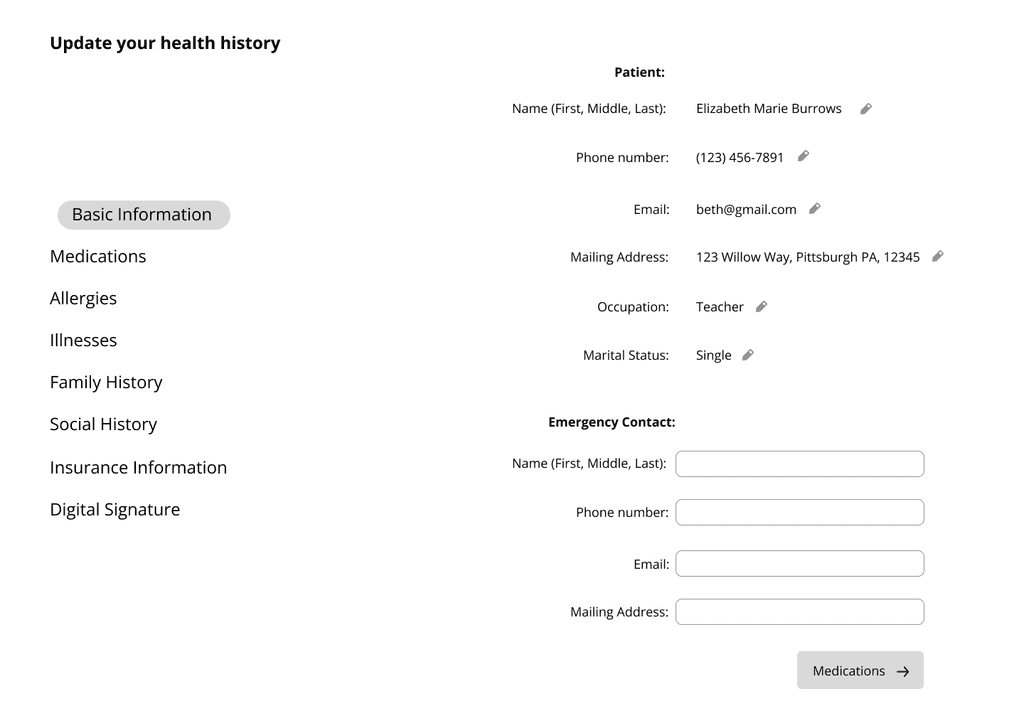
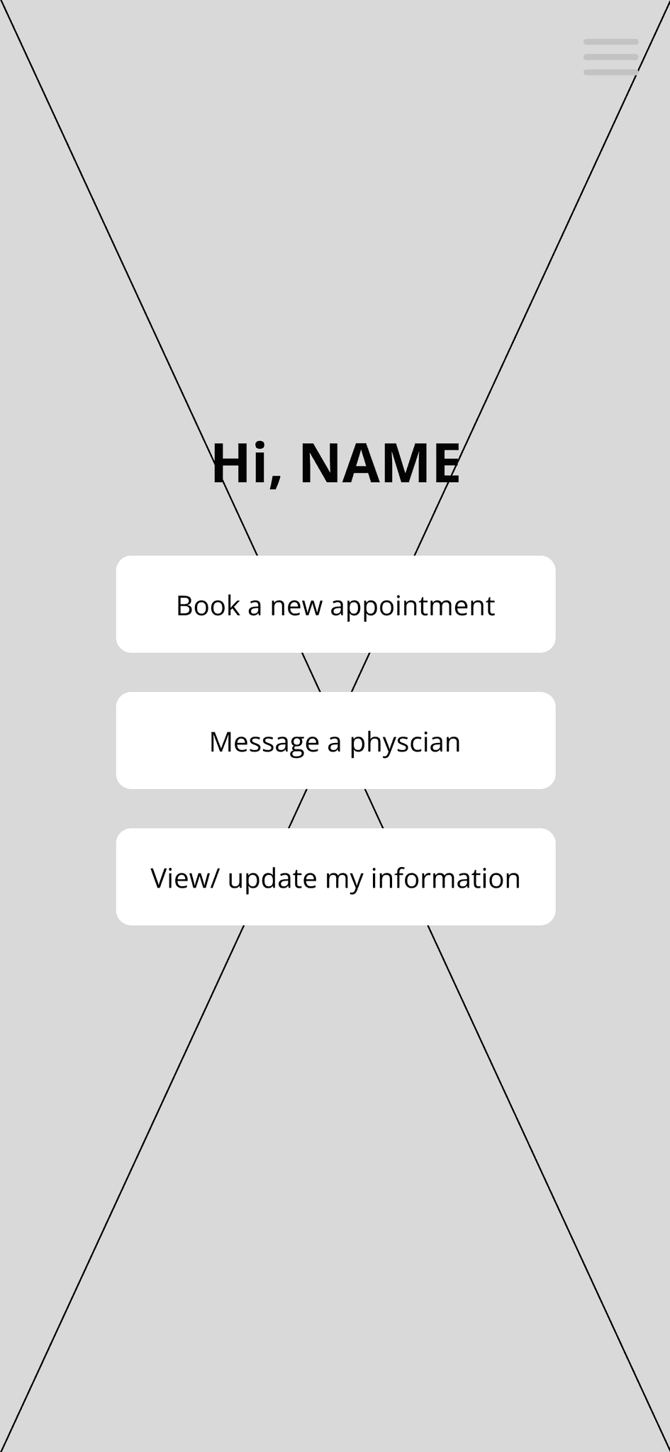
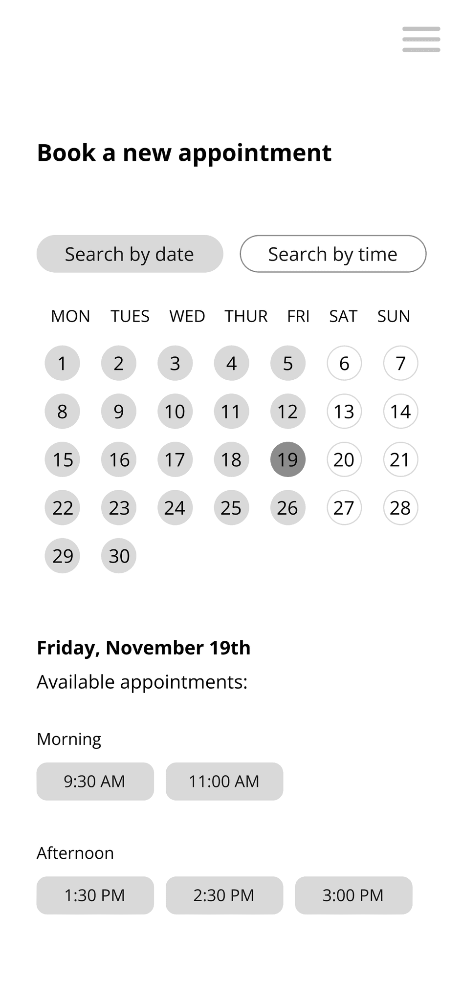
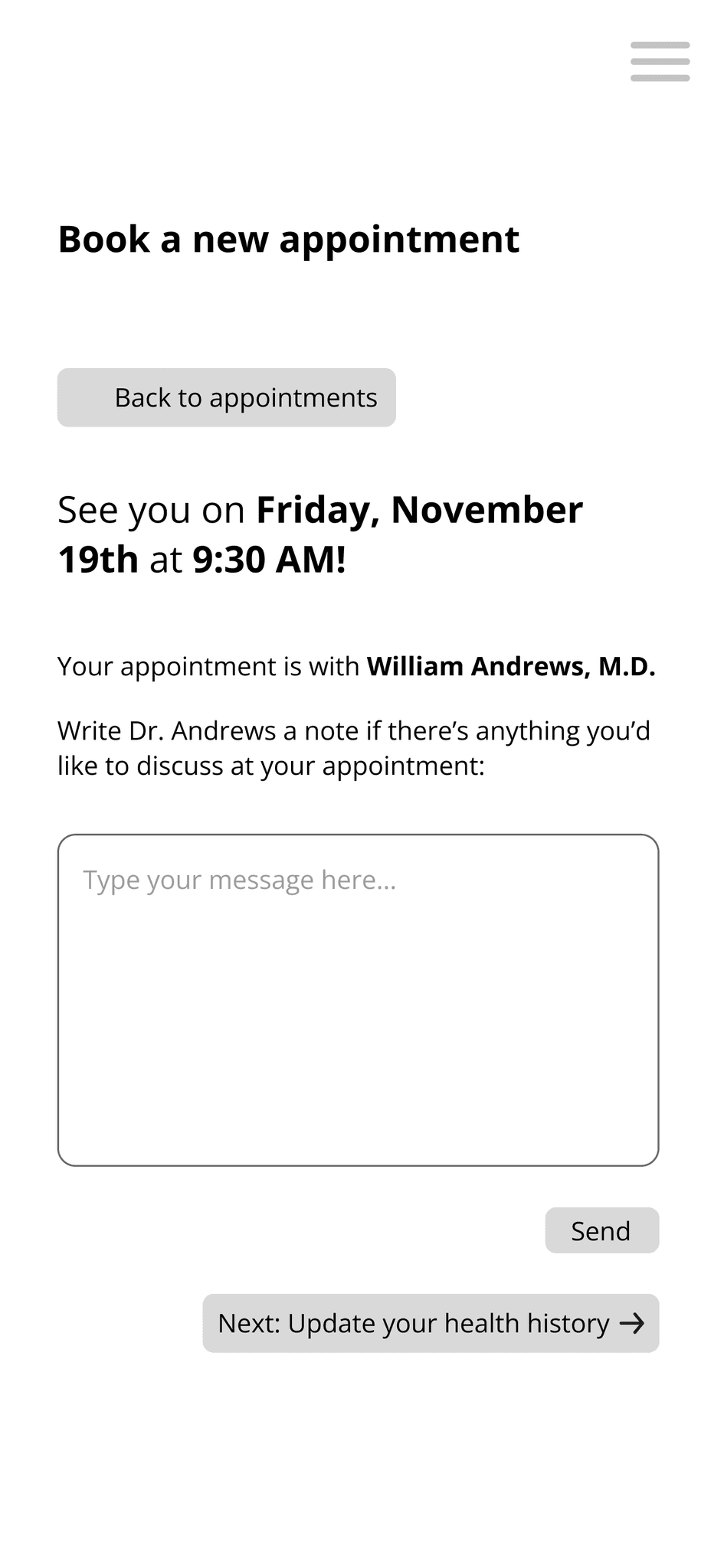
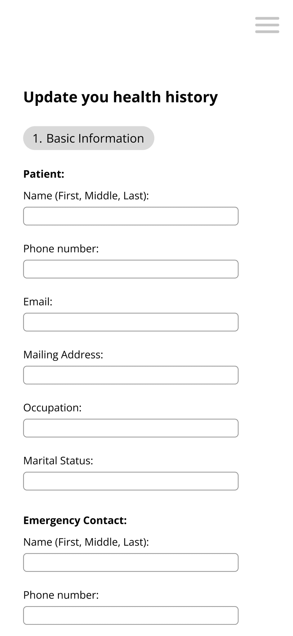
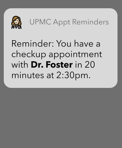
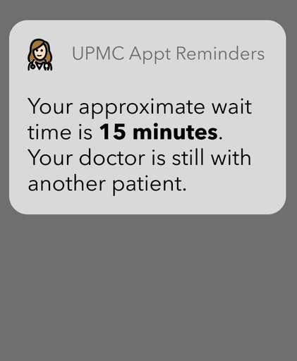
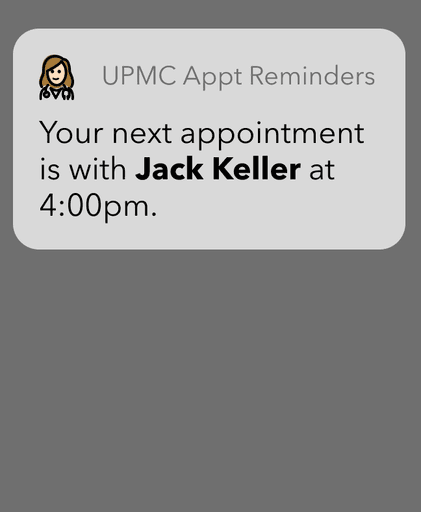
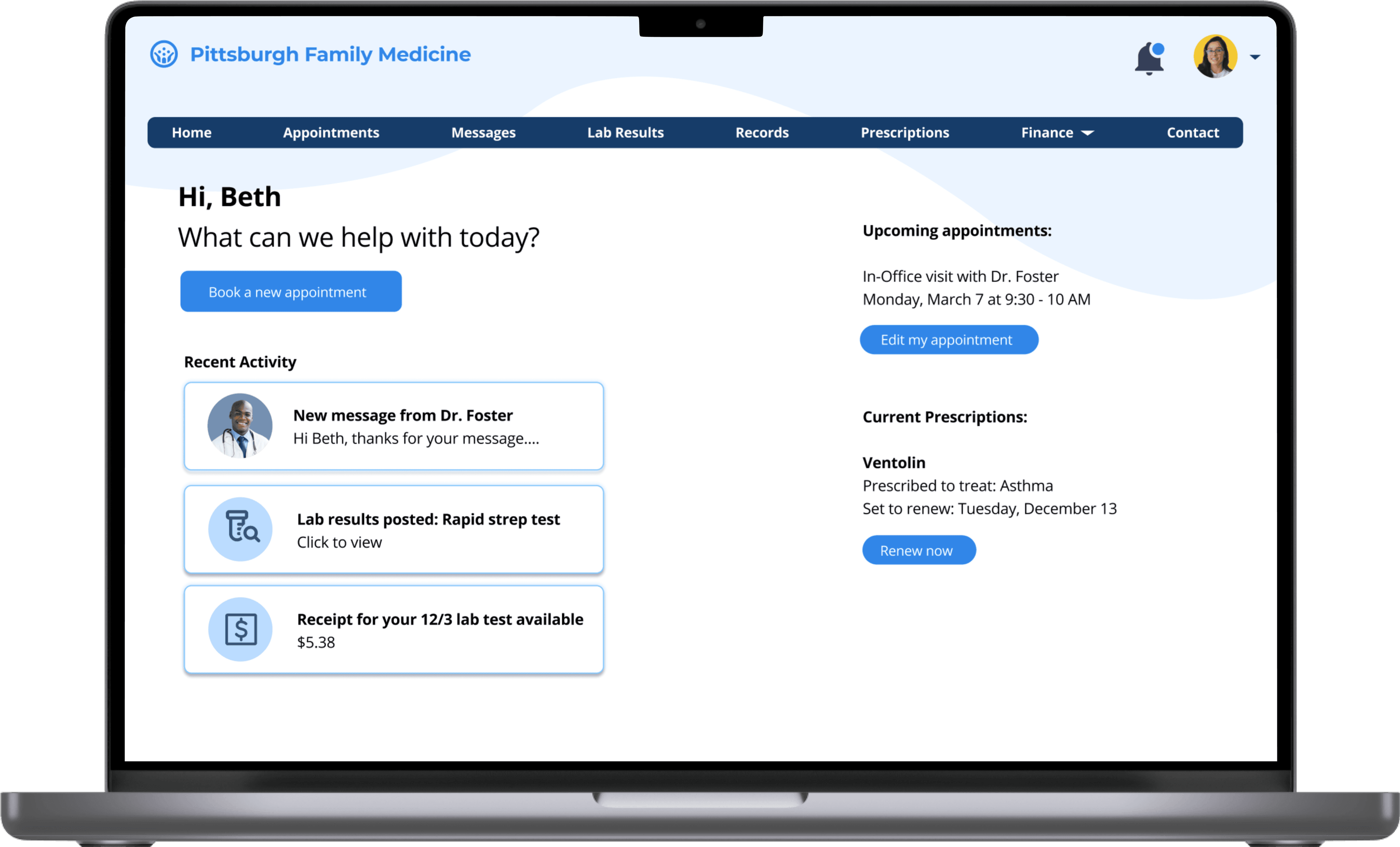
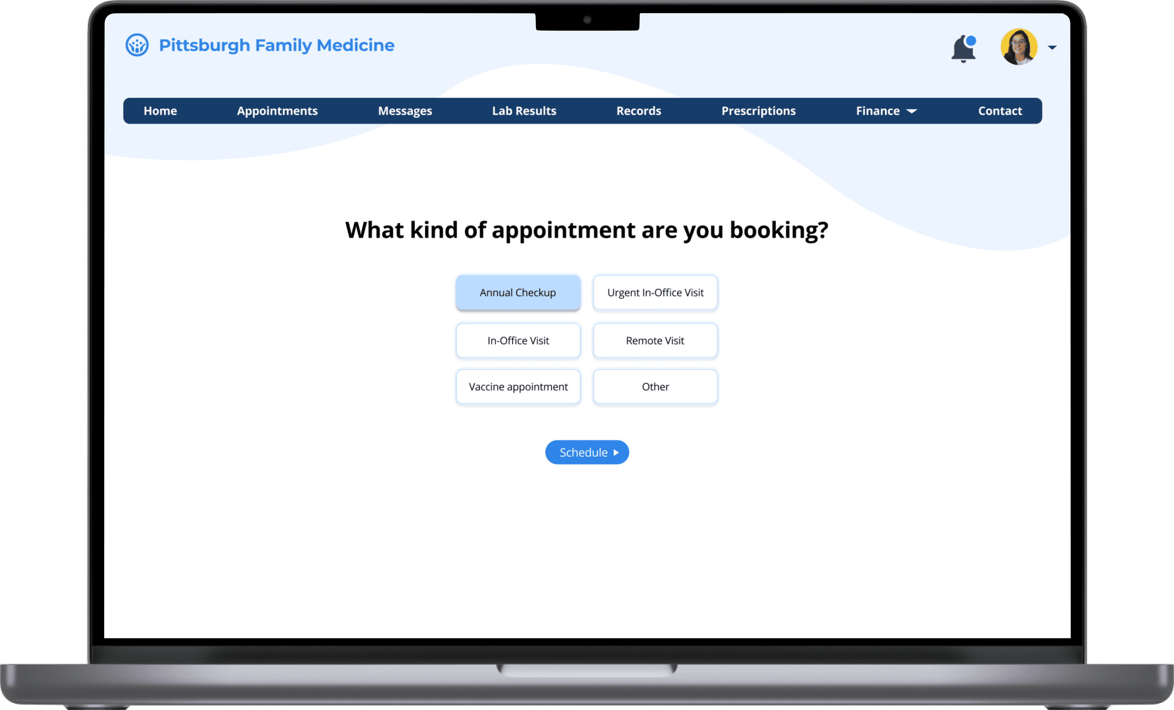
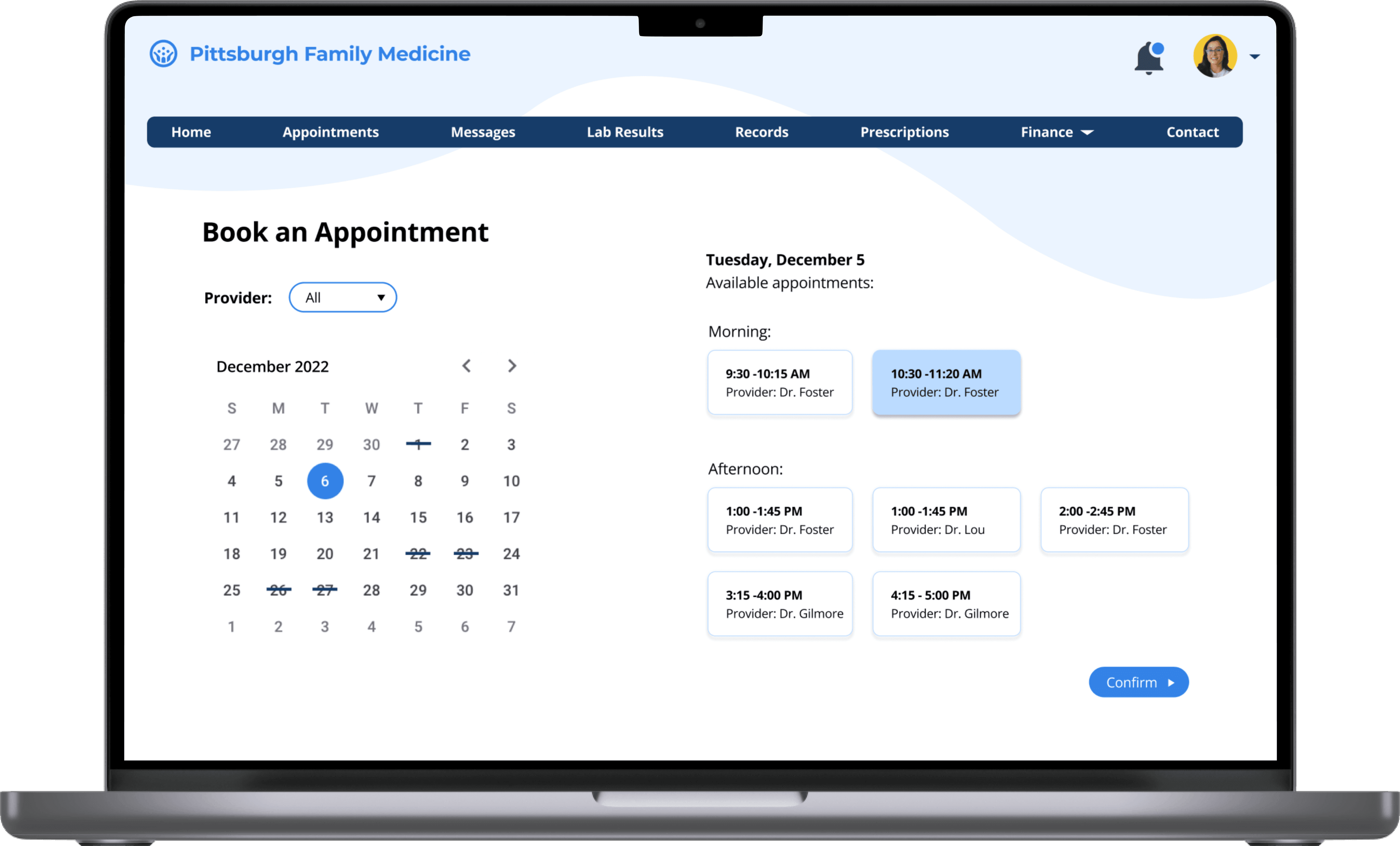
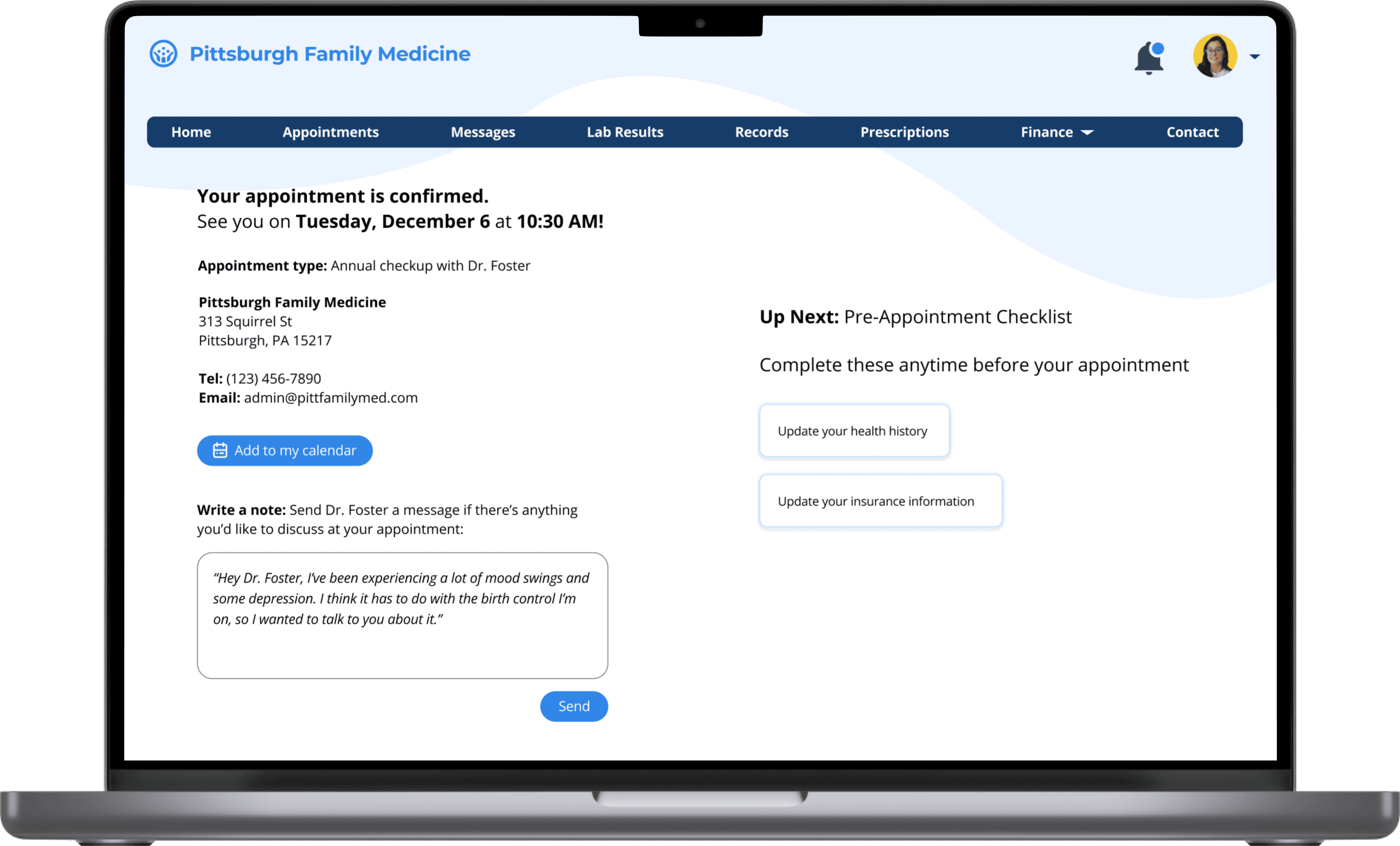
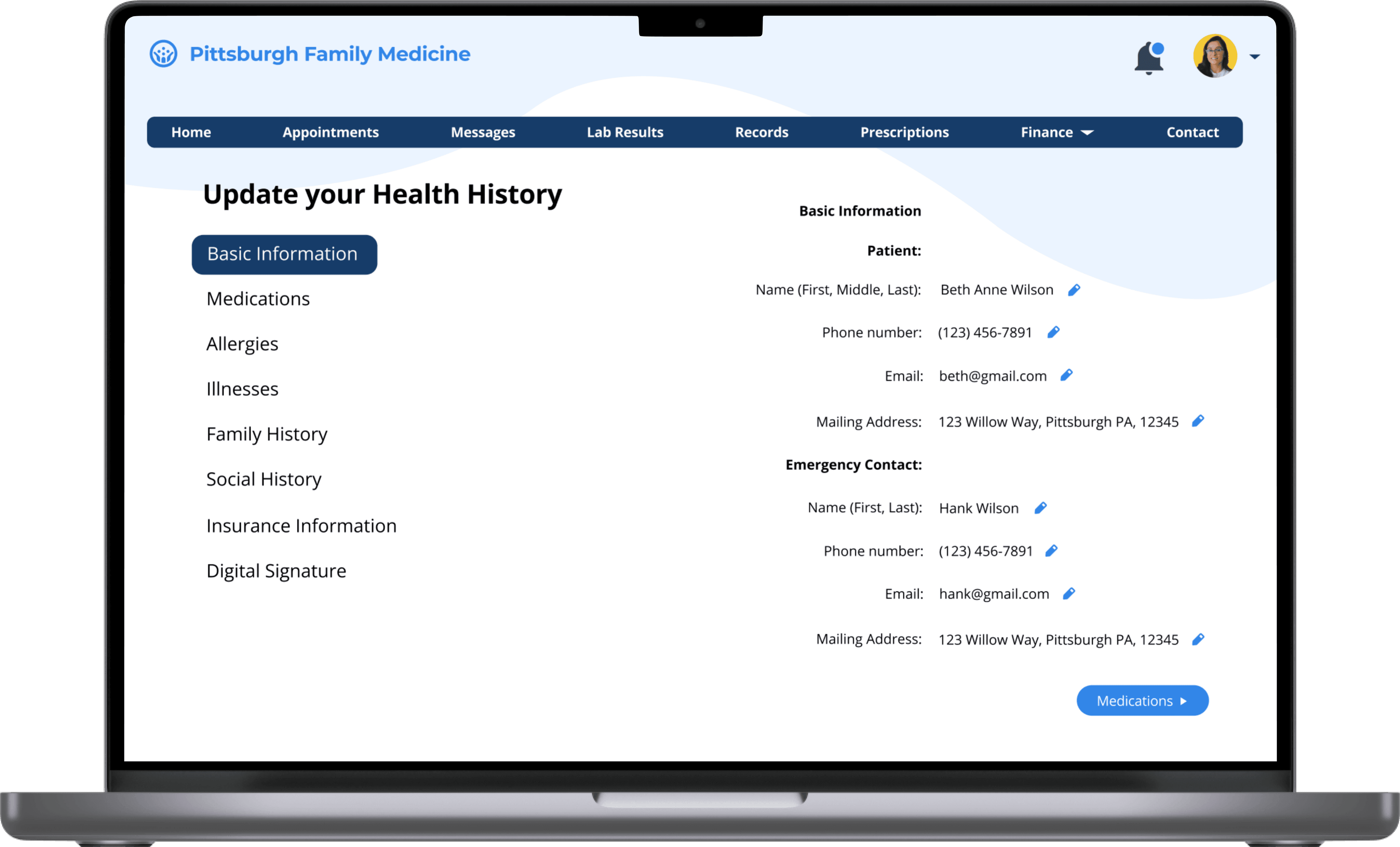
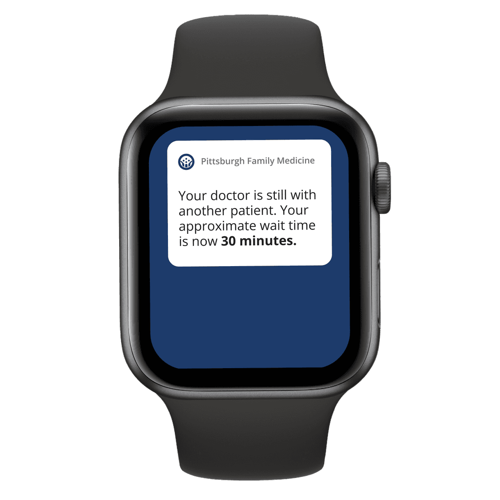
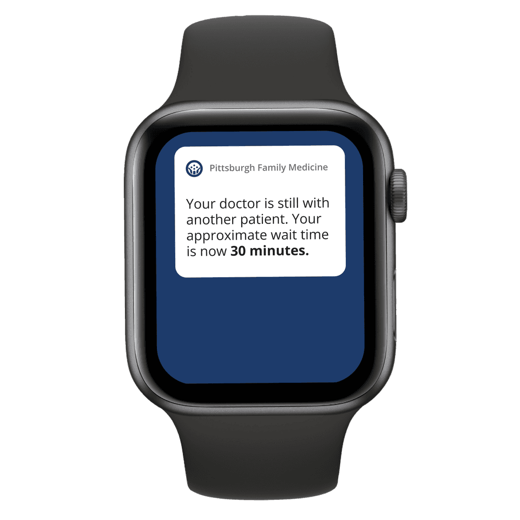
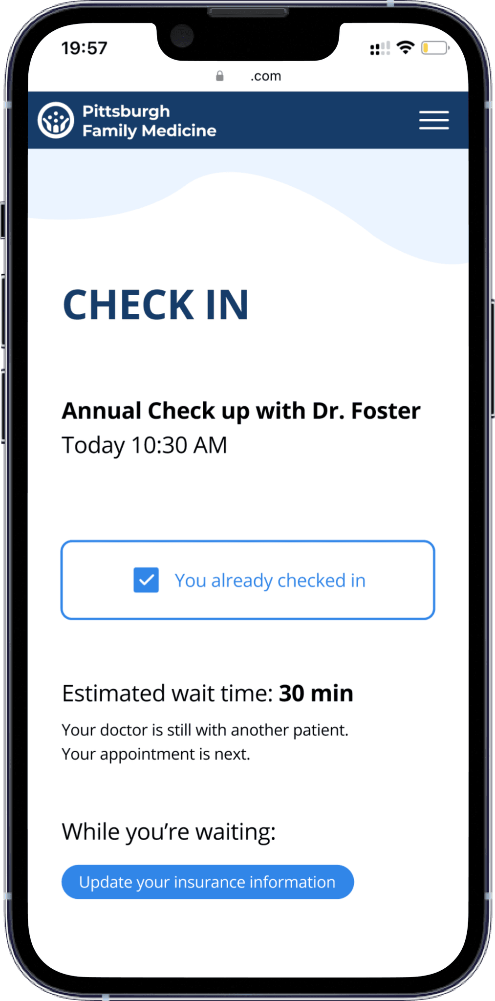
Now on the patient-side, we decided to create a flow for booking an appointment and updating the patient's health history on both mobile and desktop as well as watch notifications reminding the patient of their appointment and alerting them of any wait times.
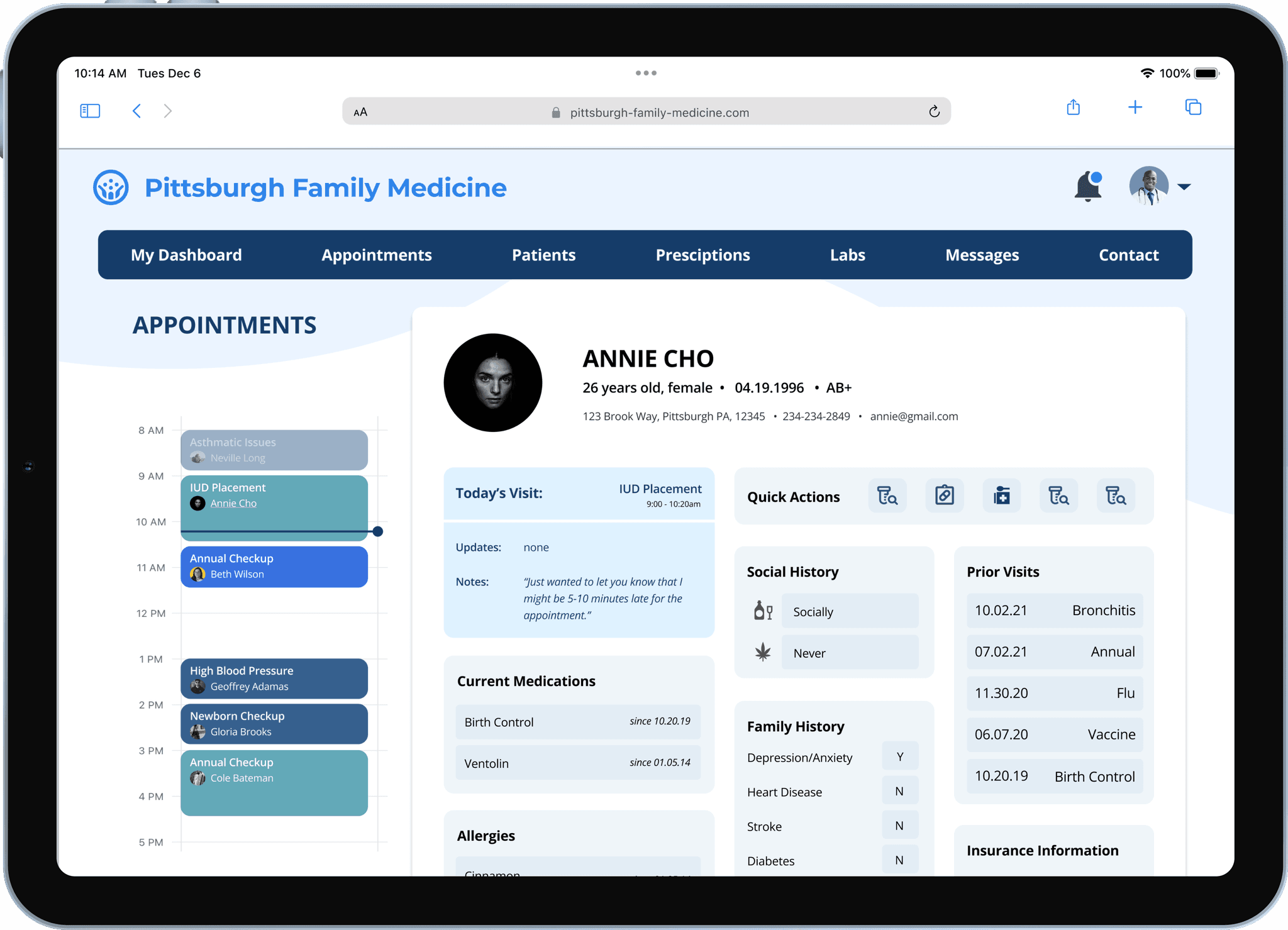
For the service provider, we focused on quickly accessing patient information like before via tablet as well as being able to communicate with upcoming patients in case of any delay via watch.
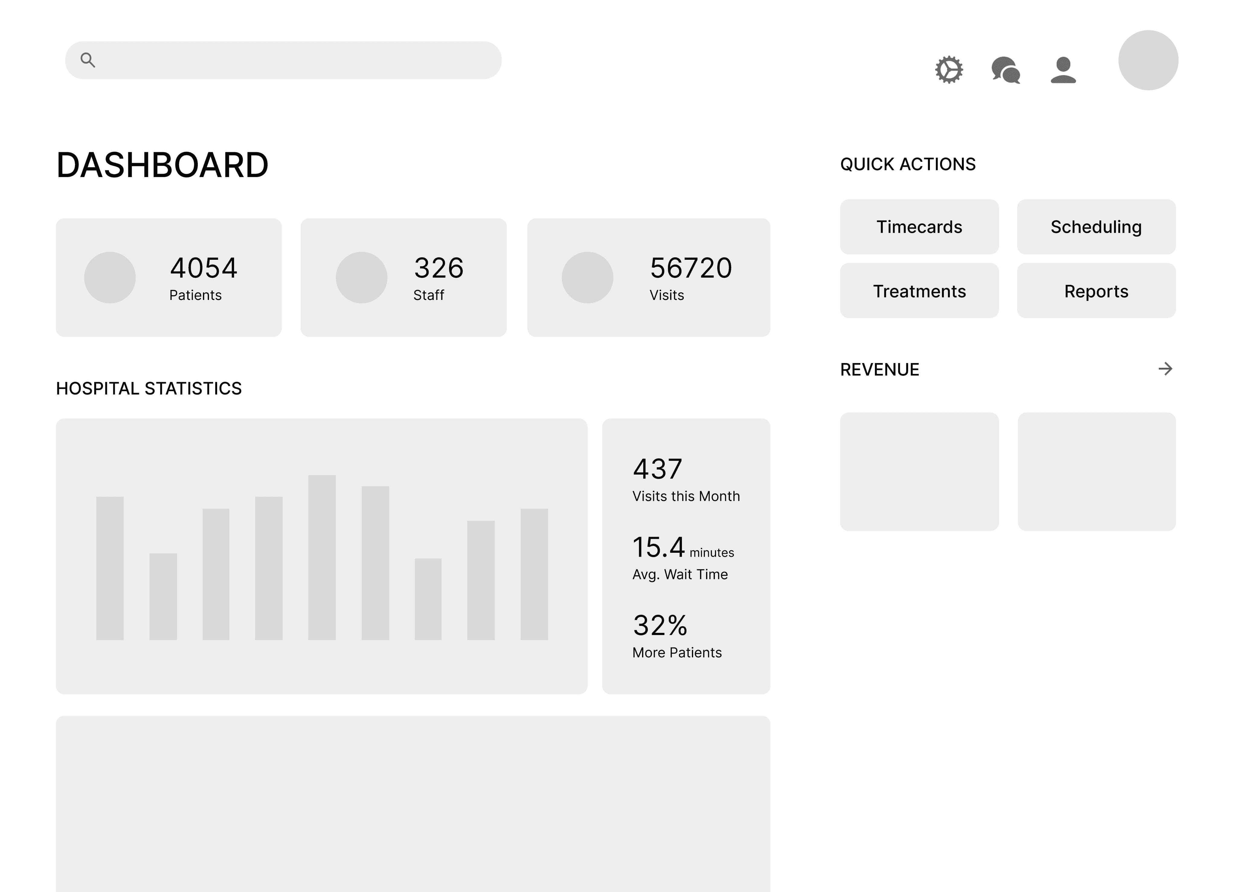
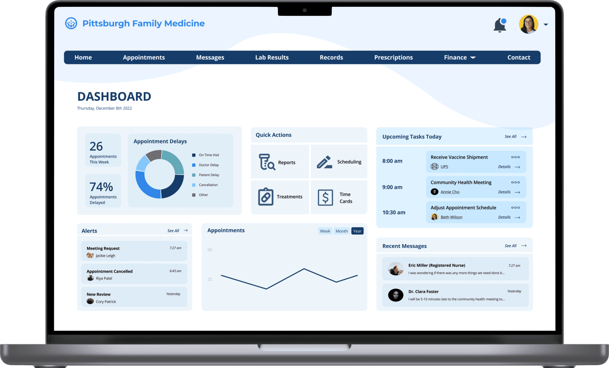
For the administrator flow, we focused on creating a dashboard where the admin could track the efficiency of appointments and the average delays.
DESIGN SYSTEM
Palette
Since we were designing an interface to be used by patients, service providers, and admins, we knew that we needed a calm and cohesive color palette that wouldn't distract from the sensitive information on each screen. We went with different shades of blues as seen below because they felt professional and clean — not too bright, but not too pale.
Primary
Secondary
Typography
Wanting a typeface that was simple and engaging, we decided on Open Sans which provided a variety of bolded styles to suit our needs.
Open Sans 36
TITLE
Open Sans 28
Heading 1
Open Sans 20
Heading 2
Open Sans 16
Heading 3
Open Sans 16
Body
Open Sans 12
Caption
Aesthetic
Wanting to make the interface more engaging to balance out the gravity of the context, we added some dropshadows and curvature.
FINAL DESIGNS
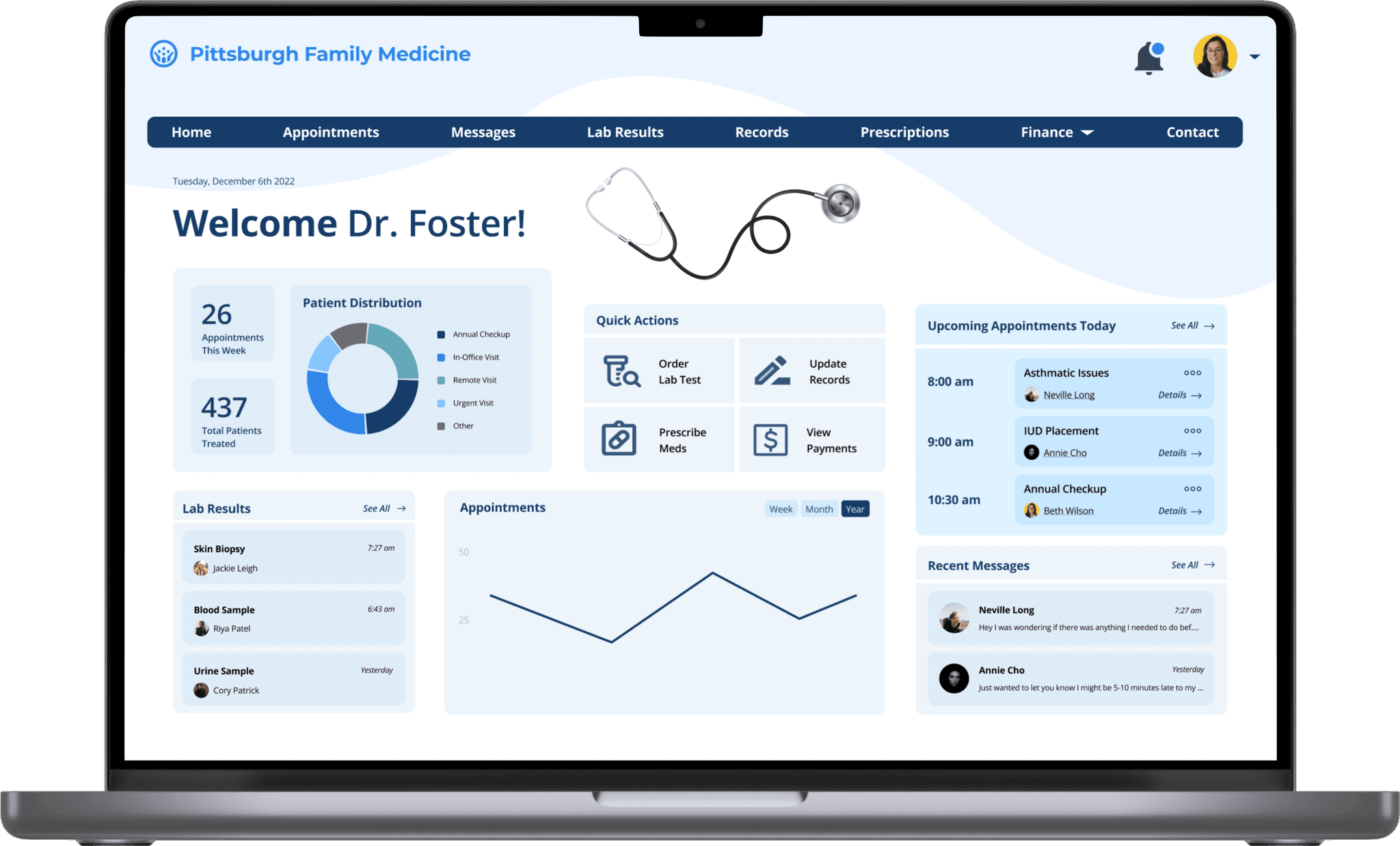
After crafting a clear design system and reframing our approach, we created a responsive web design for a family medicine practice seeking to make scheduling more efficient for patients, providers, and administrators. From the patient perspective we sought to do this by making the flow of scheduling an appointment easier and more intuitive and providing a platform for them to fill out paperwork before they arrive to the office. To improve the experience for doctors, we created an interface that allows them to easily view patient information and communicate with about delays across a variety of devices. For administrators, we created a dashboard that allows them to easily access information about each provider and provides an overview of scheduling trends that can enable them make decisions in order to improve the process.
High-Fidelity Wireframes
Below is our final set of high-fidelity wireframes, shown in chronological order with the context of our final scenario from above. You can also view all our flows through this interactive prototype.

Beth accesses her portal through Pittsburgh Family Medicine to make an appointment with her doctor, Shawn Foster. She updates her medication history to include birth control and includes a note about why she’s making the appointment. Her portal lets her fill out all the necessary paperwork in advance and immediately sends it to her doctor.

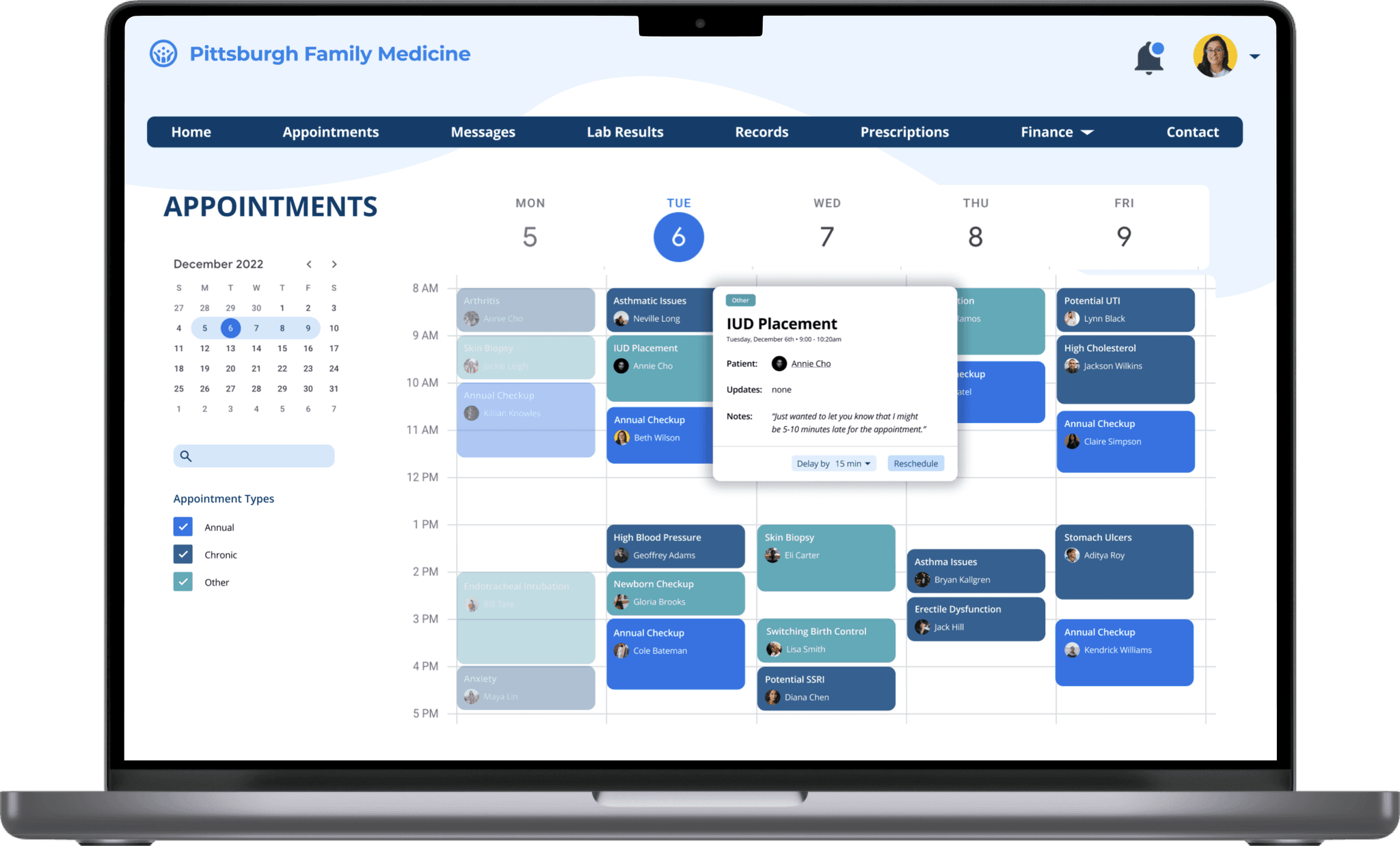
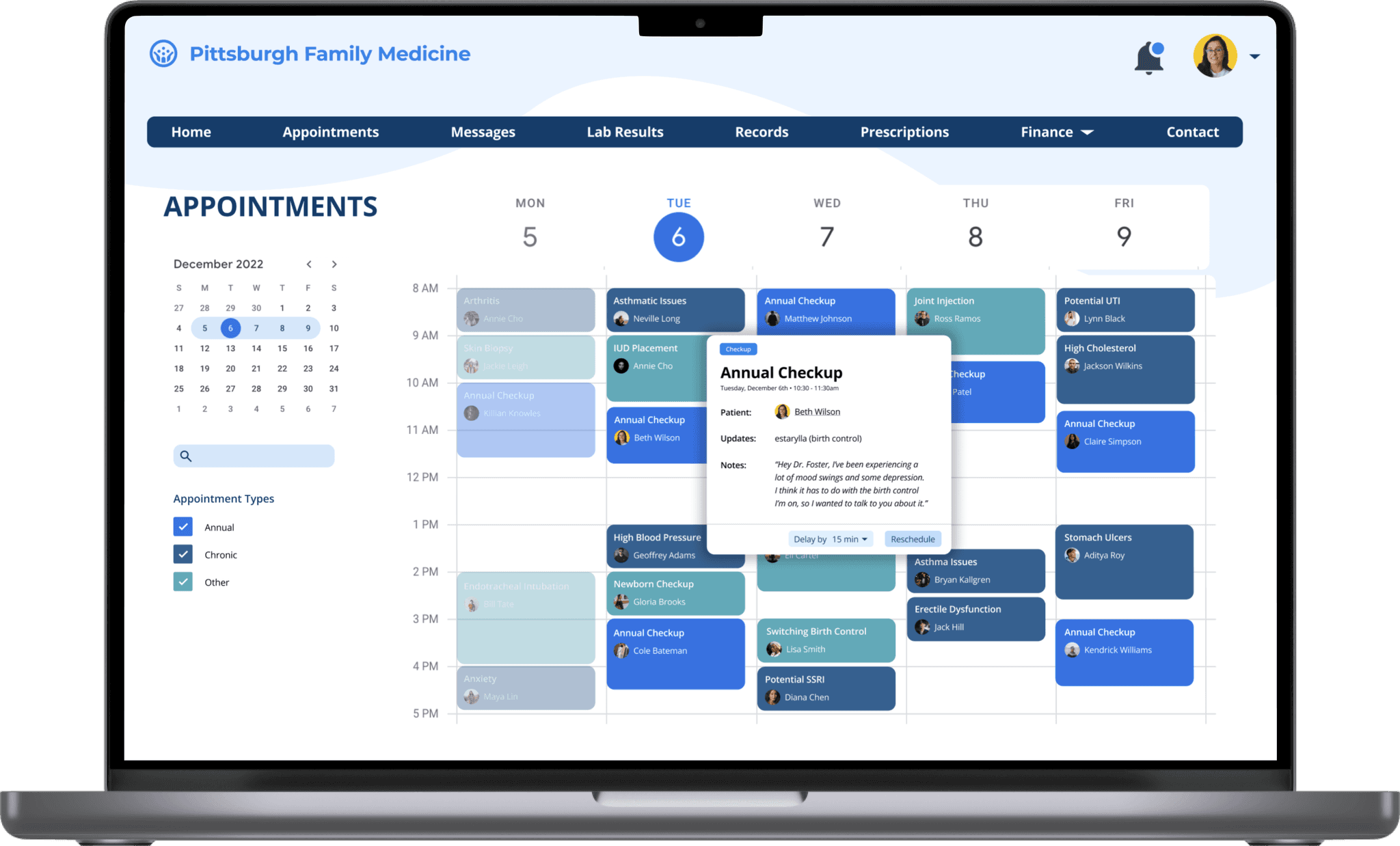
Dr. Shawn Foster starts his day on his desktop in his office, briefing himself on what the day will bring appointment wise. he sees on his dashboard that he has many upcoming appointments, so he goes to his schedule and briefs himself on each appointment, viewing all the updates in each patient’s health history as well as any notes they may have sent him.

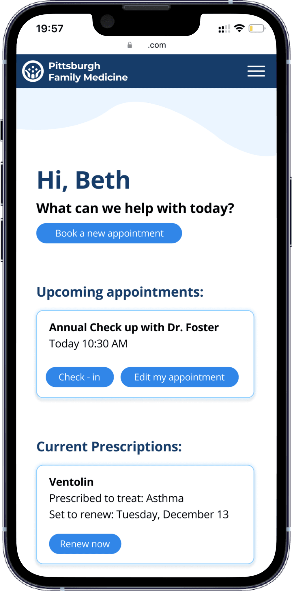
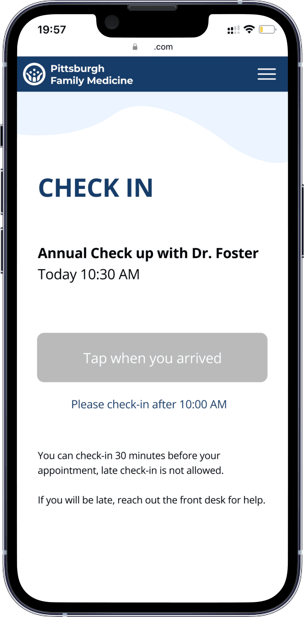
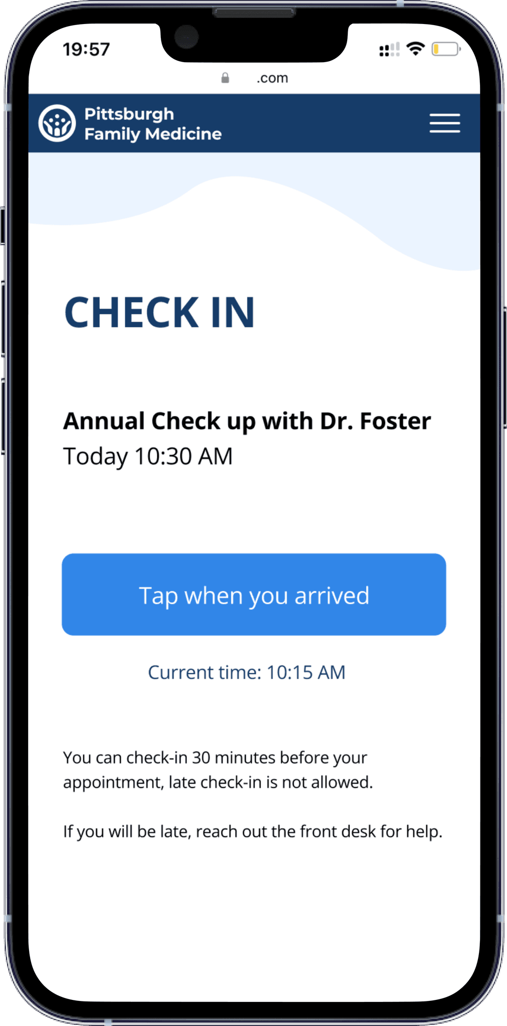
On the day of the appointment, Beth logs onto the portal on her phone to make sure there's nothing else she needs to do before her appointment. When she sees she's all set, she continues with her day until she gets a reminder on her watch that she needs to check in for her appointment once she arrives.

Dr. Foster is in the middle of his appointment with Annie (the patient before Beth) when he's reminded on his tablet that Beth's appointment is coming up soon and she's already checked in. He decides that he needs some more time with Annie, so he indicates a 15 minute delay to Beth.

Beth is immediately notified of the delay on her watch and can see that the waiting time on her phone has updated.

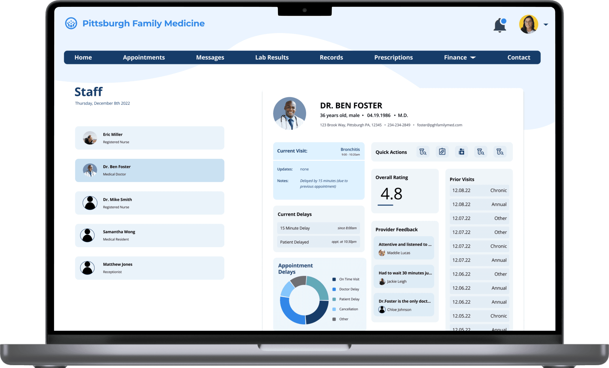
Janine, the clinic administrator, is able to view the average delays and overall analytics regarding efficiency thanks to the data collection achieved above. She also can see more detailed information about the delays for each service provider.
REFLECTION
While this project wasn’t my first foray into responsive web design, I felt like I learned a lot not only about the best practices for responsive design, but also about the healthcare domain, especially as it relates to technology.
Pretty much as soon as we started our primary and secondary research, I felt overwhelmed by the amount of problems encumbering the healthcare domain. As we developed our scenarios and speed dated our storyboards, I felt more and more inclined to try and solve as many problems as I could with a singular design. Looking back, this is often a trap I fall into -- I get so drawn to this impossible notion of a one-size-fits-all design that I lose sight of any one particular pain point. I think this a lesson that bears repeating and really captures what design is all about.
While it took us a while to realize that we needed to hone in on a singular pain point, once we did as a team, I felt a lot of clarity and focus as we developed a specific scenario that we could all design for. I feel like being able to ground our design with a specific set of interactions + characters in mind, helped really smooth things along and prepare us for the pitch portion of the assignment.
All in all, while this assignment had a lot of hurdles, especially timeframe wise, I feel proud of the work my team and I have done. I wish I could’ve had more time to engage in critiques after we had developed our high-fidelity designs and explore more in the healthcare space.
Coming Next
Internship • Summer 2022
As a UX Design Intern on the Android Color Team at Google, I was tasked with completely redesigning an Monet Studio, an internal tool focused on allowing designers to understand, experience, and utilize dynamic color as a part of the Material You system.
Web Design • User Experience • Interaction Design • Design System
