Project • Spring 2021
For the course User-Centered Research and Evaluation, my team explored the pain points young adults face when saving up for a home. After employing numerous generative and evaluative research methods to explore this domain, we designed a financial planning app that gives daily, personalized tips on how to save money to meet long-term financial goals.
Mobile App Design • User Experience • Interaction Design • User Research
BACKGROUND
The client for this project was Blend, a cloud banking company aiming to make consumer finance simpler and more transparent. Their research efforts typically revolve around people who’ve previously purchased a home, or current/prospective homebuyers.
Each team in this course was tasked with employing numerous research methods and techniques to answer the following: How might we enable better support now so that when the time comes, this next generation of homebuyers possess the financial literacy/proficiency and awareness that could affect their ability to purchase?
Role
UX Designer
UX Researcher
Methods
Semi-structured Interviews
Artifact Analysis
Storyboards
Speed Dating
Journey Mapping
Wireframing
Prototyping
Tools
LucidChart
Figma
Collaborators
Ginny Zhao
Shai Bhardwaj
Hannah Fernandes
Links
Figma Prototype
DISCOVERY
Journey Mapping
Prior to forming teams, we were individually tasked with conducting background research into the topic of home-buying and create stakeholder and customer journey maps based on those findings.
Customer Journey Map
I focused not only the order of actions that compose the home-buying process, but the various systems, emotions, thought processes, and pain points that are part of each stage. From there, I assessed each column and added the potential opportunities for innovation in that stage.

Stakeholder Journey Map
I began by researching the roles of the various agents and intermediaries involved in the home-buying process. From my research I was able to map together the overall flow of involvement and also categorize the stakeholders by whether they were primarily working with the buyer, the seller, or both in tandem. I also placed stakeholders that were only involved once a sale had been agreed upon by the buyer and seller inside the oval, providing a sense of the timing of the stakeholders' involvement.

Ultimately what these maps revealed was the complexity in terms of the financial process of buying home. There are so many intermediaries and agents involved just in the financing as well as so many pain points/negative emotions tied to the financial stages in the process that we decided to narrow our focus on alleviating the stress associated with the financing, settling on a how-might-we of How might we make the saving process for a home less intimidating and more seamless for young adults?
Contextual Inquiry + Artifact Analysis
We interviewed four recent alumnae of Carnegie Mellon University to discuss their current financial habits. We chose to perform an artifact analysis, mainly due to the nature of our topic. Financial literacy and budgeting comes with many tangible tools, such as different types of bank accounts, financial portfolios, apps, books, advice, etc. To try and understand our participant’s knowledge and thoughts to the fullest extent, we asked them to bring these three artifacts: what advice their parents gave them, their top 5 financial goals for the next ten years, and the materials they use for their personal budgeting.
Insights
People want to be more aware of their finances, but they do not want to do all the manual work that comes with organizing.
Young adults have long-term financial goals, but are intimidated by the hurdles associated with investment planning.
Young adults want to eventually buy a home, but with real estate prices skyrocketing, they fear it’s not feasible.
People are more drawn to bigger opportunities to save than small opportunities that could add up.
Affinity Diagram + Interpretation Session


Crazy 8s + Storyboards + Speed Dating
Fresh with all the insights from our affinity diagramming and interpretation session, we started ideating using Crazy 8's -- coming up with 8 ideas each in less than five minutes.

From there we created 3 storyboards for each user need (12 total) and conducted speed dating sessions with more young adults in order to determine which user need and which storyboards were the most successful.
Our goal was to start narrowing down what features of a financial planning tool people would appreciate. Our storyboards include a variety of mediums and concepts to try and guage what features of a tool would be most helpful and easy to use. One of our biggest and most telling finds was that people who are first time home buyers would prefer to have advice come from professionals, and they do not prefer testimonials from other ordinary people on the internet. They also believe that finances are too personal of an issue to discuss in depth with strangers in their same position, especially in an online chat setting.
Below are the four storyboards that our interviewees resonated with the most.


Insights
All of the participants perceived budgeting as a good habit to have, and they would want some tool to make the process easier.
In terms of saving, participants prefer the “automatic round up” idea where they could use some tool to secretly round up the cost of their purchases to the nearest dollar -- having the change immediately sent to their savings account because that way the entire process is more seamless.
We could create a feature that allows people to organize or reconfigure their savings accounts so that their savings are distributed across different long-term financial goals / expenditures (ex. a rainy day fund, an emergency fund, a dream home fund, etc.)
We could allow the user to see what purchases they make consistently every month or week, so that they can decide for themselves how they want to save based on that information
EARLY DESIGNS
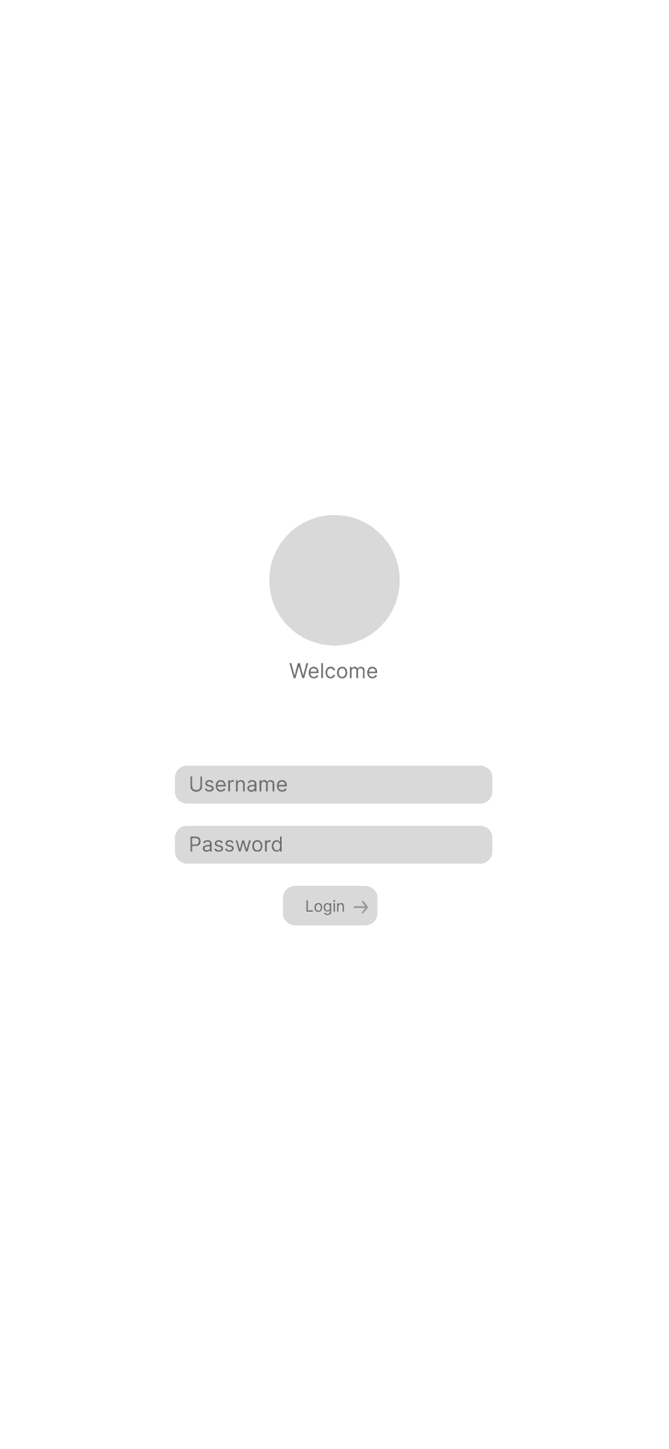
Low-Fidelity Wireframes
Now that we had understood which devices each stakeholder were likely to use, we started low-fidelity wireframing. We decided to focus on the mobile device for the patient, the tablet for the service provider, and the desktop for the administrator, designing a web solution that would target many of the pain points we had found in our research.
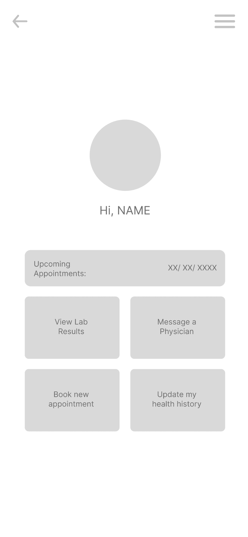
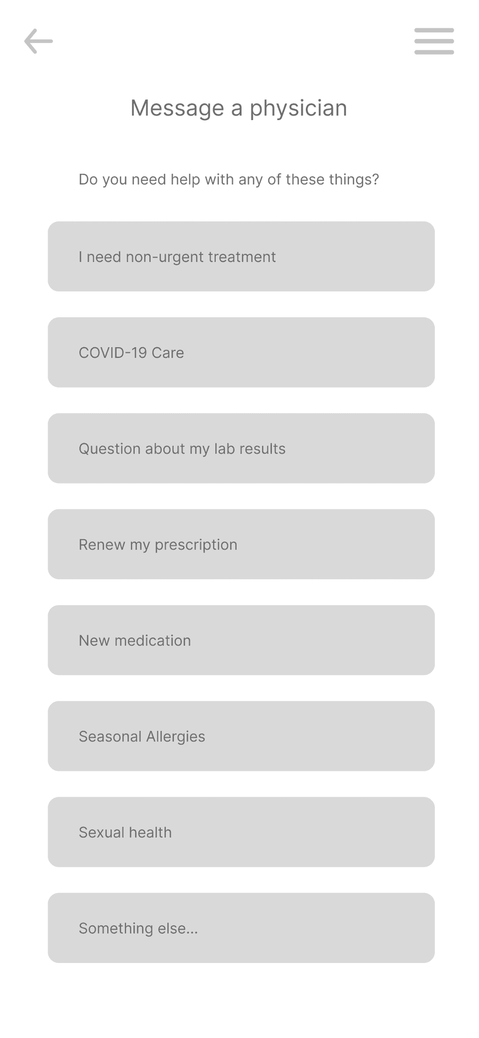
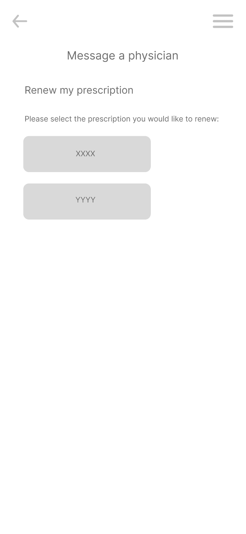
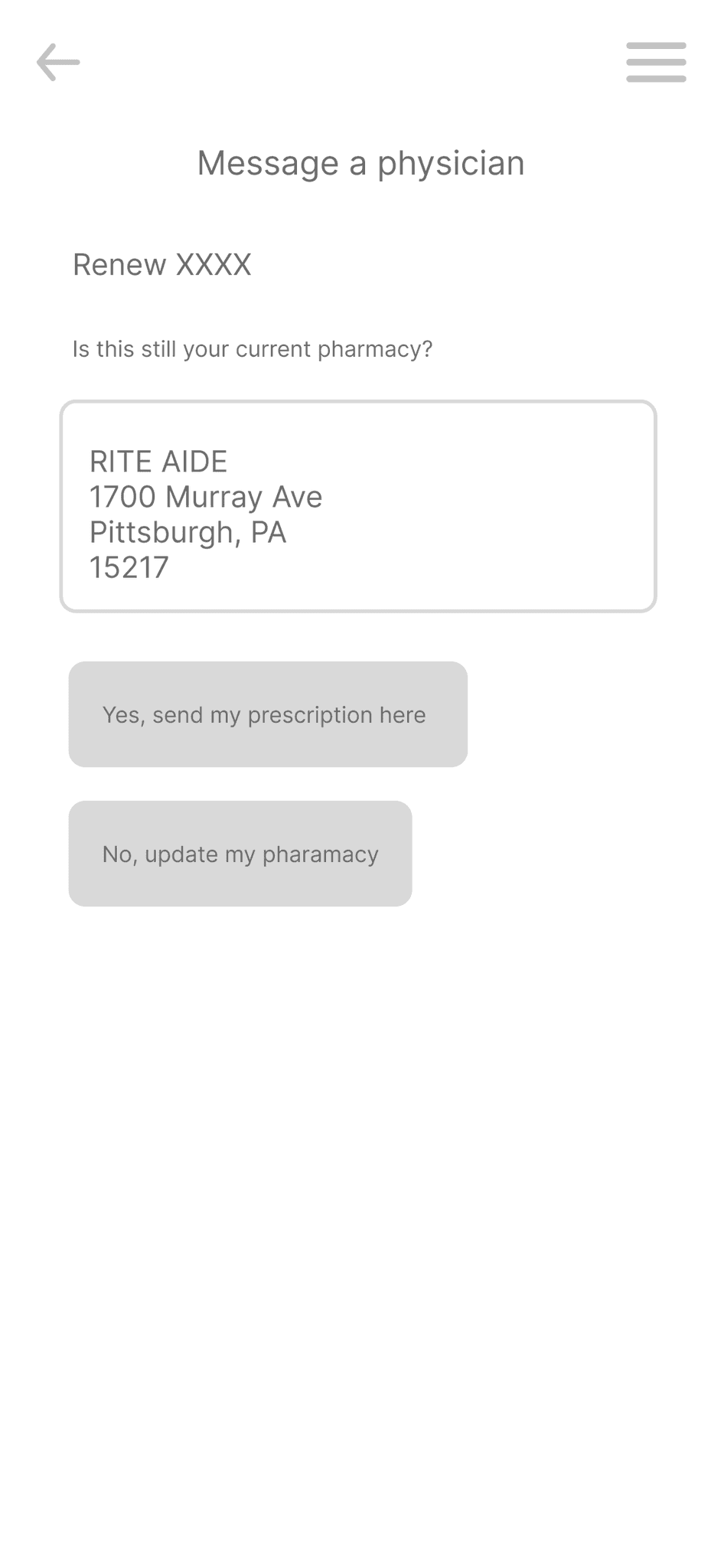
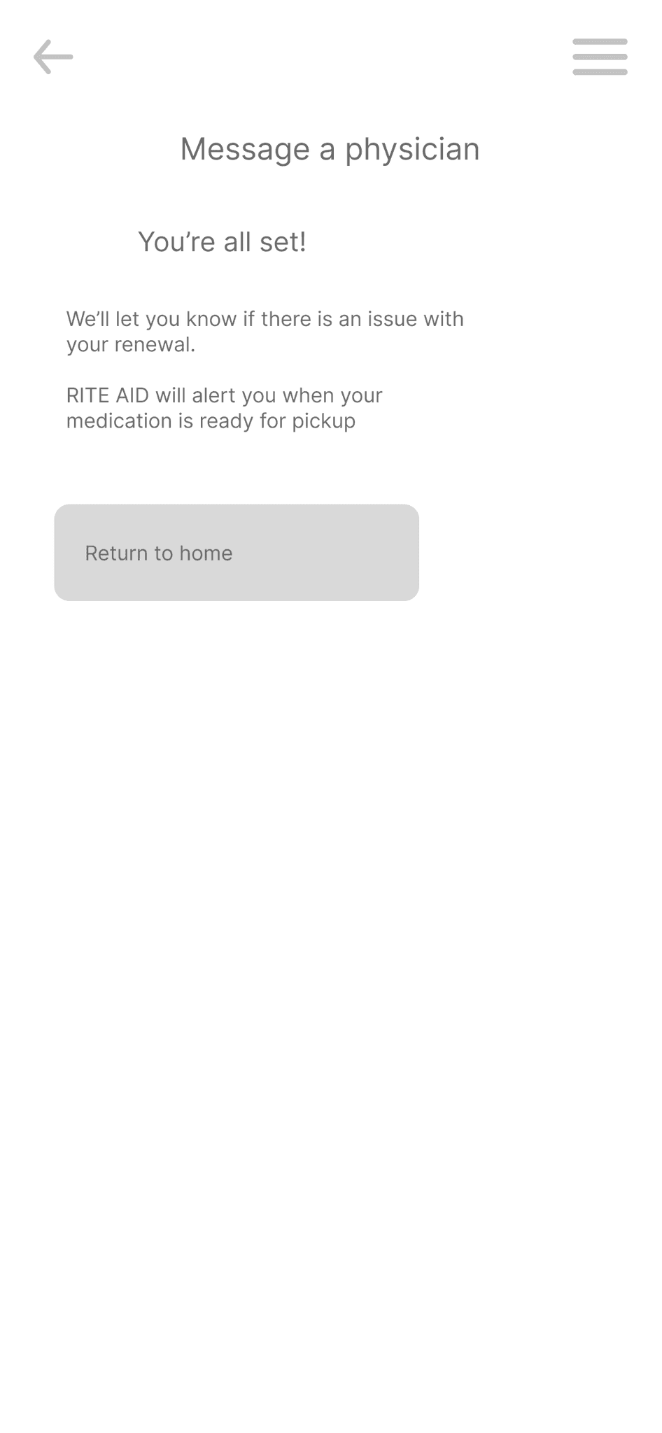
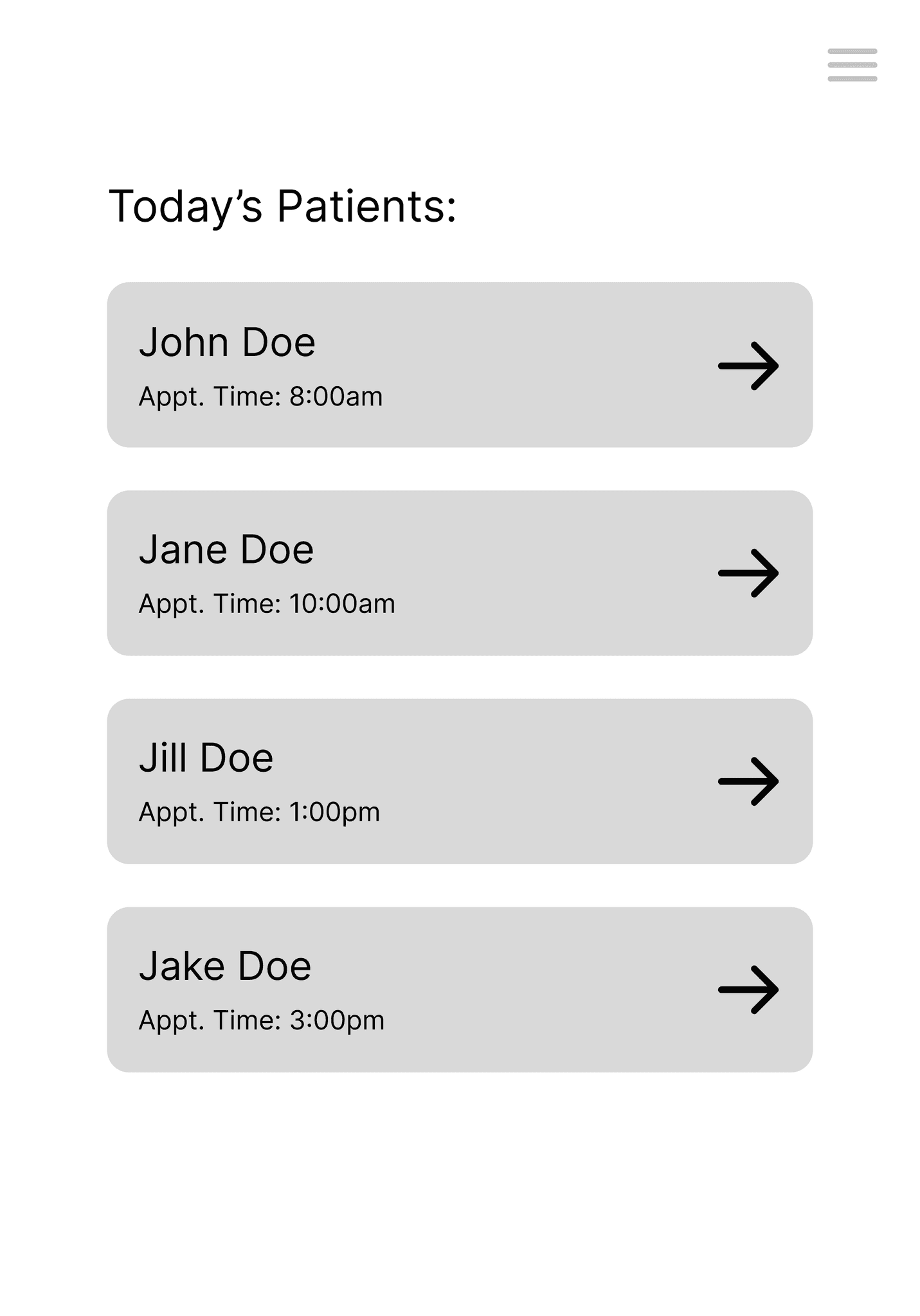
For our first iteration of a patient flow, we decided to focus on making a system that facilitated communication with a physician, as shown with a prescription renewal here.
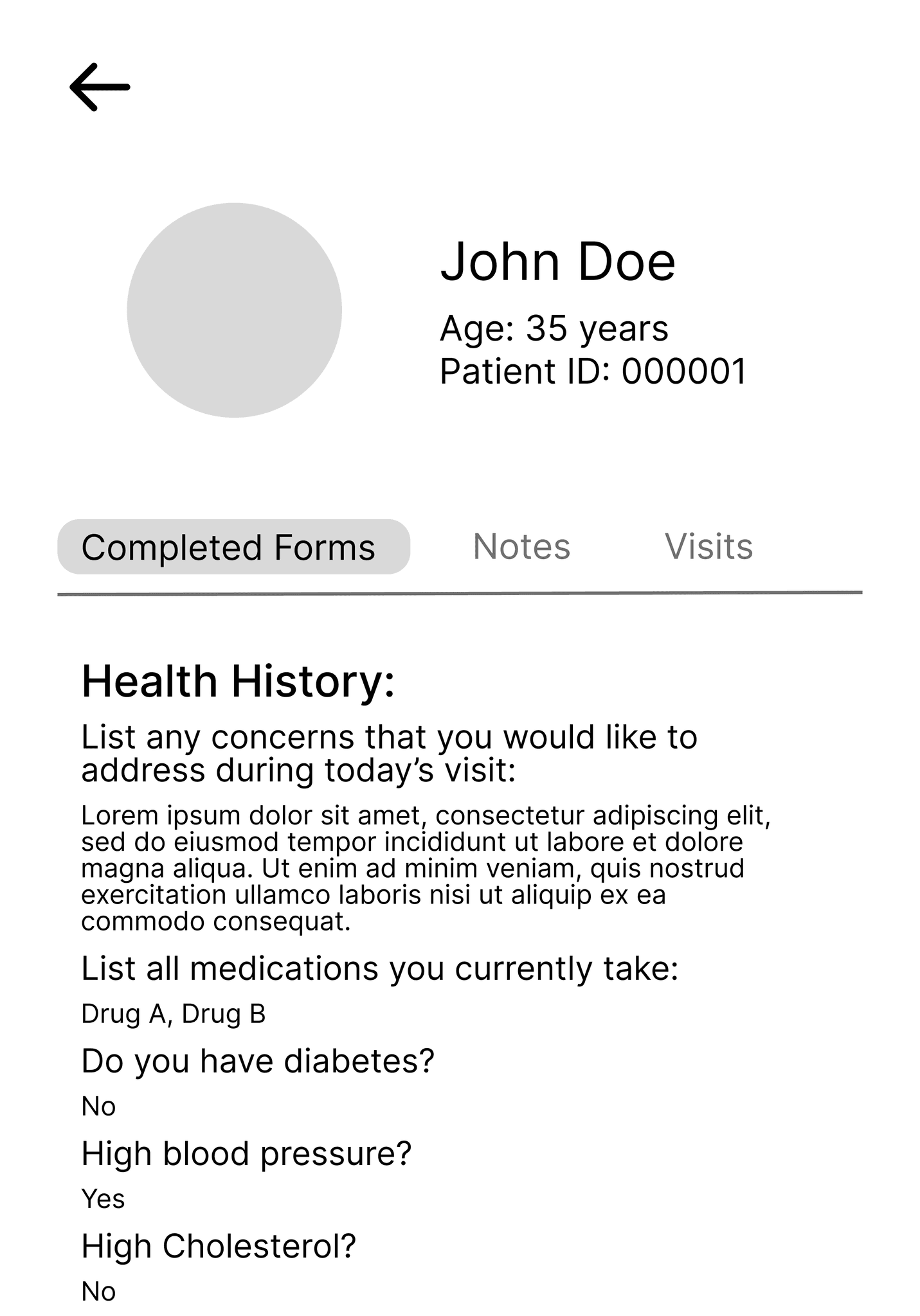
For the service provider flow, we decided to address the need for quick access to patient information for upcoming appointments, as demonstrated here on a tablet.
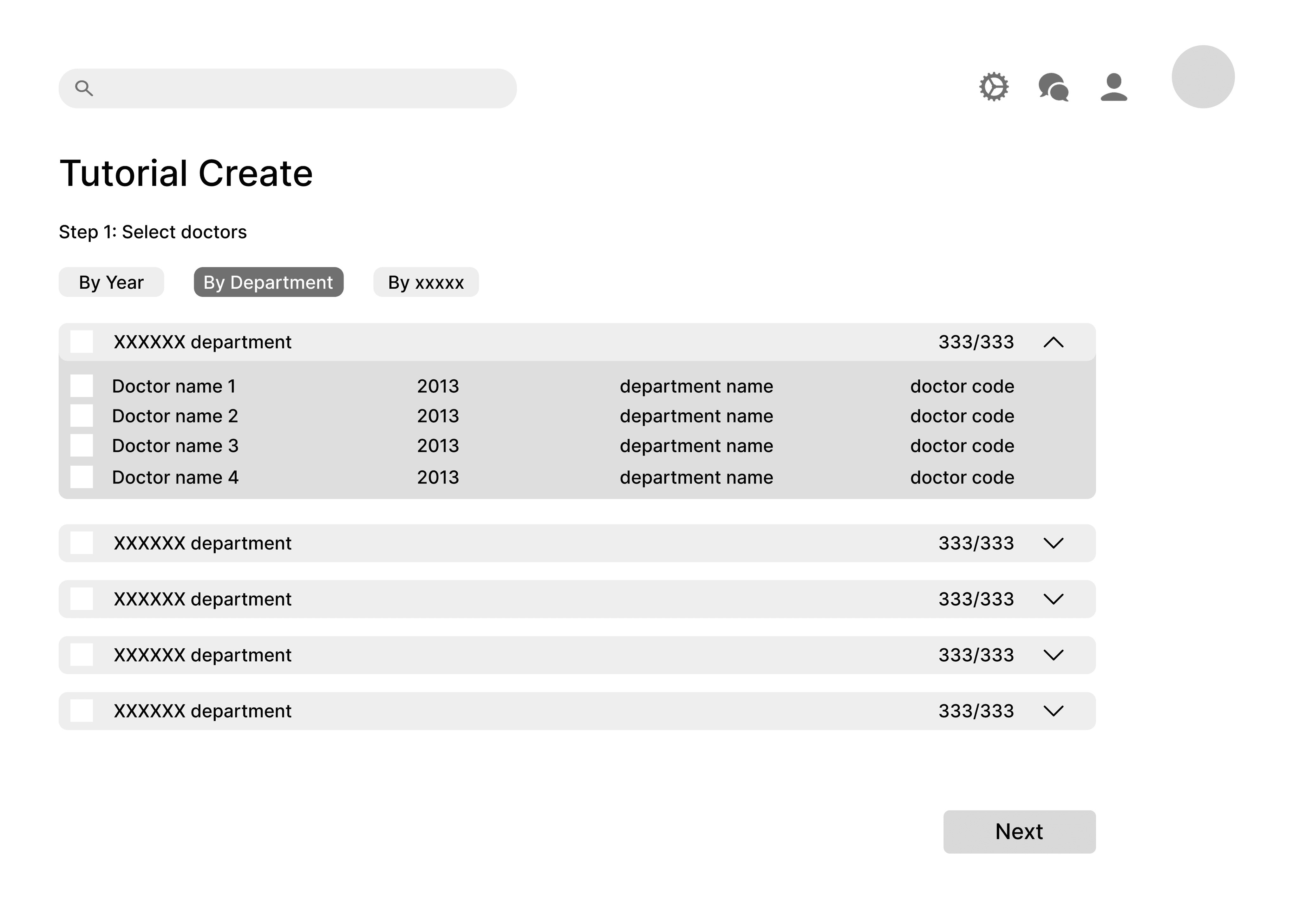
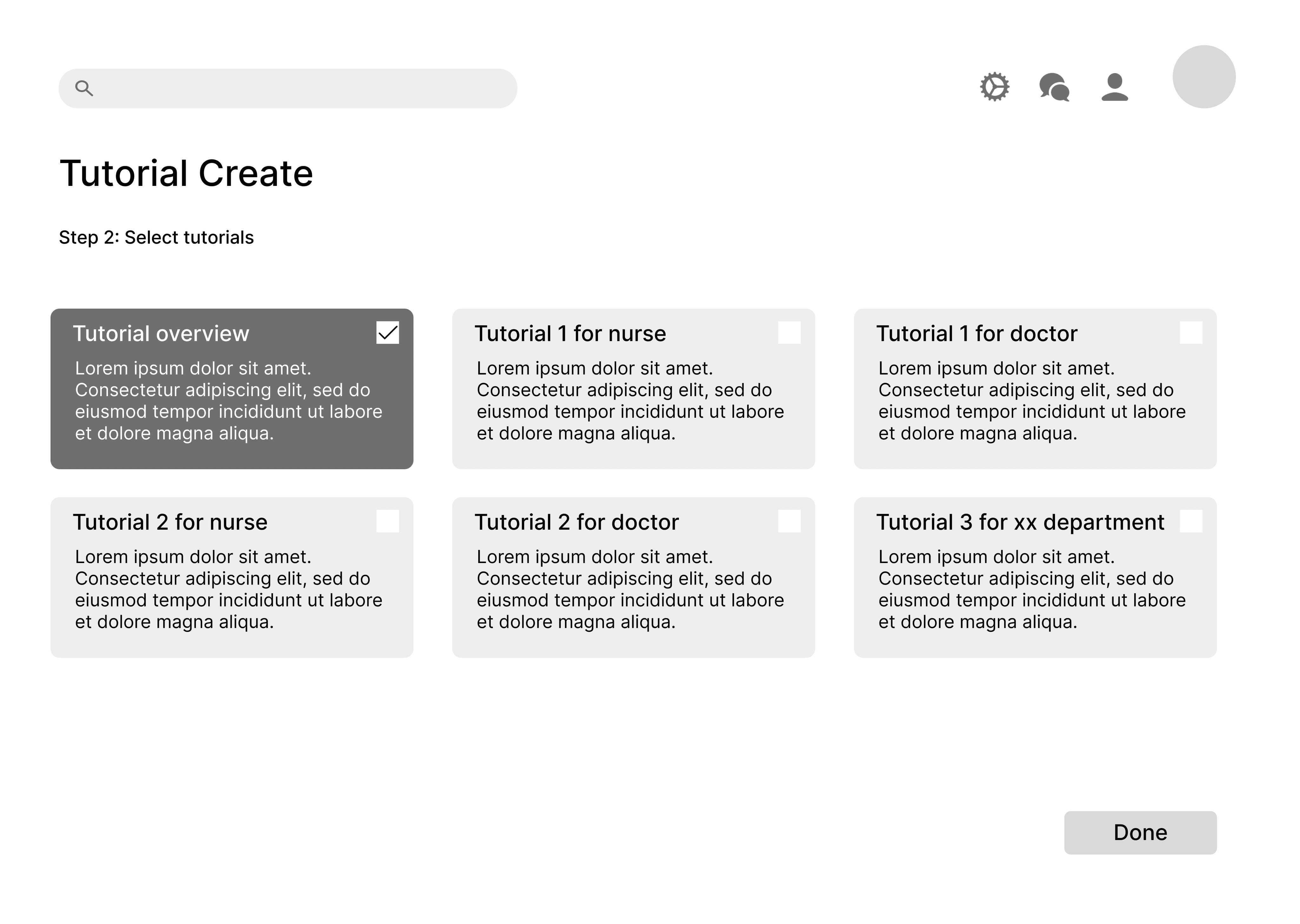
For the administrator flow, we decided to showcase how an admin could easily assign custom tutorials to different staff members for onboarding.
User Testing
Now that we had understood which devices each stakeholder were likely to use, we started low-fidelity wireframing. We decided to focus on the mobile device for the patient, the tablet for the service provider, and the desktop for the administrator, designing a web solution that would target many of the pain points we had found in our research.
High Fidelity Wireframes
Now that we had understood which devices each stakeholder were likely to use, we started low-fidelity wireframing. We decided to focus on the mobile device for the patient, the tablet for the service provider, and the desktop for the administrator, designing a web solution that would target many of the pain points we had found in our research.
REEVALUATION
Looking back, the original design felt overly stimulating and lacked a professional feel. I still felt passionate about the project and all the research that led to each feature of the design solution, but felt that the design could be updated to reflect the skills I had developed and cultivated since this project was completed.
DESIGN SYSTEM
Palette
Since we were designing an interface to be used by patients, service providers, and admins, we knew that we needed a calm and cohesive color palette that wouldn't distract from the sensitive information on each screen. We went with different shades of blues as seen below because they felt professional and clean — not too bright, but not too pale.
Primary
Secondary
Typography
Wanting a typeface that was simple and engaging, we decided on Open Sans which provided a variety of bolded styles to suit our needs.
Open Sans 36
TITLE
Open Sans 28
Heading 1
Open Sans 20
Heading 2
Open Sans 16
Heading 3
Open Sans 16
Body
Open Sans 12
Caption
Aesthetic
Wanting to make the interface more engaging to balance out the gravity of the context, we added some dropshadows and curvature.
UPDATED DESIGNS
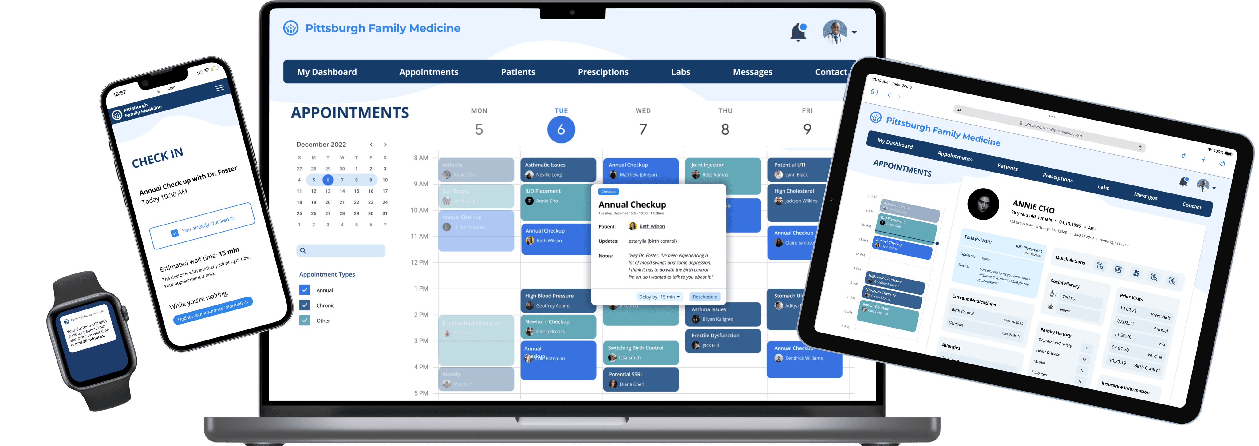
After crafting a clear design system and reframing our approach, we created a responsive web design for a family medicine practice seeking to make scheduling more efficient for patients, providers, and administrators. From the patient perspective we sought to do this by making the flow of scheduling an appointment easier and more intuitive and providing a platform for them to fill out paperwork before they arrive to the office. To improve the experience for doctors, we created an interface that allows them to easily view patient information and communicate with about delays across a variety of devices. For administrators, we created a dashboard that allows them to easily access information about each provider and provides an overview of scheduling trends that can enable them make decisions in order to improve the process.
High-Fidelity Wireframes
Below is our final set of high-fidelity wireframes, shown in chronological order with the context of our final scenario from above. You can also view all our flows through this interactive prototype.
REFLECTION
While this project wasn’t my first foray into responsive web design, I felt like I learned a lot not only about the best practices for responsive design, but also about the healthcare domain, especially as it relates to technology.
Pretty much as soon as we started our primary and secondary research, I felt overwhelmed by the amount of problems encumbering the healthcare domain. As we developed our scenarios and speed dated our storyboards, I felt more and more inclined to try and solve as many problems as I could with a singular design. Looking back, this is often a trap I fall into -- I get so drawn to this impossible notion of a one-size-fits-all design that I lose sight of any one particular pain point. I think this a lesson that bears repeating and really captures what design is all about.
While it took us a while to realize that we needed to hone in on a singular pain point, once we did as a team, I felt a lot of clarity and focus as we developed a specific scenario that we could all design for. I feel like being able to ground our design with a specific set of interactions + characters in mind, helped really smooth things along and prepare us for the pitch portion of the assignment.
All in all, while this assignment had a lot of hurdles, especially timeframe wise, I feel proud of the work my team and I have done. I wish I could’ve had more time to engage in critiques after we had developed our high-fidelity designs and explore more in the healthcare space.
Coming Next
Internship • Summer 2022
As a UX Design Intern on the Android Color Team at Google, I was tasked with completely redesigning an Monet Studio, an internal tool focused on allowing designers to understand, experience, and utilize dynamic color as a part of the Material You system.
Web Design • User Experience • Interaction Design • Design System