GENERATIVE RESARCH
Affinity Diagramming
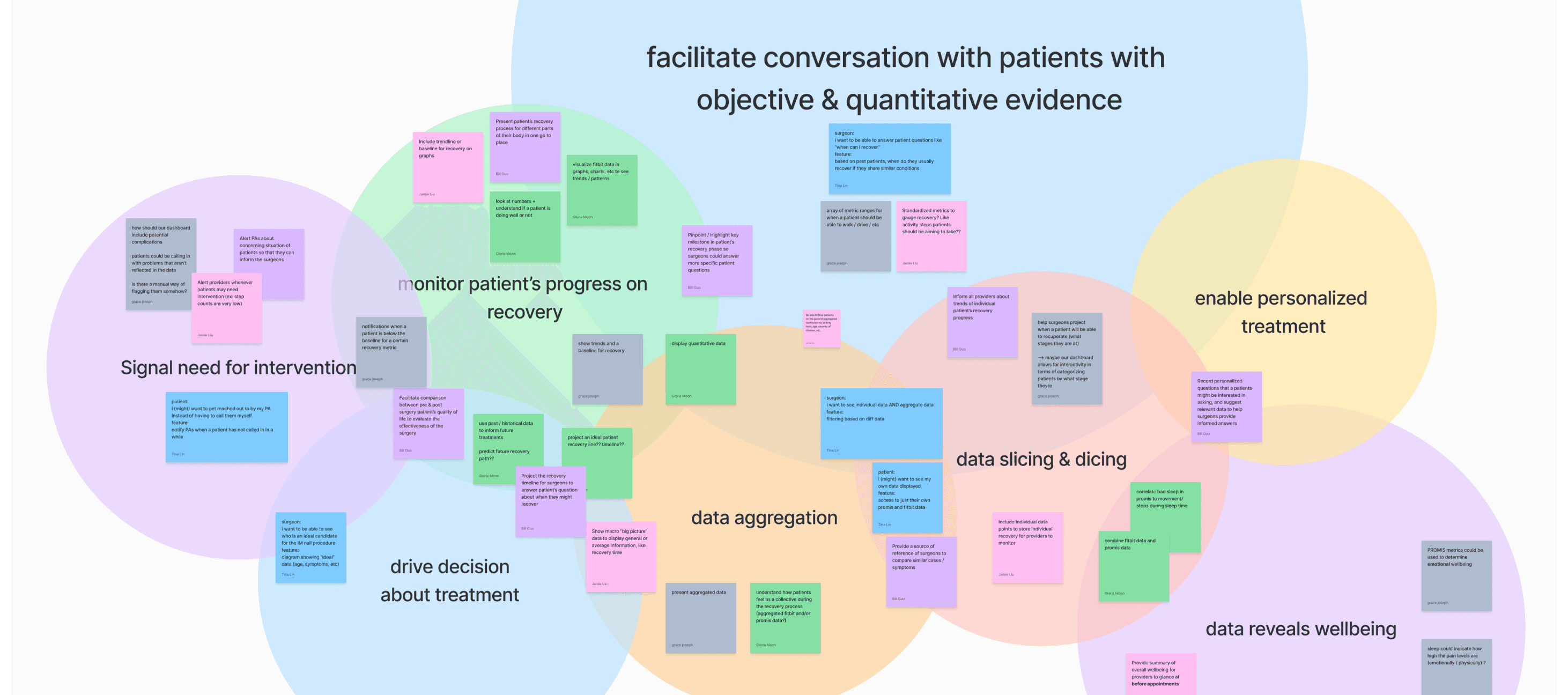
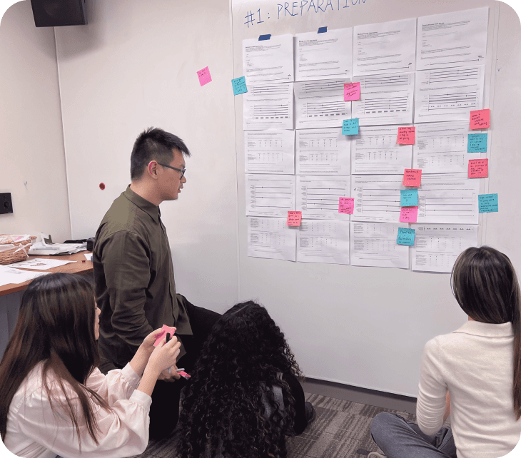
We began our ideation process by creating an affinity diagram. This allowed us to align on our interpretations of the research findings as well as to directly translate our research insights into design ideas. When creating this affinity diagram, we considered both the purpose of the dashboard and how we could organize/present the data on it given our understanding of the existing problem space.
Scenarios
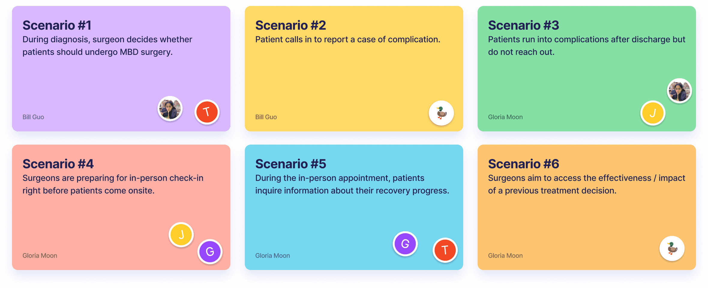
After discussing the purpose of the dashboard using an affinity diagram, we were able to identify six potential use cases. As a next step, we worked concurrently to generate various solution ideas for each scenario.
Storyboards
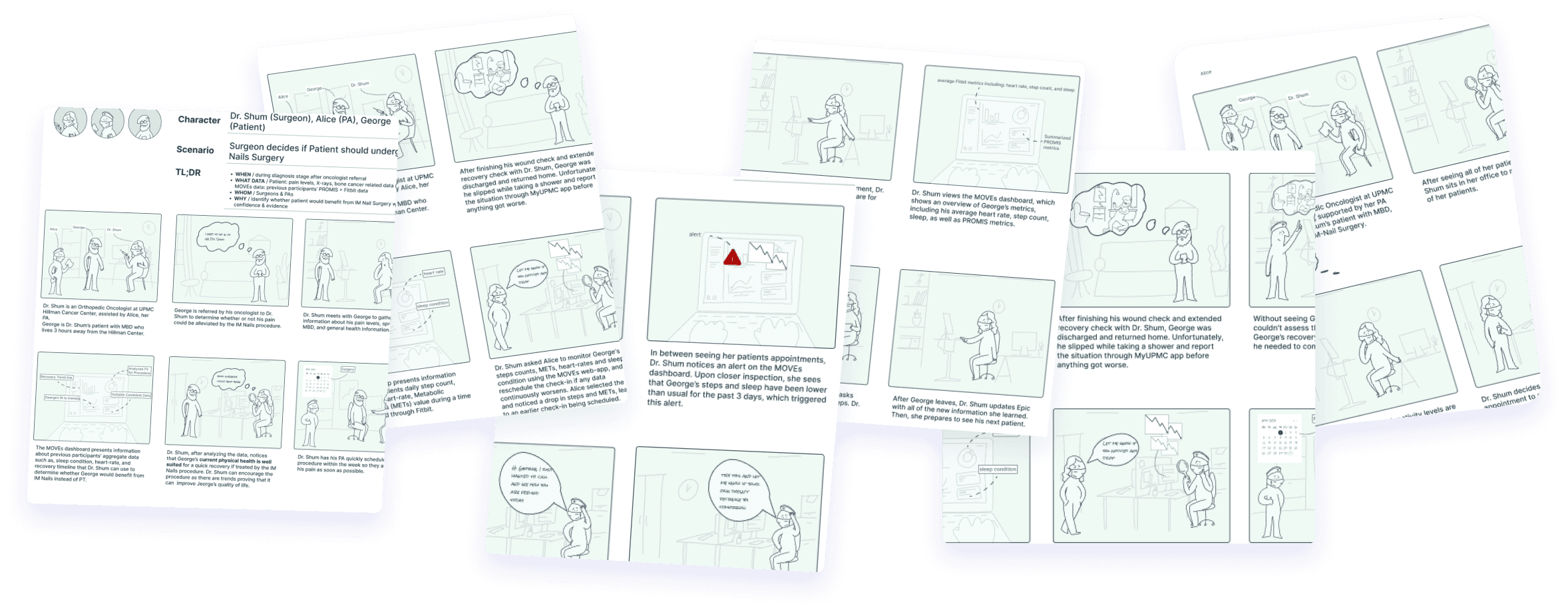
To elaborate on our ideas for the identified use cases, we utilized storyboards as a tool to explore a variety of solutions. Each storyboard contained six key elements: Character, Context, Problem, Solution, User Action, and Resolution. The use of storyboards proved effective in facilitating idea generation and collaboration within the team.
PIVOT
Despite our desire to present our storyboards to our users for validation and feedback, we were unable to schedule time with them due to their busy schedules, leaving us at an impasse. Their lack of availability limited the types of user research we could conduct and the feedback we could gather.
To overcome this challenge, we held a workshop with our team advisor, Julie, to gain a valuable external perspective and develop a more cohesive feedback-gathering plan. During the workshop, we focused on what we needed to learn from our users and clients, how to organize the feedback-gathering process, and the best practices for collecting and analyzing feedback.
We identified a pivotal question: "How might we get just enough information to move forward with our design?" This approach allowed us to pivot and led us to take a non-traditional path by exploring alternative methods to gather feedback, including speed-dating with clients and surveying surgeons.
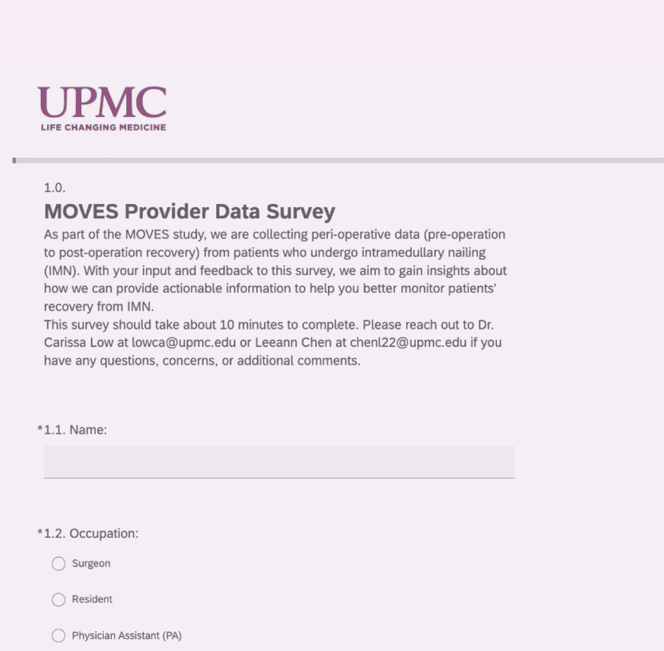
Survey Design
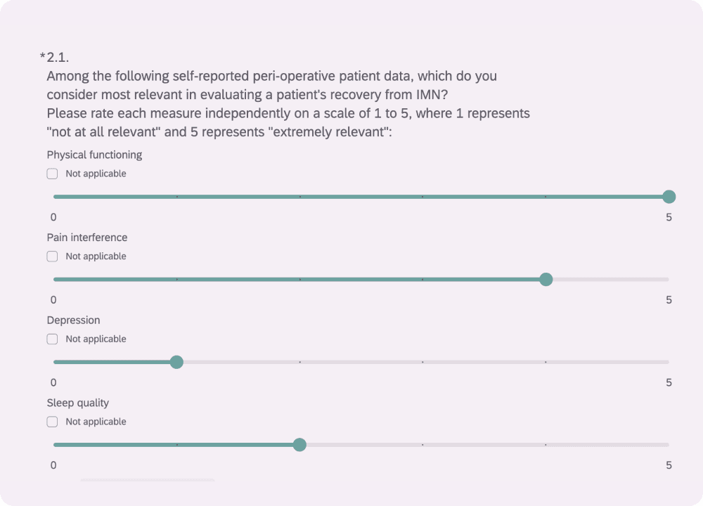
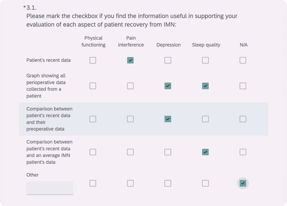
The survey also addressed the challenge of the surgeon’s unfamiliarity with patient-reported data by providing a chance for them to become familiar with potential data they may see in the future. Creating a common language helped us facilitate more productive conversations in our future interactions with surgeons.
To gather feedback from surgeons more efficiently, we shifted from synchronous methods, like interviews, to a short survey that takes only 5 minutes to complete. This allowed us to gain insights on how to provide actionable information for surgeons to help them better monitor patients' recovery from IMN.
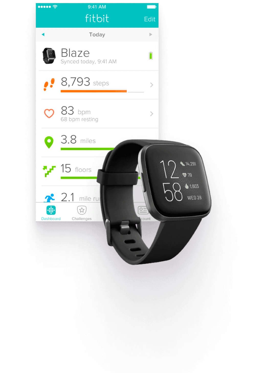
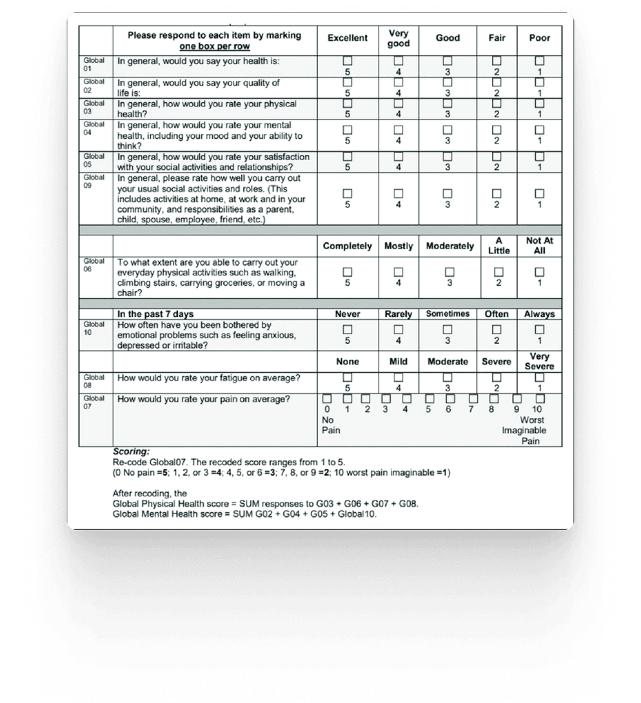
Sample Question #1: Perioperative Patient Data
Sample Question #2: Visualizing Patient Data
Data Interpretation Workshop
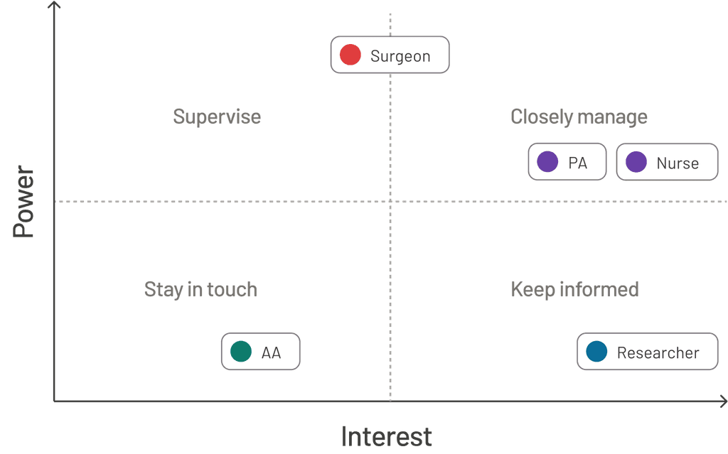
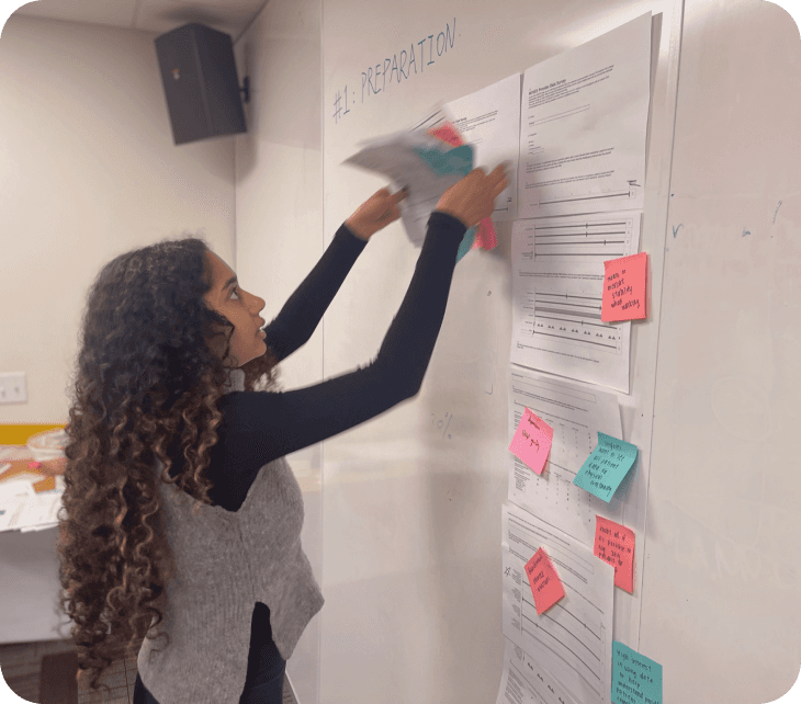
We organized a data interpretation workshop to synthesize the survey responses from our users (the surgeons) and our clients, validate the dashboard use cases, and identify the types of patient data to present.
Surgeon Consensus Analysis
First, we used a color-coding system to mark similarities, differences, and potential areas of interest among surgeons' responses, in order to identify any shared consensus or discrepancy in their beliefs.
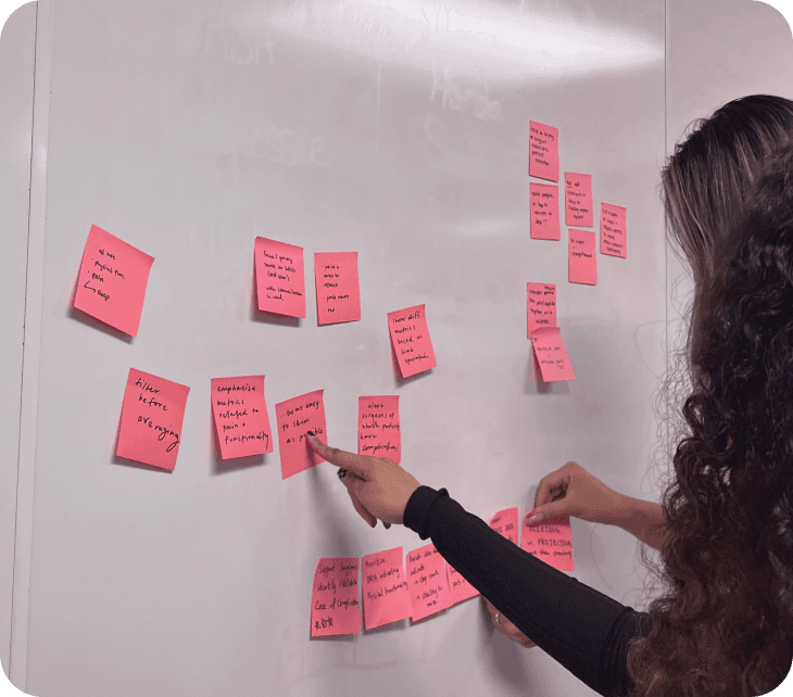
Data Clustering + Summarizing
Next, we organized sticky notes into clusters and generated new notes if needed. By collecting and aggregating the responses, we gained a general sense of the overall relevancy of the data that was feasible and necessary to introduce.
Dashboard Design Implications
Lastly, we reflected on our interpretations and findings, and re-framed them into design implications for our dashboard. We focused on defining what our dashboard should achieve for the surgeons and prioritizing the most critical information.
Through the data interpretation session, we validated two dashboard use cases and gained an in-depth understanding of the specific data and data visualization that surgeons find relevant to our use cases.
EARLY DESIGNS
Data Viz Library
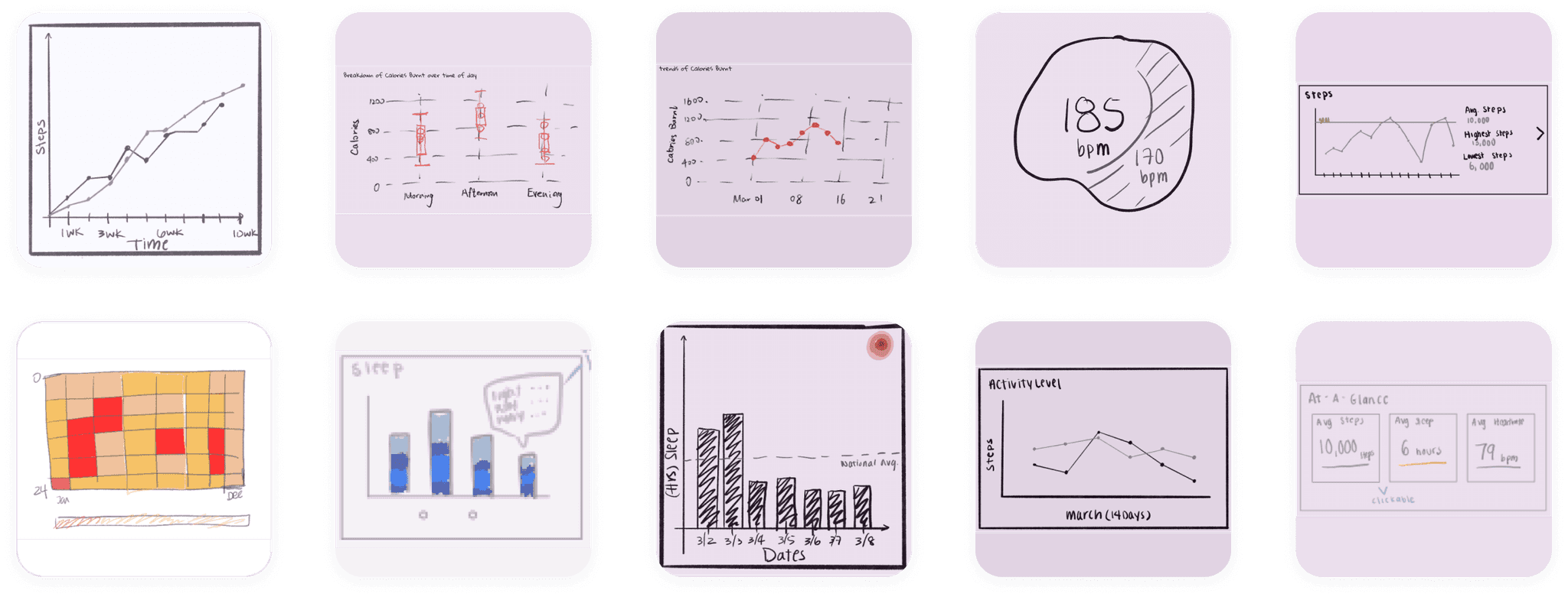
To create wireframes that support the validated use cases, we created a data visualization widget library using parallel prototyping. This allowed multiple team members to independently explore different visualizations for the top-priority scenarios. The widget library helped us establish a shared vision and explore a variety of design options, especially given the low-fidelity nature of our wireframes.
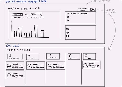
Aggregated Patient View
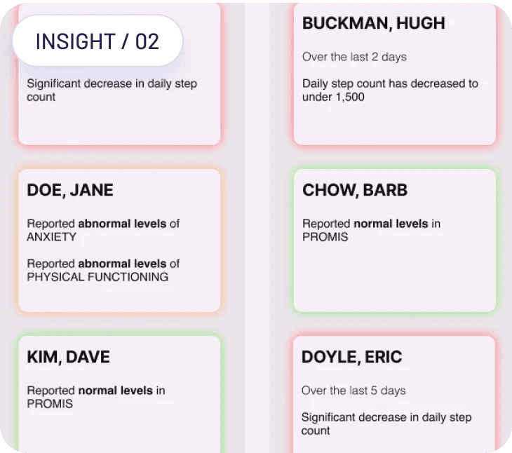
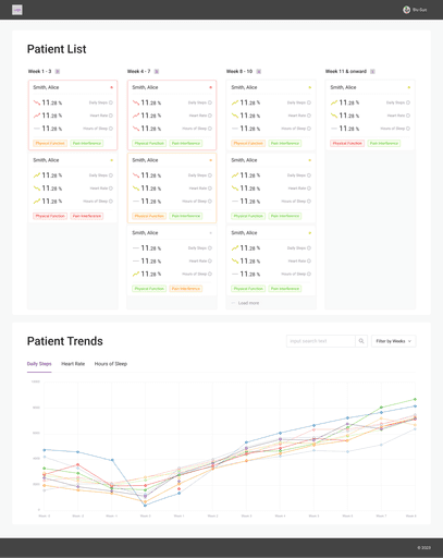
For the first prioritized use case, we explored means to present in-breadth aggregated patient data: a screen containing information about a surgeon's patients. Our hypothesis was that this page would help surgeons identify patients who needed a quick phone call to check in on them.
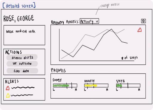
Individual Patient View
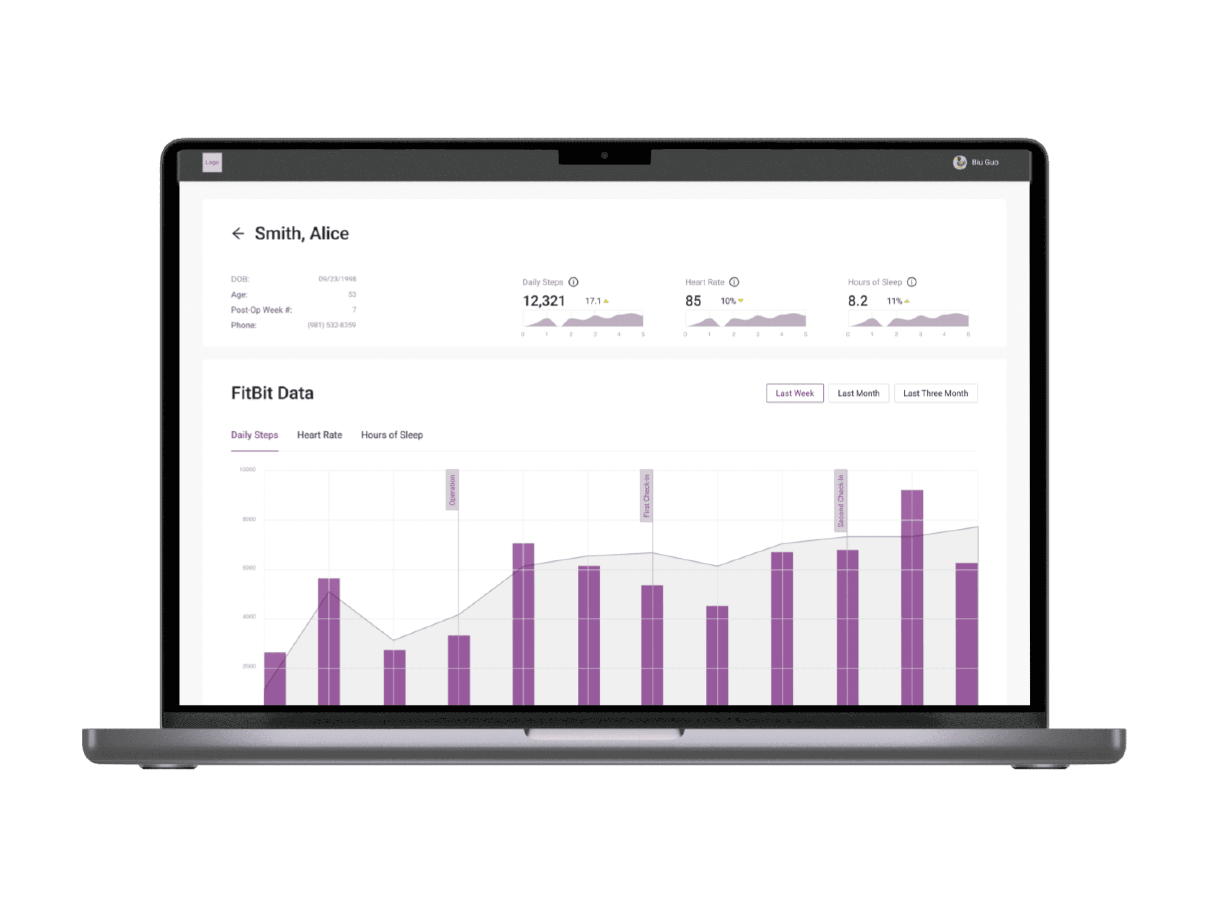
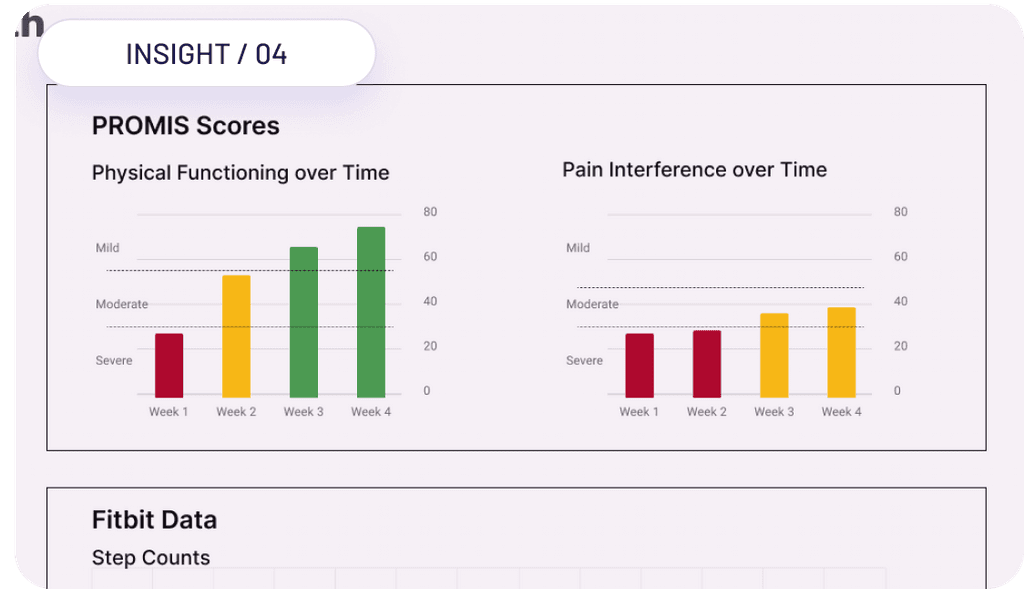
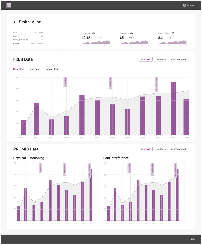
We also prototyped a separate screen to present more in-depth individual patient data. Our hypothesis was that surgeons could refer to this page to facilitate data-informed one-on-one conversations and provide more meaningful guidance during the recovery process.
Mid Fidelity Wireframes
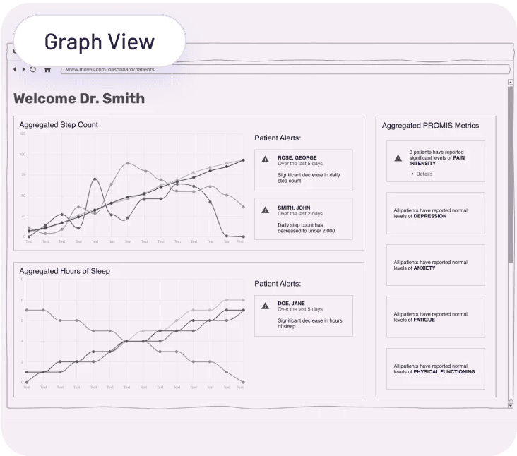
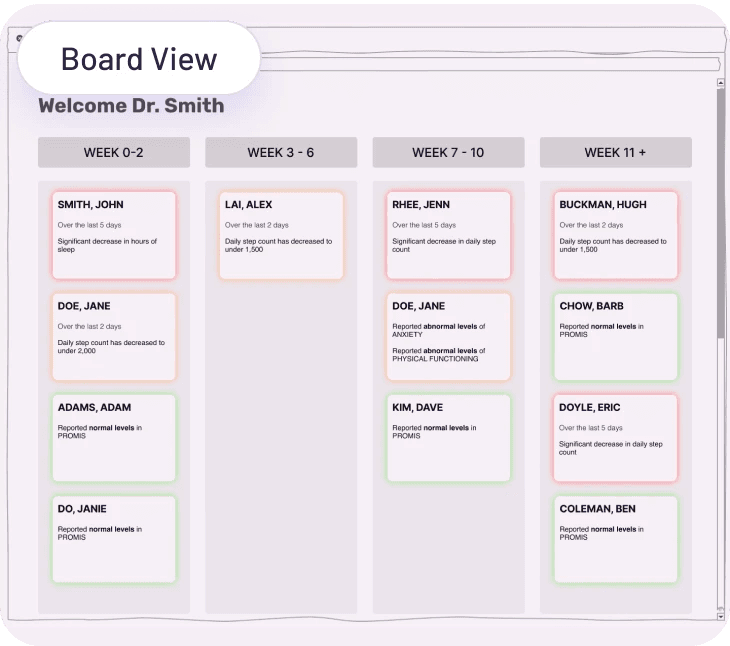
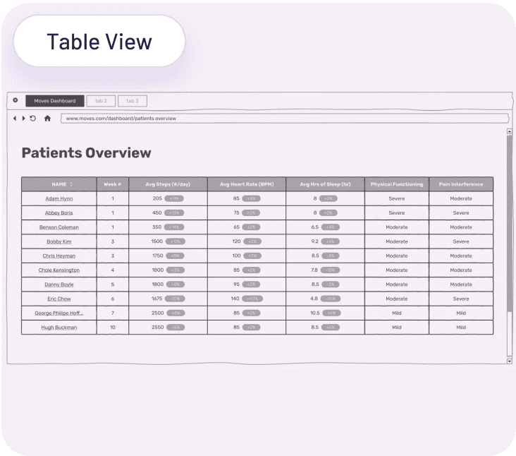
Aggregated Patient View
Our mid-fidelity prototype is intended to facilitate conversations during upcoming user studies to evaluate the dashboard's effectiveness for our two target use cases. We created three variations of the in-breadth patient list page, each with a unique feature to help us answer the following questions.
What visualization may help to highlight potential complications?
What patient data may indicate complications?
What information density and volume seem most effective?
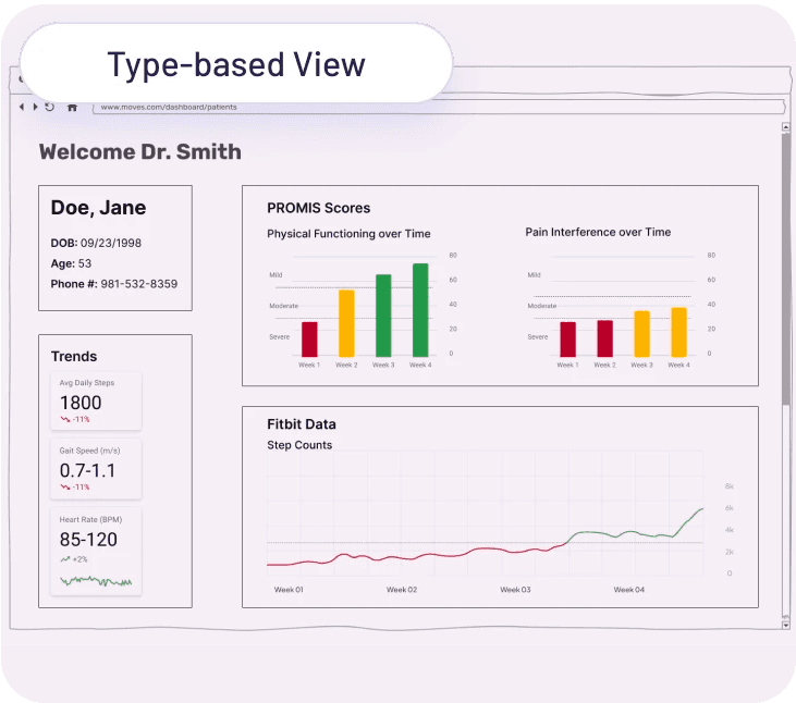
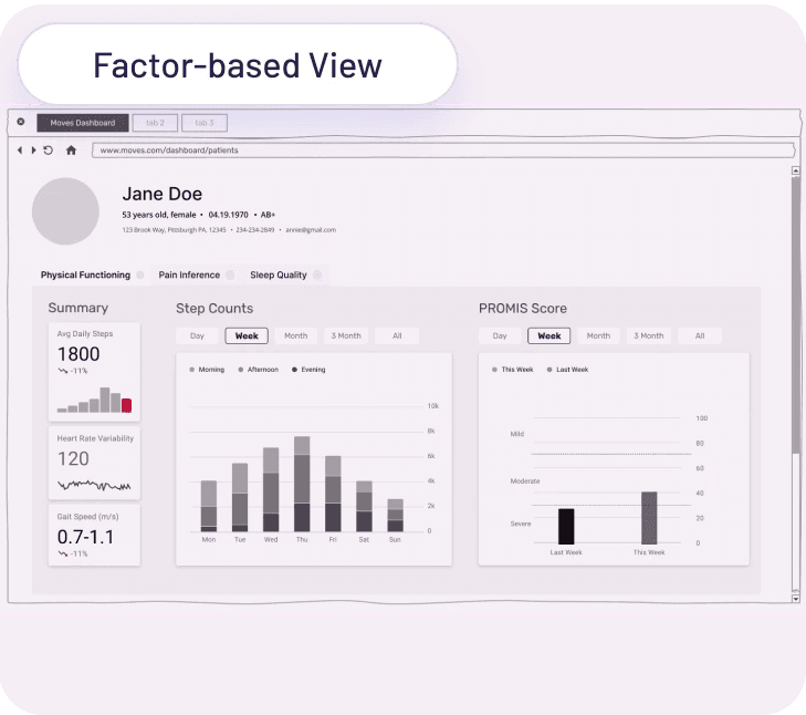
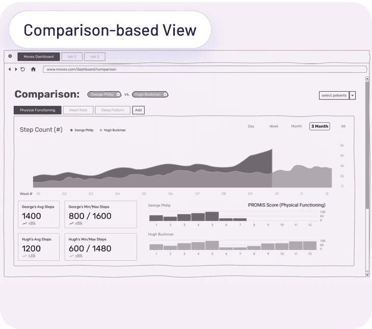
Individual Patient View
Similarly, we created three variations of the in-depth patient list page (Type-based View vs. Factor-based View vs. Comparison-based View), each with a unique feature to help us understand a different set of questions.
How much data and data interpretation do surgeons require?
How should the data be grouped? By data type or factors?
What are surgeons' thoughts on comparisons between patients?
USER TESTING
We conducted our first round of user study with surgeons using our printed wireframes and pens/paper to interact with the prototype. Their feedback was overall very positive, with many expressing enthusiasm for the dashboard's potential to improve patient care.
Insights
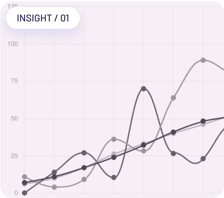
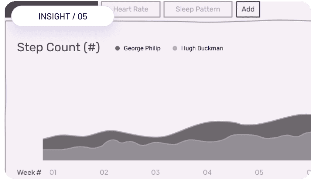
Our user studies revealed that trends and deltas provide more informative data than specific values. Comparing weekly averages is a helpful way to measure capture the different and trends.
Cross-validation of information could be used to determine check-in priority, which can help surgeons decide which patients require a quick phone call to check in on them.
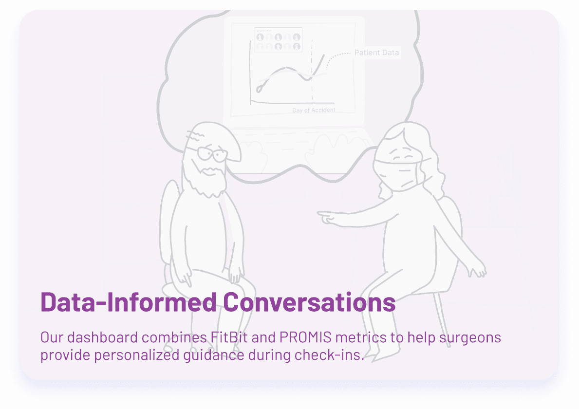
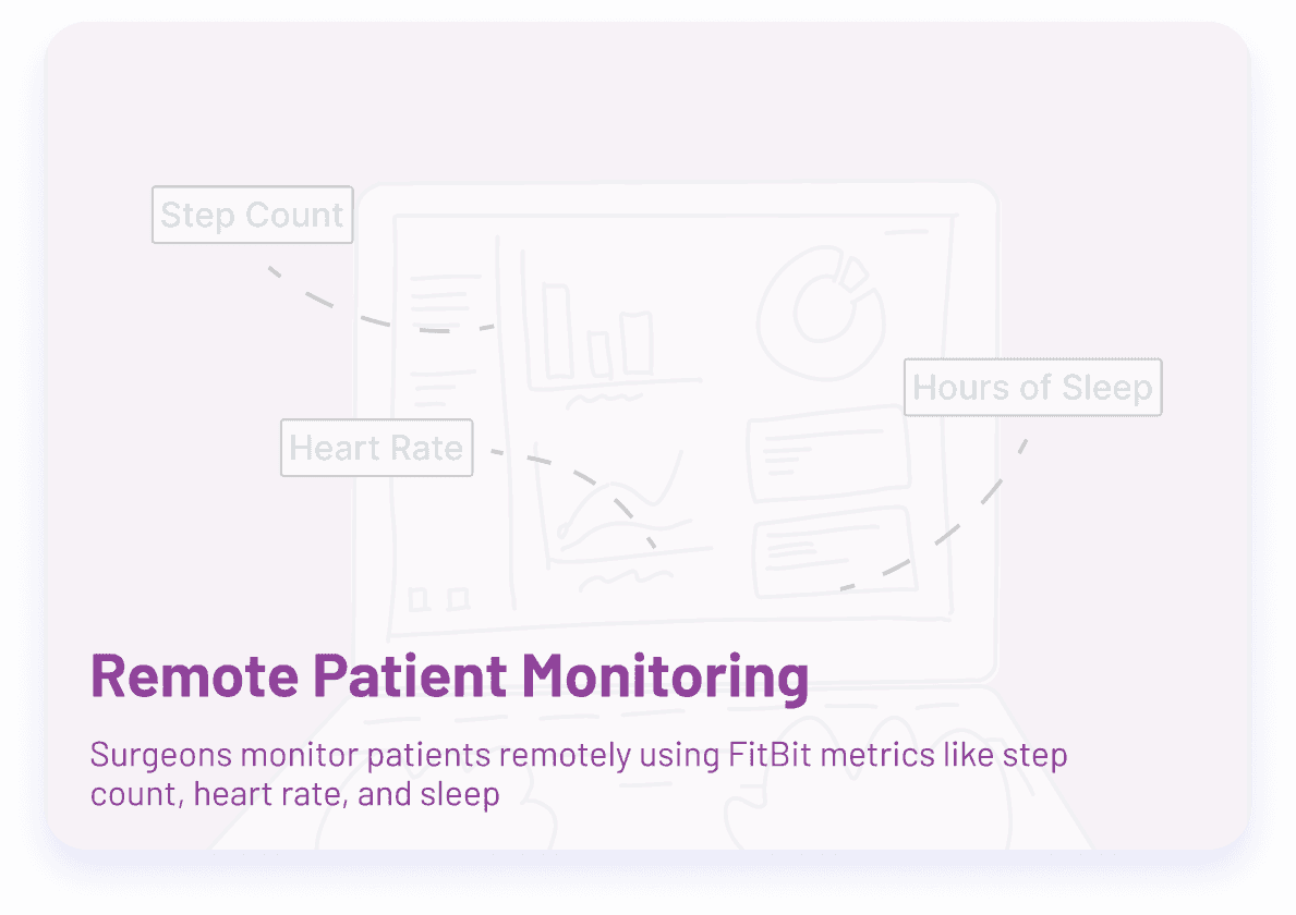
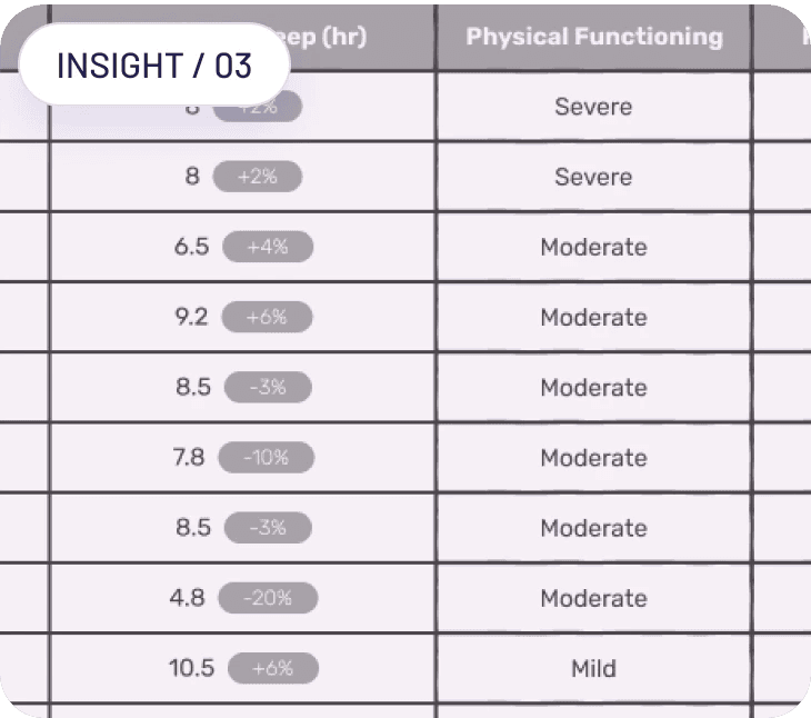
Fitbit and PROMIS data complement each other, providing both objective and subjective views of a patient's performance.
Surgeons prefer to keep data from different sources separate. Checking performance within different timeframes is helpful for detailed investigations.
Our user studies showed that comparing individuals is meaningless, but comparing individuals to the group can help facilitate conversations with patients. This approach can encourage out-performers, assure the average, and motivate those behind.
FINAL DESIGNS
High Fidelity Wireframes
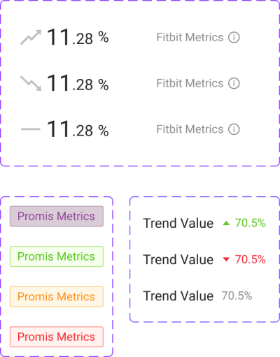
We began our high-fidelity wireframing by refining and consolidating our mid-fi wireframes based on feedback and suggestions from our users. To ensure consistency and improve the fidelity of our work, we created a design system on top of ANT design, customized the styling, and created components. Our goal was to make the interactions feel more real and the content more realistic.
Aggregated Patient View
Individual Patient View
With confidence in ourselves and confirmation from clients, we decided to develop the web application using React for the front end and APEXCHARTS.js for all data visualizations. The deployed web application visualizes dummy information for user testing purposes.
After careful analysis of the project requirements, we decided to use Ant Design as the basis for our design system. This established framework provides a comprehensive set of pre-built components and design patterns that have been thoroughly tested and refined for consistency and accessibility. By building upon Ant Design, we were able to save time and resources, while still delivering a polished and professional user interface.
Palette
To ensure a unique, tailored look and feel, we added customized styling that aligns with our client's brand and target audience. This allowed us to leverage Ant Design's strengths, while also creating a visual identity that meets the project requirements.
Primary
Neutral
Accent
Typography
We decided to go with Barlow throughout our interface because of the variety of weights and styles it offered.
Barlow 34
Title
Barlow 28
Heading 1
Barlow 22
Heading 2
Barlow 20
Heading 3
Barlow 16
Body
Barlow 12
Caption
Internship • Summer 2022
As a UX Design Intern on the Android Color Team at Google, I was tasked with completely redesigning an Monet Studio, an internal tool focused on allowing designers to understand, experience, and utilize dynamic color as a part of the Material You system.
Web Design • User Experience • Interaction Design • Design System
